HOME | DD
 Errance — Chanter et rever

Published: 2006-06-01 07:53:42 +0000 UTC; Views: 3929; Favourites: 44; Downloads: 166
Redirect to original
Description
Need to rescan. ^^Related content


Comments: 24

This is so graceful and beautiful... I really love the border that kind of swirls out of the text, but it seems to do so very naturally. Caught my eye immediately.
👍: 0 ⏩: 0


great work, but the frame is not very good done. thouse courvse are not round enough. but great work - i like it!
👍: 0 ⏩: 0

This is absolutly beautyfull  (Smile)")

👍: 0 ⏩: 0


Beautifully executed. The ligatures are nice though the the fine lines aren't quite smooth. They look a little brittle. Other than that, I think it is a delightful piece. Keep up the good work.

👍: 0 ⏩: 0

Wow. AMAZING.
Thank you, for this amazing piece and the inspiration that came with it.
👍: 0 ⏩: 1

I know what you mean, I have de same problem. Sometimes, It don't know what I can do with calligraphy... so I do anything else.
Don't worry, don't give up. There is always something to learn or to try.
 (Wink)")
👍: 0 ⏩: 0

Wow, this is gorgeous!! Is that made with a broad nib or a copperplate one (like, the one that is thin and then expands if you press on it, dont know its name)?
Is the text in French? What does it mean?
👍: 0 ⏩: 1
It's a copperplate nib, a thin one.
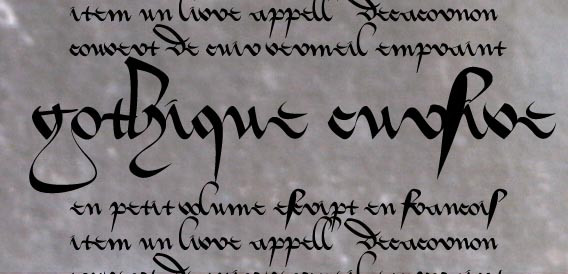
It's in french, from Cyrano de Bergerac. (english version [link] )
" But sing,
Dream, laugh, go lightly, solitary, free,
With eyes that look straight forward--fearless voice!
To cock your beaver just the way you choose,--
For 'yes' or 'no' show fight, or turn a rhyme!
--To work without one thought of gain or fame,
To realize that journey to the moon!
Never to pen a line that has not sprung
Straight from the heart within. Embracing then
Modesty, say to oneself, 'Good my friend,
Be thou content with flowers,--fruit,--nay, leaves,
But pluck them from no garden but thine own!'"
👍: 0 ⏩: 1
oh, copperplate is soo hard to manipulate! for me, at least..=\
I love the decorations on the side!
Cyrano.. Really got to read it sometimes soon.
👍: 0 ⏩: 0

Je n'arrive pas à trouver pourquoi, mais j'aime beaucoup moins que d'habitude... il y a quelque chose qui me dérange.
👍: 0 ⏩: 1
Il y a eu beaucoup de perte par le scan... ça rend pas grand chose. En vrai, ça a légèrement une meilleure tête. Après, bon, on peut pas non plus tout aimer.
👍: 0 ⏩: 0

great work..... why dont you submit this on scriptorium...??? more ppl will be able appreciate it that way...
👍: 0 ⏩: 1
Ok ok, I put it on scriptorium.
👍: 0 ⏩: 1

This is great...your really good at this. I wish I were that good at calligraphy. ^_^
👍: 0 ⏩: 0


j'adore cette cursive incisive et mystérieuse. Pas besoin de comprendre il suffit de d'admirer
👍: 0 ⏩: 1

c'est une très belle page j'aime franchement le style par contre je ne déchiffre pas tout le texte : je ne suis pas habitué a lire la cursive mais j'aime beaucoup son tracé et les jeux de plumes.
👍: 0 ⏩: 1
Le scan perd beaucoup... mais couvre les endroits où j'ai gratté le papier. C'est long à secher & du coup, j'ai fait quelques bourdes. Note aussi que comme c'est dure à lire, je corrige pas les fautes d'orthographes.
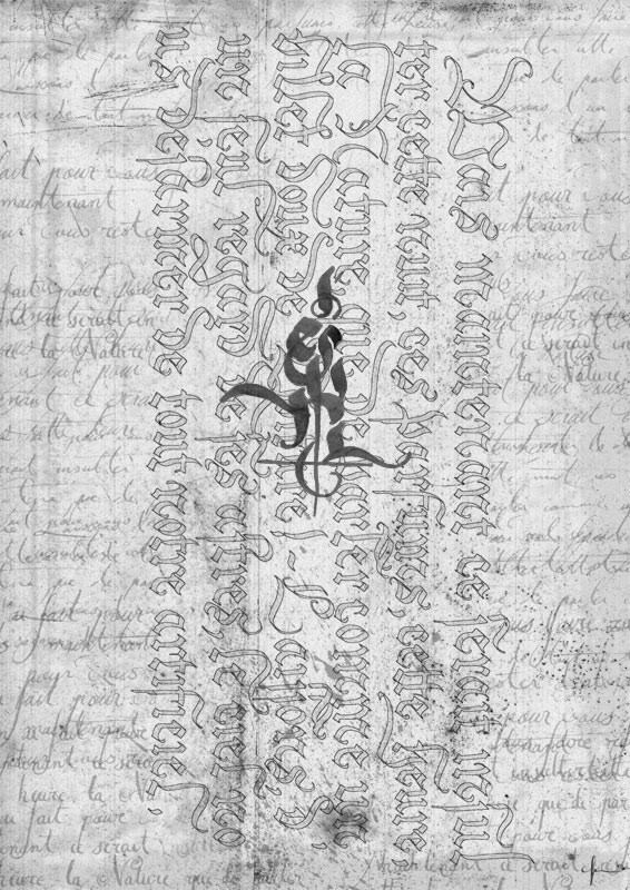
Ce que j'aime dans cette écriture ce sont les hampes qui descendent sur plusieurs lignes, c'est rare.
")
👍: 0 ⏩: 0


this work of art in writing just made me swallow the gum i was chewing. this is completely amazing. i don't know how you keep your hand so steady through those extra-long descenders. i couldn't do it, that's for sure. reminds me of some serious formal court-hand. you have your own distinct style, that's for sure.
if you don't mind my asking: what kind of nib did you use for this? did you use a fountain pen for this? if not, you must have had to do some heavy-duty loading of ink on the dip pen or quill.
👍: 0 ⏩: 1
Hé hé, I use a ruler to draw the descender.
I'd rather do it without, but it's not terrible... This scipt is flemish & cursive. I don't why but I really love the cursive.
I use a quill, a sharp one. I don't have a fountain pen, I use gouache & water, loading the quill each two or tree words.
👍: 0 ⏩: 0