HOME | DD
 fediaFedia — Desktop with Office 2010
Published: 2009-05-16 13:44:18 +0000 UTC; Views: 14847; Favourites: 30; Downloads: 662
Redirect to original
Description
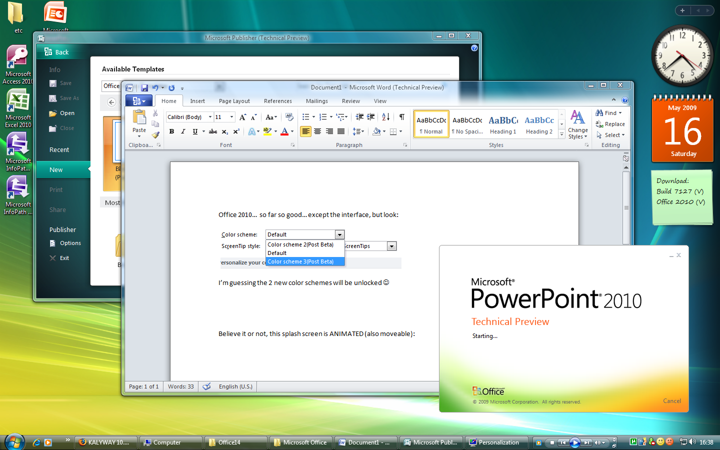
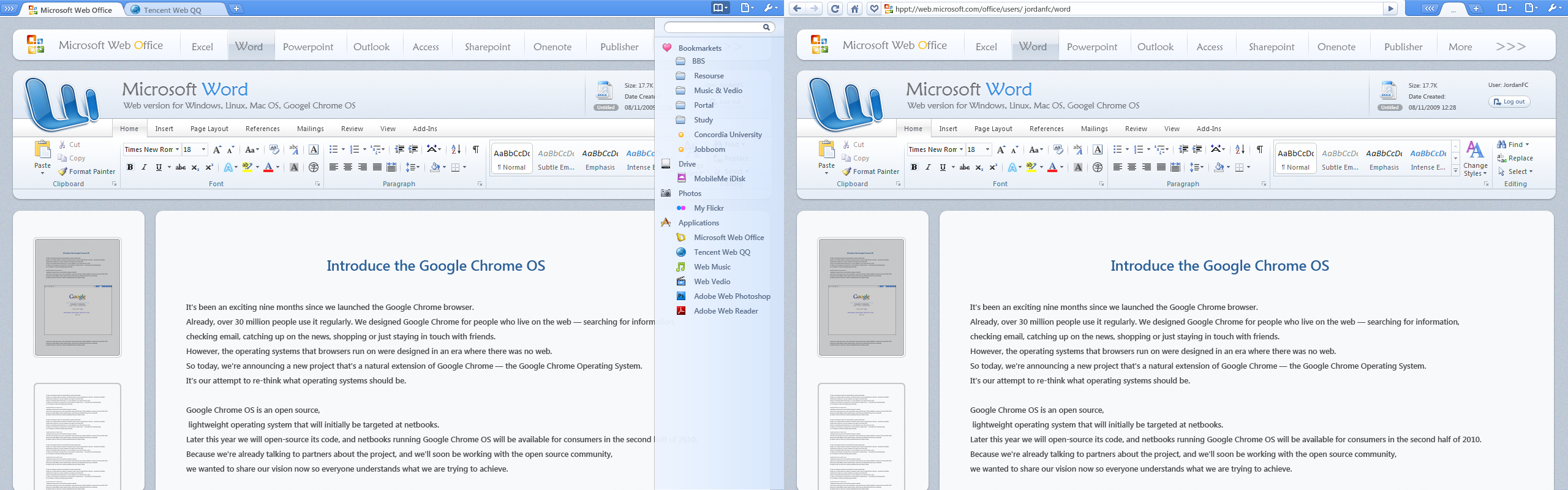
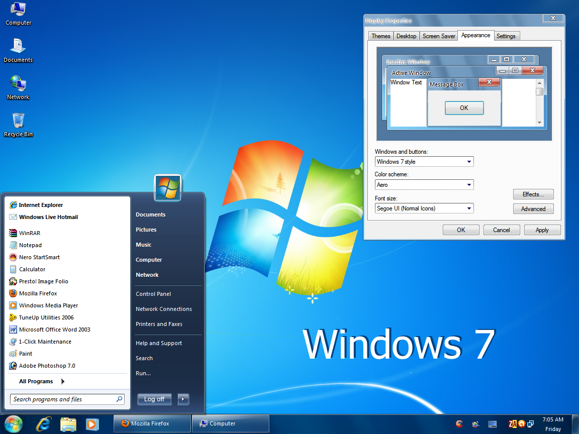
Mini review:Like many others I got the possibility to test Office 14 today. The installation took quite a while but it was worth it. Even though Office 14 preview might seem a lot like 12 I can confirm there are a lot of differences. The first thing that surprised me was the awesome animated splash screen, it's really a nice touch. The office button serves a different purpose now, it openes a sleek looking screen which you can see behind the word window, it's still a little glitchy. The interface is quite boring, but I noticed that there could be 2 new color schemes for office apps in the further betas, so it's not a big problem. Overall there are numerous feature changes and fixes, it feels like the good'ol 2007 but it's better now!
Comments are welcome!
P.S. 7127 - not worth downloading, believe me.
Related content


Comments: 127

Hope it will look even better with those 2 color schemes unlocked in the beta
👍: 0 ⏩: 1

hopefully, its looking like it will be even better than 07 was
👍: 0 ⏩: 0

downloaded a nice torrent i guess?
If I had fast internet I would have installed it today.
👍: 0 ⏩: 1
M'yeah, I think the install took longer than the download
")
👍: 0 ⏩: 1
I found some links on rapidshare
but I don't have a Premium account so
I takes hours to download this.
👍: 0 ⏩: 1

That White light around menu bar is gr8
matches with Aero Perfectly!
")
👍: 0 ⏩: 1
Yep, it's a gradient btw. I wish it was also in maximized mode, when you maximize it appears on the dark glass but then disappears turning to just white...
👍: 0 ⏩: 2

actually it does, but only on windows 7. i mean, the gradient transparency effect is still present when the window is maximized, but only on windows 7. it would be so much better if microsoft changed the ribbon's main font (segoe ui, 8pt) to segoe ui, 9pt.. thay way it would look better and more vista-ish/seven-ish because vista/seven both use segoe ui 9pt. segoe ui 8pt looks awful to me, looks like some kind of rubbish typewriter font from the 40's. btw, are you thinking of creating a win7 superbar theme for xp? that would be so damn cool!
👍: 0 ⏩: 1
In seven its like that because it's transparent when maximized anyway. And yeah 9 fonts would be great. As for superbar theme, i think you'll like this: [link]
👍: 0 ⏩: 1
it is like that not only because the window is still transparent when maximized, but it also acts like if the window wasnt maximized at all. i noticed that because i installed vistaglazz to make windows transparent when maximized, but it didnt work for office 2010. the titlebar looked transparent, but the tab bar had no transparency. so i guess its more like a "windows-7-only" feature.
btw, ive seen ernasco's theme and i find it really interesting. the only letdown is that i use google chrome and the buttons and scrollbars look like classic ones when i use windowblinds.
👍: 0 ⏩: 0
oo
Still ,a better upgrade to 12
👍: 0 ⏩: 0


It's like that in vista, there is a small space between system and 3rd party icons.
👍: 0 ⏩: 0
Oh forgot to mention that it starts way faster than 2007
👍: 0 ⏩: 0

looks cool but I think I'll stick with office 07 for now
👍: 0 ⏩: 1
I installed it so I can use 2010 and 2007 side by side
👍: 0 ⏩: 1
oo I never knew it could do that - is that an option because if it is, I might as well try it out on my xp.
👍: 0 ⏩: 1
[link]
In the setup you have to uncheck the uninstall older version and install 2010 to a different program files folder, works great for me, but i doubt I'll be needing 2007...
👍: 0 ⏩: 0


Where do you have got office 2010? lol
👍: 0 ⏩: 1
<= Prev |