HOME | DD
 fors-t — Guess the meaning, forget the feeling
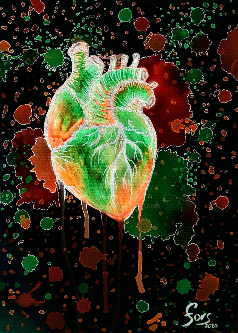
#heart #love #abstract #abstractart #falling #fallinginlove #humanheart #loveromance
Published: 2020-02-25 21:46:55 +0000 UTC; Views: 619; Favourites: 55; Downloads: 0
Redirect to original
Description
Done as an emotional piece in watercolors. Then got inverted in Krita and a completely different artwork was born.Also planning to upload the original later which took me about 3h.
Related content


Comments: 8

👍: 0 ⏩: 0

👍: 0 ⏩: 0

Hello there!
I'm from ProjectComment 's weekly commenting project and I'd like to give you some constructive feedback on your artwork.
I'm saying right off the bat that I really like your artwork. One of my very first digital artworks was a heart like this but obviously your version is much better than mine was ^v^
Anyway, what's most interesting about this to me has to be the very striking colours and the intense contrast of warmth and brightness. There's something so mesmerizing about the green, something off-worldly and the inverted values happen to look like the heart is translucent, like an emerald or green jelly.
As it intrigued me, I decided to invert it back to the original and it doesn't look half bad either. There were still some interesting colour variations going on but nothing like now. Regarding your artwork in its older state, I happen to note the lines don't quite match up. To have a true black colour for lines is never a good idea when working so intensely with colours. I recommend to use a very dark blue or purple so it doesn't stand out so much. But given that it looks excellent here, I can't really criticize you for it. Thematically, the biggest difference between the two is that the white, blue, purple image tries to be harmonic in its composition of colours while the black, orange, green, white version does everything not to 'function' in this harmonic way. You could probably call it rebellious but that's only my guess here.
The only real criticism I can give you here is that the lines (both black and white) do look very washed out and inconsequential. No doubt they serve to better dissect different areas of the heart but with so much colour variation going on, you don't really need these thick black/white lines. The only good looking aspect of them, in my opinion, are the outlines of the puddles outside the heart and the veins (and I excuse myself if the term wouldn't be anatomically correct, I would have used a neutral term from veins/arteries that just doesn't exist in the English language).
I suggest to try not to rely so much on these big lines as they flatten the image out and look - as mentioned before - inconsequential. The inverted effect of them does have a really nice look to it, I give you that but I reckon, you wouldn't want to invert all of your paintings from now on, right?
Again, this is a very nice looking artwork and one that attracts interest (at least mine). I don't know enough of watercolour to give you some tips about it but as of now, it looks very solid and the stains for the background are a nice filler to make it look more interesting. So for your future artworks, only try to slowly step back form using these fat lines and turn towards a more elegant way to paint.
I hope my feedback could help you and I wish you a good day!
👍: 0 ⏩: 0


No problem, keep it up.
👍: 0 ⏩: 0