HOME | DD
 fors-t — Autoportrait
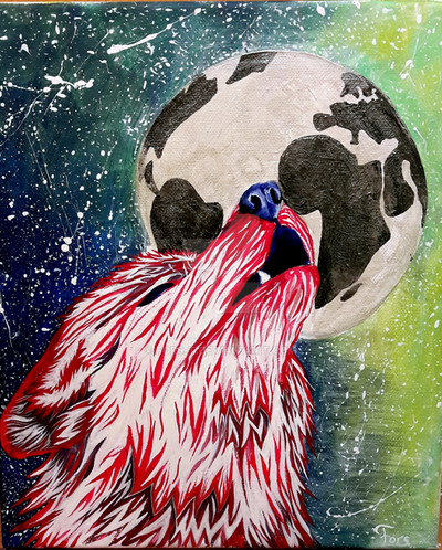
#abstract #blood #earth #howling #moon #painting #redwolf #stars #whitewolf #wolf #bloodywold #abstractart #acrylic #acrylicpainting #traditionalart #universe #howlingwolfdrawing
Published: 2016-12-31 20:54:28 +0000 UTC; Views: 532; Favourites: 39; Downloads: 0
Redirect to original
Description
Canvas, acrylic.Last painting of this year.
REF.
Got kinda inspired by Lucky978's tutorial
Related content


Comments: 9


Hi there,
I really think that picture has something. I already got caught by it in the preview. That's surely due to the eyecatching red colour. The drawing certainly makes me thoughtful. Due to the red, bloody looking colour of the wolf's fur and its wet looking appearance it somehow looks suffering. The globe in the back looks like our earth but without any colours at all as if it became like a moon itself!! Because you often see drawings with a wolf and a moon makes the earth even more look like the moon!! This makes you ask yourselves what happend to it and why is the wolf suffering or seemingly mourning over the earth that looks so extinct! It's very likely the humans that lived (?) on the earth are responsible for that!
Looking at the drawing from a techniqual perspective you have chosen the colours really well. The cool greenish bueish colours in the background help to make the red shine even more. I also love that you use different "techniqes" for background, the globe and the wolf. It makes the drawing so much more interesting. And I love how you splattered white everywhere to indicate stars (?).
I would maybe still add a bit more variety in colours when drawing the globe. They still can be the same ''dull" undertone but just to make it look a bit more interesting. But I also like it like that because its a good contrast to the background. So perhaps I would just add only a tiny bit more shading/colouring. I also don't like the horizontal strokes on the right bottom side. I would make them circling around the planet (like above). Or at least I would decide on either making the strokes straight or curving and apply it to the whole drawing.
I would let some hairs grow over the ear as on other parts of the wolfs head. I looked at your reference picture and there a only very little hairs on topo of the ears but there are some. I would perhaps add slightly more shading to the wolf. And the nose part looks slightley funny to me but I'm not sure what's wrong with it. I think the nose part is bend to much in direction of the viewer. It actually has to sit a bit more to the right/back. Looking at the reference picture now it should be a bit flatter and therefore wider too. But ir's a difficult angle and you did a great job already!
All in all a successfull piece that is satisfying to the eye and makes your brain thinking
Have a nice day
👍: 0 ⏩: 1

Thank you, thank you and thank you one more time for taking the time to comment 
I'm really glad that you like the ideas. I think you expressed the others really well. The moon-earth was one of the main ideas, I guess just a moon would look too dull but the continents make it look more interesting.
You're right. I wanted to indicate the stars. I'm really glad that you like my color choice! ^^ actually, the horizontal strokes are pretty much everywhere, also above the moon, but they are not that easy to spot. I'll try to make my strokes softer next time so they are not that eye catching - probably also because of colors, dark and bright.
I'm thinking about reworking this digitally - I'll definitely give the planet more shading ^^
You hit the right spot, nose was the hardest part for me ")
Thank you very much again for your kind words!
👍: 0 ⏩: 1
Ahh I see hope painting the drawing could help with the feeling
Ahh ok, well I guess the image is a bit too small ")
 (Wink)")
But that would be a good solution to make the strokes a bit smoother  (Smile)")
If you are doing so I'm looking forward to it!! But I think sometimes using traditional techninques makes the piece really special and can't be replaced totally by digital art. Especially when you can feel and see the paint on the canvas/paper.
Haha well it's a difficult angle and its not obviously wrong
You're welcome, sure
👍: 0 ⏩: 1
Actually it did help pretty much!
It is also harder to spot because there are darker colors mixed and also more stars
I am still not sure - I am planning to do so but.. you know, now I have a portrait I am drawing and I am not sure when I will finish it.
And thank you one more time!
👍: 0 ⏩: 0
