HOME | DD
 Fragilance — Surrounded!

#ghost #girl #oc #ocs #robots #originalart #originalcharacter #originalcharacters #photoshop #photoshoppainting #robot
Published: 2017-02-18 19:11:23 +0000 UTC; Views: 369; Favourites: 19; Downloads: 2
Redirect to original
Description
OC's used:fav.me/day1p0v
fav.me/dax29dl
+++++
In this picture I wanted to try using a thin outline instead of the thick outlines I usually do. So far, it turned out pretty good. Though I'm a bit iffy about how I made their shadow's project.
Related content


Comments: 10

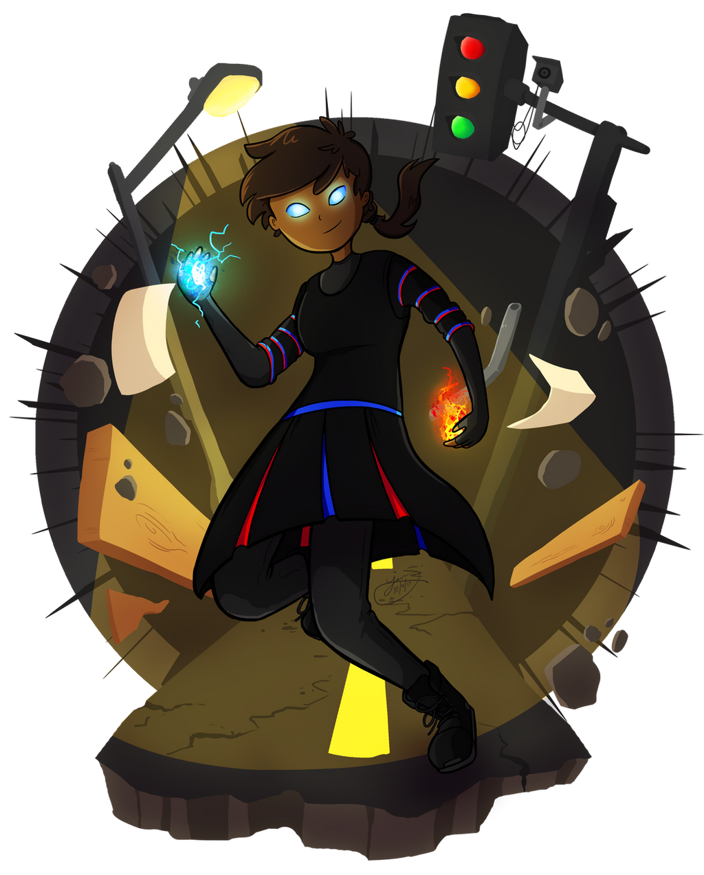
The thing that stands out the most about this piece is the atmosphere and general composition. The dark, unclear silhouettes and dull red eyes of the monsters emerging from the darkened background really gives an aura of menace that you pull off fantastically. The brightly coloured and clear main characters give a fantastic contrast and centers the action. The color pallet of the two also makes them stand out, but not so much that they would be jarring or out of place with the scene. The expressions of determination and posing really drives home both the stakes of the coming shadows, and shows a very cool, but subtle interaction between the two characters. Fantastic job all around.
A few points that you may want to consider in the future though. The proportions and posing seem a little off, especially Jennifer's right arm. Its a bit too long and stiff, especially when compared to the nice flowing cloth effect in her clothing. Her back as well is very stiff and doesn't show off that motion very well and looks very strained and mechanical. Her head doesn't really seem to fit properly with her shoulders, as it is a bit too forward. When you draw a character, especially in a dynamic pose, make sure to consider the neck. Jennifer's neck would be both very long and oddly angled the way it is positioned relative to the shoulders. The other main issue is the shading. While the shading is pretty good overall, there seems to be conflicting light sources between the shadows on the floor and on the main characters.
Another things this piece does really well are some of the more subtle details. I like that Jennifer's diamond-pattern is repeated on the background wall. Its a nice touch that ties the foreground and background together. It also leads a viewer to speculate a connection between the setting and the characters, and that there may be more going on that just a one shot-image. Very nice work on that. Maxwell's robot is pretty nicely drawn and the semi-transparent nature of his hologram is a nice touch, as is the gradual fading from top to bottom. All in all, a pretty nice picture. Keep up the good work!
Discovered via
👍: 0 ⏩: 1

Sorry for the late reply!
I appreciate that you have given a lot of in-depth points on where I succeeded and where I still need to make improvement, especially with the proportions and the general posing of the characters, such as Jennifer's right arm and her neck. I didn't even notice the inconsistencies between the shadows on the body and the floor until you mentioned it. I really need to pay more attention to both of these regarding the light source.
I'm happy you noticed the recurring theme of diamonds within the picture. I also used this theme as the background for the last picture I made before this one. With these kind of pictures, I like to create a connecting story between them.
Anyways, thank you for the critique! I'm glad that the picture came though when it comes to the general feel of it. As noted, I will try to improve on drawing people more naturally with proper proportions (especially when it comes to more dynamic angles and poses!).
 (Wink)")
👍: 0 ⏩: 0

Really awesome picture—it has a full, intense atmosphere and compelling characters that are so much more than generic, clearly having a story that's waiting to be told!
I love the flow of Jennifer's trench coat and definitely how you paid attention to how the diamonds would be resized and cut off on some parts—that's not something everyone would do! The expressions are also perfect, they seem to be calculating their way out of a seemingly impossible situation. You've also added the wrinkles in their clothing, making this even more dynamic as the clothes twist the way the characters are. The shadows which you were slightly concerned about look perfect to me; they're elongated at just the right angle to match their poses, which, if I haven't already said, have perspective perfection (and/or symmetric sensation, whichever one is less cheesy, haha) and add much to the atmosphere of this tension-filled situation.
Now, on the topic of poses, there are a few things I'd like to point out. You've already heard about the transparency of Maxwell, and how being slightly more see-through would make him look more like a hologram. Also, Jennifer's left foot—it's facing directly sideways, which looks a little off and is actually a near physical impossibility for most people in that pose. The heel would be what's mostly visible, but that's a teensy thing to notice, similar to how her left hand's pinky is a bit too long compared to her other fingers. I know there's that perspective going on, but usually the finger's keep their respective size ratios regardless the pose, but her right hand is looking swell ")
Of course, you've got a gallery full of lovely art and characters that hint at amazing stories, so keep doing what you do, and whether I was of any help for future drawings or not, I wish you the loveliest of days!
👍: 0 ⏩: 1
Thank you for commenting, and sorry for the late reply!
I'm glad you liked the general feel of the picture. I wanted it to really portray a sense of danger, so I happy that feeling really shines the most! The coat was the part I really enjoyed working on
Also, thank you for mentioning the anatomy mistakes relating to posing, even if they were minor. I don't want her left foot to look too awkward. I did felt that there was something wrong with how Maxwell was positioned, and I didn't know what until you mentioned his arm.
Again thank you for your critique! I hope you have a great day as well!
👍: 0 ⏩: 0

I like the way you have staged the scene with a dynamic angle on the characters and stark shadows. It gives the scene a sense of danger and urgency. The girl especially is posed very well, with a dramatic flair to her coat. I also like the subtle glow of the hologram on the back of her jacket. It’s a detail some viewers might not notice, but I think having the glow enhances the feel of the lighting. The dark looming figures are defined enough to be ominous while still a mystery to the viewer, adding more tension to the scene. The colors and patterns work well together, with the diamond shapes on her coat and the background, and a cool-colored foreground contrasting with the reds behind.
For improvement, I think the hologram could be slightly more transparent. I can see a very faint shape of the diamonds behind the projection, but it is a bit too subtle for me. This makes the figure look very solid. Both characters also appear to be looking too far up to be staring at the shadow figures. I think this could be helped with either staggering the heights of the figures in the background a bit more to make the ones on the side of the image appear clearly larger (and closer to the viewer), or lower the pupils on the characters just a bit. Overall I think the poses of the characters are well-designed and effective, except for the woman’s right arm. I think the hand is at an unnatural angle from her wrist.
I hope I could be of some help. I like your character designs, and I am intrigued to know more about the story behind them.
👍: 0 ⏩: 1
Sorry for the late reply!
I'm happy that you liked the designs within the picture, especially the coat and the details that are focused around it. Personally its my favorite part of the picture!
For the hologram, I was worried that if he was fully transparent, he would be harder to see. I do agree that he should be more transparent, as you said, he looks too opaque! As for the wrist, I did have a hard time drawing it without it looking too awkward. I really need to practice how to draw people in proper angles.
Anyways, thank you for your critique! Without your comment, I would have never gotten any of these suggestions, especially with the eyes.
👍: 0 ⏩: 1
No problem! I see what you mean about not wanting him to be too hard to see. There is definitely a balance to the transparency of his design. Practice is definitely the key for perspective drawing. It can be tricky.
You're welcome  (Smile)")
👍: 0 ⏩: 0

Given the direction and intensity of the light source, I think you made the shadows project almost perfectly. (I don't think a hologram would cast a shadow, though. Aren't they just light-based projections?)
I also really like the dynamic poses. This looks like it could go into a 360 degree animation! Overall very well done.
👍: 0 ⏩: 1
Thank you for your kind response! :3
The shadows were supposed to only project the lady and the robot. If it does look like the shadow is also projecting the hologram, then its an error on my behalf. (And yep, holograms are mostly light projections
I'm happy you liked the poses! I'm still practicing on drawing really dynamic stuff, and with more action in the scenes.
Again, thank you for commenting!
(Love your profile pic btw!)
👍: 0 ⏩: 1
You're more than welcome! It's always nice to see some action-packed art like this.
(Dance on, my Frisk.
Dance on.)
👍: 0 ⏩: 0