HOME | DD
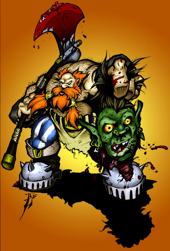
 GH-MoNGo — Battle of Nettlebranch Hill

Published: 2008-10-01 15:31:08 +0000 UTC; Views: 5915; Favourites: 105; Downloads: 0
Redirect to original
Description
First off I have to thank *ScottPurdy for giving me a lot of pointers about how to approach this painting. It was definitely a challenge for me.When I went to the VCU Graphics Lab to have the original drawing scanned, the manager really liked it and told me that he wanted to see it when it was finished. When I showed it to him today, he said it was "awesome". He's a big fantasy fan himself.
For the original concept I wanted to really emphasize the contrast between the orcs and the gnolls (which is why the orcs are all clean-shaven). I was also aiming to make the whole scene bloody and brutal, but without muddying the composition. It was difficult to gauge the values on the spatters since Naphthamide Maroon (PR171) and Perylene Maroon (PR179) have such significant drying shifts (they dry a lot lighter than they appear when wet).
Ink, watercolour, casein on Twinrocker 200 lb. CP Watercolour Paper.
Related content


Comments: 195

Excellent work - I suspect a little more motion here and there (blood spray etc) would have looked great but it's still a really great piece of fantasy artwork.
👍: 0 ⏩: 1

Thanks a bunch!
I see your point, but I thought any more blood flying around would muddy the composition.
👍: 0 ⏩: 1
It's always a risk - though a brighter red might help and you really would only need a few carefully placed spots of spray.
👍: 0 ⏩: 0

This is the kind of thing I wish was in history textbooks.
👍: 0 ⏩: 1


Amazing painting, great characterization and great action combined!
👍: 0 ⏩: 1
Thanks a bunch, glad you like it!
👍: 0 ⏩: 0

Excellent work Darrenn! I wasn't expecting you to get this done so quickly!  (Smile)")
Cheers for the nod, although it's not necessary, anytime mister
 (Wink)")
👍: 0 ⏩: 1
Thanks a bunch, man!
To be honest, I was hoping I could get it finished quicker.

👍: 0 ⏩: 1
I promise the next one will go a lot quicker!

👍: 0 ⏩: 1
Stop talking! Paint, paint, paint!!!
👍: 0 ⏩: 0

pretty damn nice! all the light & shadows look great and the backround looks nice too. If I have to give critique I'd say the image looks a bit too static even though there's loads of stuff going on
👍: 0 ⏩: 1
Thanks!
Yeah I'm still trying to loosen my figures up. Thanks for your thoughts!
👍: 0 ⏩: 0

Nice control of value on this one..
Your certainly gaining great skill with the brushes!
Nice complexity to the comp
👍: 0 ⏩: 1
well deserved.. your really starting to gain ground ..
👍: 0 ⏩: 0

I'll make sure to get that down for you!
👍: 0 ⏩: 0

I really dig the muted color scheme on this; it works really well.
👍: 0 ⏩: 1

Need I say that it is awesome? Seems many people have beaten me to that fact already.
Anyways great work as always.
👍: 0 ⏩: 1
Thanks a bunch!
Your opinions are always welcome, even if others have already shared their views and they happen to share the same ones as you.
👍: 0 ⏩: 0


great work indeed! the poses are dynamic, the picture and amount of work is epic. that's great. considering it's a traditional art you have my full respect here. that's the way of a jedi. kudos!
but let me grumble a little, will you? the only thing that bothers me here is composition i guess (i'm far from being a pro at that and i don't know what educational goals you had while painting, so don't take it too serious). first of, if you desaturate your picture you will find out that there's one plane and that's kinda boring, 'cos you have characters that a bit farther and a bit nearer, but they all have a same amount of contrast and detail, and that's flatterns overall image. and the second is - the centre of composition seems to be this bloody sword sticking out of orc's back and, well, i'm not sure i'ts the most interesting part of the picture. i mean, bloody hell, you succeded in so many great expressions on that brutal mugs, you have a plenty of great action going on, but my eyes are stuck on almost empty part of picture, 'cos it's red and that's the point where two diagonals collide.
anyway, the quality is on par with hammersnow, and that's the one i was impressed, so it looks like you leveled up and no accident here. congrats, man! keep 'em coming.
👍: 0 ⏩: 1
Thanks a lot man!
Yeah, I admit I have a tendency to de-saturate my figures. It's something I have to work on. I tried to put a bit more emphasis on the gnoll with the spear coming out of his back.
👍: 0 ⏩: 0

Hey!!! Great job!! You've created a great sense of action in this!! *Ahem* I'm a bit of a fan when it comes to goryness so this is an instant fave for me!! Nice work!!
👍: 0 ⏩: 1
Thanks a bunch, glad you like it!
👍: 0 ⏩: 0

Nice action piece, I love that there is so much going on and a lot to look at. The muted colour scheme also works well in conveying that it's a bloody, brutal battle.
I'll try and offer some crit as you have asked for it - I think maybe there could be a little more contrast in the background and shading. Also, the sword sticking through the guy's back sits a little awkwardly with the wolfman holding the sword at the back - it looks like it's going into his hand, if you know what I mean. Hope that helps
👍: 0 ⏩: 1
I see what you mean, thanks for pointing it out!
Glad you like it!
👍: 0 ⏩: 0

Amazing! Putting so many characters into one scene is so tough, and I think you've handled it brilliantly. I've already seen an improvement in your art just in the time I've been watching you. I really see big things for you in the future!
👍: 0 ⏩: 1


Nice action piece. ")
I feel that you handled the painting of the blood especially well.

👍: 0 ⏩: 1
Thanks a bunch!
It took about two weeks of painting to finish the whole thing.
👍: 0 ⏩: 0

This looks good, but is it really a "painting" when you're filling in inked outlines?
👍: 0 ⏩: 1
There's more paint on the paper than ink.
👍: 0 ⏩: 0

hmm somehow I dont think I should join this battle....either way I am really amazed at your artwork. mine is like something a 7 year old would draw for the fridge compared to you're work!!
👍: 0 ⏩: 1
Yeah you'd be torn to pieces.
Aww, thanks!

👍: 0 ⏩: 1
torn to pieces? wow ...what is this war about?
👍: 0 ⏩: 1
The orcs called the gnolls smelly, and the gnolls called the orcs stupid. That's one way to start a war.
👍: 0 ⏩: 1
wow that is like... the heroes calling Dr. cube a pimple faced plastic surgeon. you just don't do that... ok I'll stop.. I am probably scaring you with my kaiju big battel love.
👍: 0 ⏩: 0


Really like the tones and lights on this one man! Great piece
👍: 0 ⏩: 1

Very nice, great details in the skin especially, and I think you got the contrast right.

👍: 0 ⏩: 1
Thanks a bunch, man!
Getting the skin right was one of the harder parts, glad I got it down well.
👍: 0 ⏩: 0
| Next =>