HOME | DD
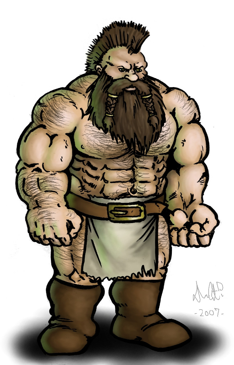
 GH-MoNGo — Bonesnapper

Published: 2009-02-22 21:17:40 +0000 UTC; Views: 1794; Favourites: 29; Downloads: 0
Redirect to original
Description
I was feeling blue.Acrylic on illustration board
Related content


Comments: 71

heh, dolph lundgren look-a-like contest winner '09

👍: 0 ⏩: 1


 (Smile)")

Excellent work - nice contrast between the colours.
👍: 0 ⏩: 1


")

Thanks bro!
I'd say he was more "plotting" than "brooding"... plotting whose neck to crack in two!
👍: 0 ⏩: 1

wow, here in the Philippies we called it 'Kapre'
👍: 0 ⏩: 1

As everyone else has already said I really like the extreme lighting effect you've used; the artwork deffinatly resinates the dark mood of the ogre. Also, I like the hair; it has texture and detail, good job
👍: 0 ⏩: 1


Say word? You seriously thought "RIPPER will like this!" amongst other deviants no doubt.
👍: 0 ⏩: 0


I am really liking how you're developing a rich style with this particular medium on support. I'm thinking this may be your strongest technique in your repertoire. Regardless of which medium you prefer, I'm looking forward to more of your works.
👍: 0 ⏩: 0

I wish I could paint ")
👍: 0 ⏩: 1

I think it's cool beans and all, but have a question. Do you paint your pictures with the scanning process in mind? I have found that every scanner I use to upload art lightens my hues and even bleaches out some. This has driven me to consider darkening my paints just so that it comes across well online. Normally I would say screw the computers interpretation, but, I need the computer to develop my comic book. So, any and all hints and tips from you would be much appreciated.
Oh, and cool beans.
Your work continues to rock.
👍: 0 ⏩: 1
Thanks!
I paint to look good in person. If I need to adjust the picture in Photoshop after scanning (which I rarely have to do since I got a good scanner), that's what I do to make it more consistent with the real product.
👍: 0 ⏩: 1
Ah, I guess I'm like the fly who is born and dies on a rainy day. Rain is all I've known. So I've only known bad scanners, I must change that. Thanks for directing my hunt, bro.

👍: 0 ⏩: 0

Looking good mate. I still think you could do with more contrast though
")
👍: 0 ⏩: 1
You and your contrast.
Thanks!
")
👍: 0 ⏩: 1

The musculature is great, I'd work on the ear. It looks like the skin has grown over a lot of it. Then again I don't know if that's intentional....
👍: 0 ⏩: 1
The opening to the ear is further down than it is portrayed in the picture.
👍: 0 ⏩: 1
Ah.
Yes, that was intentional. All my ogres have that. (See The Wrecking Crew .)
👍: 0 ⏩: 1

Nice contrast of color! Really makes him stand out.
")
👍: 0 ⏩: 1
Thanks!
He'd be too big to hide anywhere.

👍: 0 ⏩: 1


wow he looks awesome in acrylic....so much more alive, and a dash of je ne sais pas. the light and shade make him more 3d, and his focused on something..... 

👍: 0 ⏩: 1
Thanks!
I'm really starting to like acrylics.
👍: 0 ⏩: 1
awesome, remember, NEVER give in to oils....
👍: 0 ⏩: 0

It looks like a close up scene from a movie about a guy who kills everyone who ever pissed him off in his life. And in this scene he is standing over the flaming remains of some poor moop and day dreaming about his next victim.
Cool use of colors. No pun intended.
I especially like the sharp contrast. It looks like I could crawl right into the page and inside his ear to hide from something chasing me... and then provide the persistent, pursuassive inner voice that commands a big badass like him to go crush said threat.
👍: 0 ⏩: 1
Thanks!
Haha, now there's an idea! Mind control on an ogre! That would be a scary thought!
👍: 0 ⏩: 0

haha nice painting
Love the expression and the manage of lighting
👍: 0 ⏩: 1

Love the blue tint to the lighting. Well done.
👍: 0 ⏩: 1

Sometimes the old tricks are the best: A low placed source of light to make the face look more scary. Well done.
👍: 0 ⏩: 1
| Next =>