HOME | DD
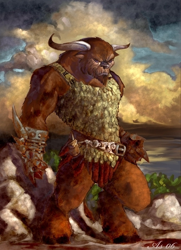
 GH-MoNGo — Angry Minotaur

Published: 2009-02-16 00:56:31 +0000 UTC; Views: 1868; Favourites: 38; Downloads: 0
Redirect to original
Description
*ScottPurdy : "Hey Darrenn you need to make your darks darker."Me: "Okay."
*DKuang : "Hey Darrenn you need to make your highlights stand out more."
Me: "Okay."
Acrylic on Illustration Board.
Related content


Comments: 87


Damn he's so angry, he's filling me up with rage too! 
👍: 0 ⏩: 1


Hmmm...
Settings:
Highlights: -10
Halftones: -6
Darktones: 0
[OK]
XDD
👍: 0 ⏩: 1

Darker darks plus highlightier ("Is that a word? It is now!") highlights equal one strikingly groovesome image.
I love your paintings - they somehow manage to look grittily realistic and energetically toony at the same time, and it's a winning combination. I ocassionally wonder if I should have a go at painting something again at some point (it's been more than l decade since I last picked up a paintbrush, not counting the time I helped to decorate the bathroom), but then look at the teetering mound of Other Arty Stuff That Really Needs To Get Finished Quite Urgently and go and have a soothing cup of tea instead.
But anyway. Great work, fella!
👍: 0 ⏩: 1

Thanks big guy, I appreciate it!
Sure, you should give it a try, when you do have some time to spare.
👍: 0 ⏩: 0

Hey Darrenn you need to make your browns browner :q
Lol... The ruggedness and strokes add a good sense of roughness to this fella. His Manliness is off the charts! :0
👍: 0 ⏩: 1
")
Holy poo, mine only goes up to +20 D:
👍: 0 ⏩: 0

Great contrasts, it does pop more this way. Your work is taking on a more organic feel to me. You lines are looser in a good way, like your becoming more and more comfortable with your medium. As always, i'm impressed. Great job, bro.
👍: 0 ⏩: 1


The darks and lights thing is true. There is a place for subtlety, but in two dimensional representations it is almost always good to push the envelope a bit on contrast.
I remember the time I was doing a jack-o-lantern in pastels and my teacher told me to add some blue into the shadows. I was amazed at the results. The contrast of the piece stood out so much more, and the thing looked more real than ever.
Darker darks and lighter lights really shine in digital representation too. Something happens when things are transfered to digital media (or initially created in it). They just really pop with higher contrast. I don't color often, but I've noticed an amazing improvement once I started using exagerated highlights and shadows.
All of that aside, the thing I really like about this is combination of emotion and mass. You can really see something happening in the beast's expression. Also, I dig the background blend.
👍: 0 ⏩: 1
Thanks man. I've been working towards pushing for more contrast in my work, and I guess it's finally starting to show.
👍: 0 ⏩: 0

Mongox, makes your darks darker and your lights brighter, all the whole removing those pesky bloodstains!
👍: 0 ⏩: 1

")

nice I like the expression on his face! experimenting with contrast is always good
👍: 0 ⏩: 1

 (Wink)")

great work, what can I say. However, I'm sure he has alot to say
👍: 0 ⏩: 1
He'd probably say something like "RAWR IM GONNA KILL YOU!!!".
")
👍: 0 ⏩: 1


Those highlights still need to pop a fair bit more imo
Hey Darrenn, mind if I do a quick paint over for you on this one?
👍: 0 ⏩: 1
Sent to your inbox.. I've rushed it, so if you have any questions, etc, give me a shout
👍: 0 ⏩: 1
I'll check it out when my campus network isn't so sluggish.
👍: 0 ⏩: 0


No problem dude
I'm just one of the devoted fans
👍: 0 ⏩: 0

nice expression (:
i can visualize him making a rampage in a city
good work
👍: 0 ⏩: 1

I'm loving the dark texture here. It compliments the minotaur's... angriness?
I think I like the highlights on his horns most of all. Great job there =] I think the other highlighted areas could've been blended in a little more smoothly (or maybe use a smaller brush). It almost looks like you highlighted just to highlight in some areas (his snout, for instance) The shadowing looks well blended and fantastic, however.
Kudos on his expression. I've noticed that you do expressions particularly well  (Smile)")
👍: 0 ⏩: 1
Thanks a bunch!
Yeah, I admit I might have overdone some of the highlights.
👍: 0 ⏩: 1

He'd probably crush anyone he hugged.
👍: 0 ⏩: 1
")

Hooray darks and hilights! Even if they do make the minotaur angry
👍: 0 ⏩: 1
He'd be angry even without them.
👍: 0 ⏩: 0

Well contrasts are good for that dramatic effect. He certanly looks like he have issues. Quality as always.
👍: 0 ⏩: 1
| Next =>