HOME | DD
 invent-a-shell — Oops

Published: 2006-12-05 01:28:15 +0000 UTC; Views: 1358; Favourites: 26; Downloads: 27
Redirect to original
Description
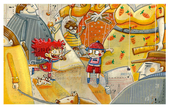
Retro 60's / 70's colours in acrylics.Related content
Comments: 18

... are all wonky!
👍: 0 ⏩: 0

Bleugh. I am drunk and more tired than i've been in a long, long while.
👍: 0 ⏩: 1

Hey, awesome. 
👍: 0 ⏩: 0

I have to agree with the Triplets of Bellville comment.
Love the style! And colours.
👍: 0 ⏩: 1

Oooh, my favourite one so far. How on earth did you get the oranges all stripey like the background, out of curiousity?
The only bit I didn't like was the lady on the right - her dress is so similar in colour to the brown on the orange box that to begin with all I saw was a disembodied arm... maybe her dress should be pale leaf green or something like that?
Anyway, this is the rock, antface. I marvel at your skills. *marvel!*
👍: 0 ⏩: 1

Thankees for comment! It should be dark viridian green, not leaf green, but yeah, you right. Oh wells. It was only a quick editorial piece neways... no point in changing it really...
👍: 0 ⏩: 0

I like everything except the background as it should be less textured and flat than the subjects themselves. Seems to be lack of depths here...
👍: 0 ⏩: 1

Thanks for the critique! ^__^ Feel free to do the same to my other works... i'm just not bothered to change 'em all to "Encourage Advanced Critique".
However, I think for this particular piece, I wasn't really aiming for depth: if I wanted that, then I would have added shadows, and as you say made the background in flatter colour, or more likely make a perspective supermarket landscape... however, partly due to the small amount of time you are given for magazine editorials (1 day max normally, maybe 1.5 or 2 for multiple illustrations) i'm trying to develop a style more based on pattern and mark-making, so I think it's okay for characters to look as if they're floating in space.
👍: 0 ⏩: 0

i like this one very much!
the kid reminds me of "The triplets of Belleville" cartoon movie ([link] )
have you seen it?
👍: 0 ⏩: 1

Weeeiiirrrrrd... I mean, yes I have seen it, but I, and everyone else it the UK, know it as "Belleville Rendevous". O_o
It's SUCH an amazing film with such amusingly animated characters... heehee. The mouse-man makes me giggle! ^o^ I saw a slightly shorter film once, made by the same director - animator guy, where a park-warden dresses up as a pigeon in order to get food... yeh... the plot is kinda weird, and it's properly scary at times. Wish I could remember the name... will try and find out for ya!
Comparing my work to that is quite a compliment! Thanks!
👍: 0 ⏩: 0
