HOME | DD
 janvanlysebettens — Quicktut: glossy icons
Published: 2008-03-28 15:23:38 +0000 UTC; Views: 2700; Favourites: 33; Downloads: 122
Redirect to original
Description
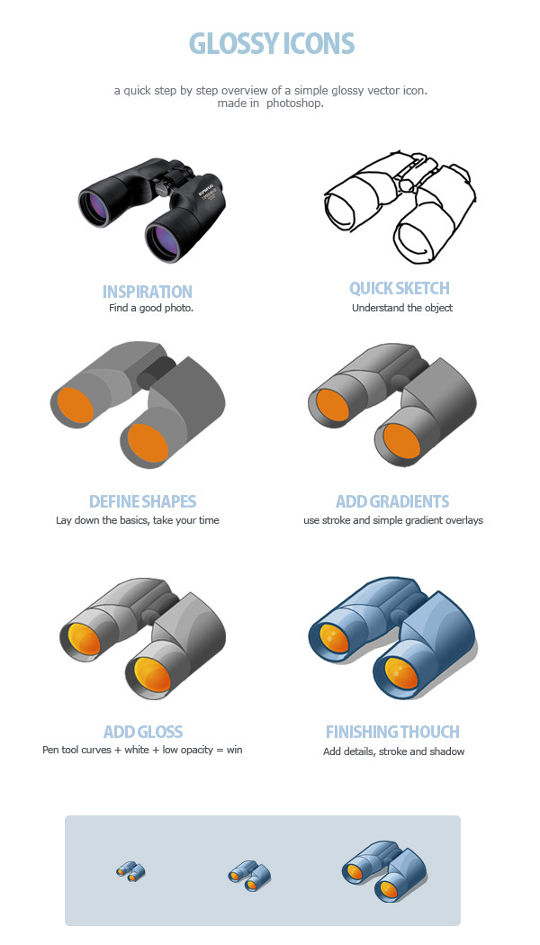
A Quick tutorial:Just an overview of the steps I go through when making an icon.
icon made for depthskins design studio , don't use.
Related content
Comments: 32

Don't know, it should be more like the original photo and don't think it's that 'glossy' imo. Though, fun for a simple icon.
👍: 0 ⏩: 1

why should it look more like the original photo ?
👍: 0 ⏩: 1

Because you could make it more glossy than.
👍: 0 ⏩: 1

Use of colors, now it are all very light colors. If it was more black you could create more contrast by adding white glows are something.
👍: 0 ⏩: 1

Quick but quite self-explanatory tutorial to me.
👍: 0 ⏩: 0

Looks awesome at the intended target resolutions. 
👍: 0 ⏩: 1

yeah I noticed... the real icons aren't cropped though...
( and what's with the anger mood ? 
👍: 0 ⏩: 1

Whoops... I was buggering about with the mood menu cause I was bored. You know I never use moods.
👍: 0 ⏩: 1

I know you don't.. that's why I was so surprised
👍: 0 ⏩: 0

great tut! I like it, thank you for this overview...
👍: 0 ⏩: 0

some private ones, yes
👍: 0 ⏩: 0

Sweet.. XD
Perhaps you could also add some more to it.. such as shines, burn and dodge to it. It'd look awesome that way.. To make it more realistic/tit0-ish.
👍: 0 ⏩: 1

yeah, thing is that these icons where only needed in 32x32 and 48x48 px versions.. so adding that much detail would be a waste of time I think..
👍: 0 ⏩: 0

Not really a tut... but if you look that way it can be lots easyer^^... thanks for the idea!
👍: 0 ⏩: 0

