HOME | DD
 JeffGraham-Art — Syaf Hulk-Wolverine - inks

Published: 2013-07-21 01:42:41 +0000 UTC; Views: 7017; Favourites: 138; Downloads: 130
Redirect to original
Description
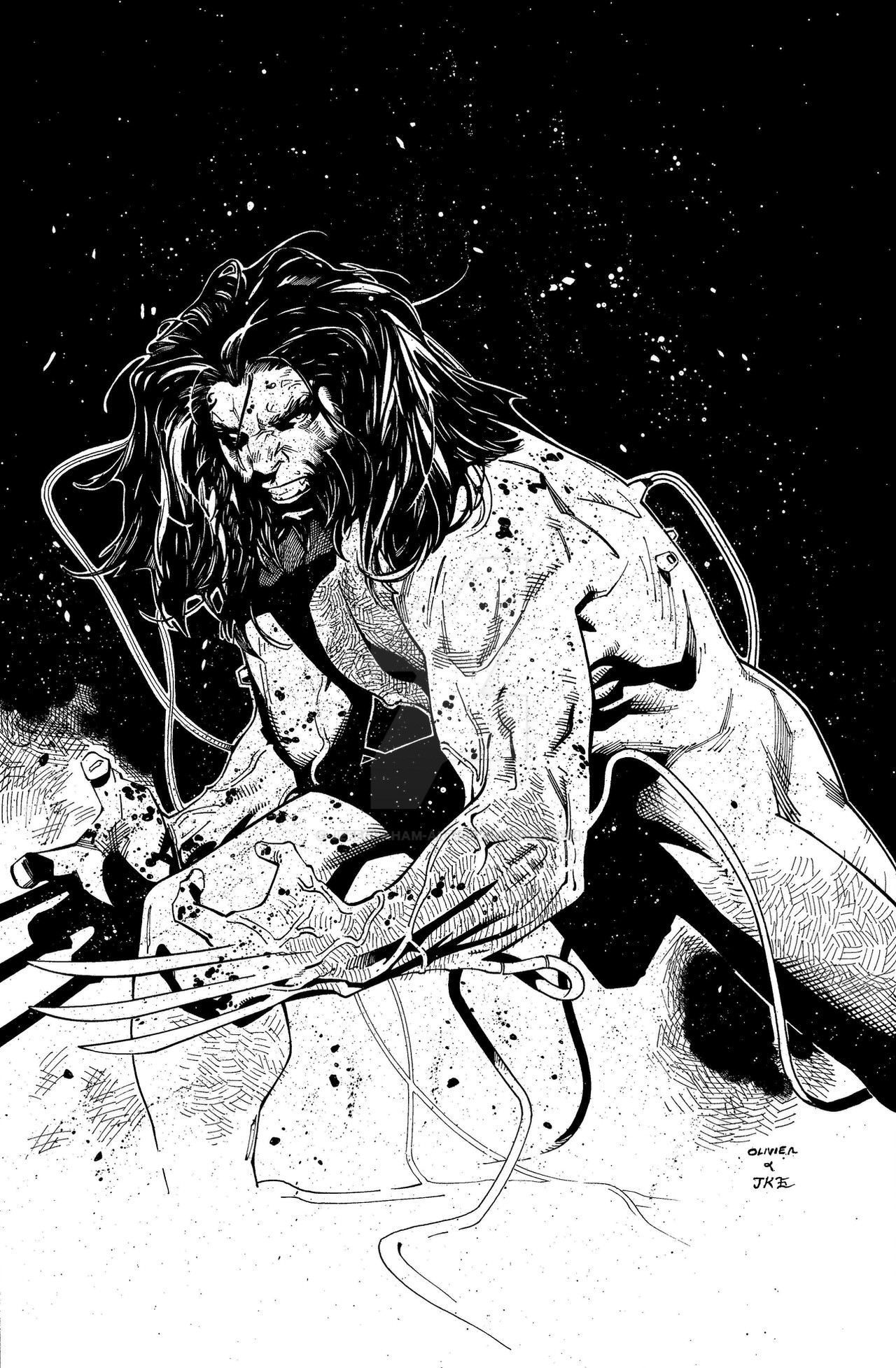
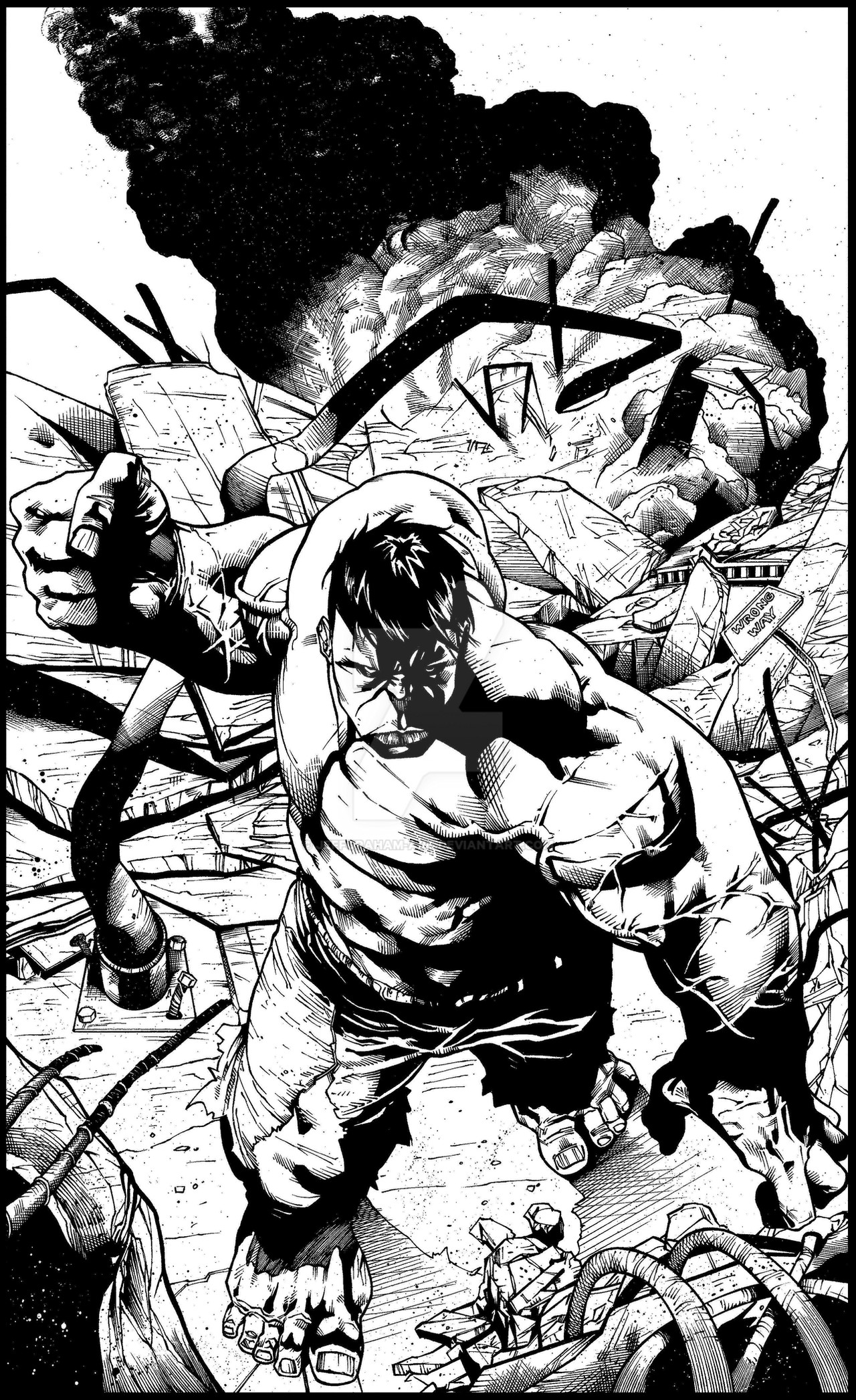
An awesome penciled piece posted by Ardian Syaf; the amount of detail & line work is phenomenal!!Pencils:
Inks:
Cheers,
J
Related content


Comments: 33

 (Smile)")


If you'd like to check it out, I posted my colors of this here electric-eccentric.deviantart.…
👍: 0 ⏩: 1

Checked it out, and am watchin' ya now! Very nice job!!
👍: 0 ⏩: 1


Thanks & thanks for the fav!!
👍: 0 ⏩: 1


What is the primary center of interest? is it the hulk's fist smashing earth? No. Is it the hulk's fist in the air? No. Is it Wolverine's torso rising into the sky? No. (secondary CI, yes.) So, why are these areas described with high contrast? And where, in the remaining filed of gray is the primary CI - and why isn't it the area of highest contrast?
My opinion: the PCI is the Hulk's face. The detail turning it gray should be eliminated. His matching gray hair should be turned solid black to frame the face and, along with shade and cast shadow below the head, create the contrast that is missing so that this head stands out.
Very difficult to speak up when the art has so much going for it by our (comic book illustration) standards. Still, let's not lose sight of the forest for the trees.
👍: 0 ⏩: 1
This was a tough piece; in hindsight (as seems to be my way) I agree, Hulk's face should be the PCI. I should have done something to bring that out a bit more; you tend to lose it with all the linework.
👍: 0 ⏩: 1
Once you see it, even in hindsight, the hard part's done. But seeing it . . . ah! There's the rub!
The penciler's technique and drawing skill can completely wrap you up. It's like looking at a pretty girl and going all goofy. But looks aren't everything. What kind of person is she? What can she do with that dynamite body? Is it just so much silicon and plastic surgery? Or is it the body of a trained athlete. Most important - can she dance?
For now, the colorist will fix it. But after enough hindsight, you'll get the knack of looking ahead, so the inks will stand on their own as completed compositions.
👍: 0 ⏩: 1
Looking quickly at a thumbnail, I think solid black for the hair - less highlights - would draw you in to Hulk's face a little more.
👍: 0 ⏩: 1
I may not always be right, but I'm never wrong, eh? Hehe.

Thumbnail for analysis and troubleshooting is good. And thumbnails to plan from the start save a lot of time and effort. But for maximum benefit they should test the tonal scheme as well as placements of figures, perspective and such. Tonal scheme is the single most important element of composition, especially for black and white art.
👍: 0 ⏩: 0


Nice! You got a lot of details in there man, Great inks!
👍: 0 ⏩: 1
Thanks man!! It was a fun piece to tackle!
👍: 0 ⏩: 0

Thank you. Very kind words!
👍: 0 ⏩: 0

Wow, this is sick! I liked the pencils when i first saw them. You did an awesome job right here. Thumbs up.
👍: 0 ⏩: 1

Great work on this pic man. I checked the pencil and according to me you interpreted them in a good way
👍: 0 ⏩: 1
Thanks man!! I'll post a side by side in a couple of days for all to see!
👍: 0 ⏩: 0

The line work on this piece is just incredible no pun intended. Hulk Smash!
👍: 0 ⏩: 1
That's all Syaf!! I just interpret what he puts down!  (Wink)")
👍: 0 ⏩: 0