HOME | DD
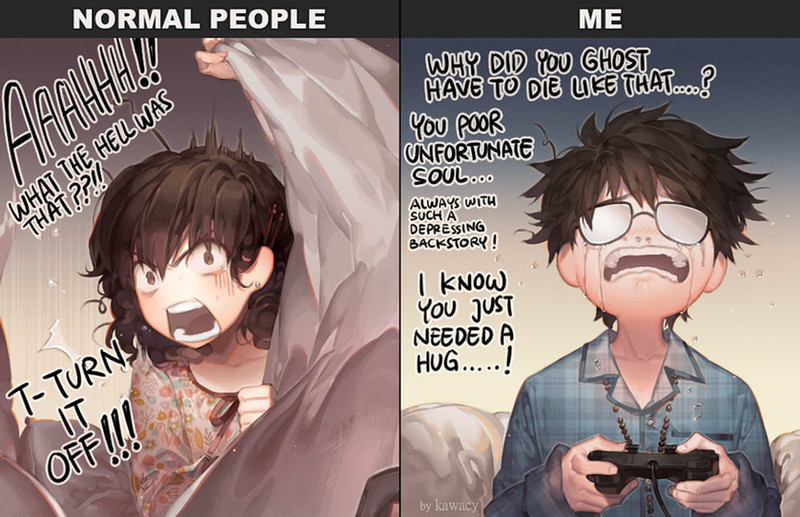
 kawacy — Normal vs my shading

#vs #difference #normal #shading #kawacy
Published: 2015-04-14 07:06:24 +0000 UTC; Views: 220435; Favourites: 10638; Downloads: 3368
Redirect to original
Description
my shading is nowhere near realistic but i do that on purpose, not aiming to be realistic
the normal version isn’t realistic either, it’s just it’s plain and i used to shade that way and the pics weren’t so lively
Related content


Comments: 387


Garrettsmash  He's referring to the way he shades, he's not claiming he owns the method, relax.
👍: 0 ⏩: 0

Yeah, 'cause you are the only one here hue shifting.
"My" shading, lol-
👍: 0 ⏩: 0


i love the shading on the apple it looks really real and the skin shading looks really good
👍: 0 ⏩: 0

By the way, don't get me wrong, your art is very strong. You have found your style and are expanding it, which is the way to go. But you already have hundreds of people telling you that, you don't need me to add to the noise.
👍: 0 ⏩: 0
I don't mean to be offensive, but what do you mean when you say "normal" shading? Figures and objects will look completely different in different shades of light. I could say your first apple is lit in the midday sun, and your second apple is caught in sunset. Its' more a matter of warm light and cold light in these instances.
To my understanding, there is no normal. Every artist finds a technique that works for them and they run with it. Those that do not have that experience must practice to get there.
I am by no means a professional but I am working as hard as I can to become one within a couple of years. Looking at fantastic ateliers like the Watts has really expanded my understanding of color and light.
👍: 0 ⏩: 3

You're completely right in that there is no "normal" but here, it seems the artist is using the term in reference to the local colour of the object and using shades that follow from the local colour along a linear line (as shown in the colour picker box by the arrow).
Otherwise, it's a simple illustration of how using a much wider variety of shades can make a picture more lively. There is a place for linear shading (I guess you could call it), but in these instances it does not serve the images in question.
👍: 0 ⏩: 0


i think by "normal" they meant they were basing off the local color of the object? instead of optical colors
👍: 0 ⏩: 0


wow is great!!! I will practice
👍: 0 ⏩: 0


Thats a great techinque,thanks man
👍: 0 ⏩: 0

I think yours makes the art have a more... mature feel to it. But that's just my opinion. I could be completely wrong.
👍: 0 ⏩: 0

")

well i got to say youre shading is way better it has a warmer feeling
👍: 0 ⏩: 0

I really like your style  (Smile)")
👍: 0 ⏩: 0

I honestly had no idea how to even do the "normal" shading displayed, so it seems best to start there and work my way toward complexity. Either way, thank you for the resource. Much appreciated.
👍: 0 ⏩: 0


Oh..It's look interesting. I like it! //sorry, my gramma skill it too poor.
👍: 0 ⏩: 0

this is interesting! im still barely past one color shading, so this is well beyond me.
👍: 0 ⏩: 0

this is actually a more realistic shading since in reality light sources always influence an object's color in some way. In reality nothing is usually just lighted by a single white light source
👍: 0 ⏩: 1


realistic is no fun anyway, we see enough relaism in our daily lives,
👍: 0 ⏩: 0

this just BLEW my mind. This solves all the problems I have with color theory oh my god
👍: 0 ⏩: 0

I enjoy your stylized shading. It has character.
👍: 0 ⏩: 0


This actually already exists, It's known as color theory and hue-shifting.
👍: 0 ⏩: 1

I like the concept, mind if I give it a try in one of my next drawings?
👍: 0 ⏩: 0

to be fair, while your shading isn't realistic (as you said), it is more realistic than the flat plain shading most people use. (unless the motif is lit by only one pure white light which is extremely unlikely and terribly boring)
👍: 0 ⏩: 0


Reminds me of colour grading in movies. It's the easiest way to make something look cinematic: Highlights tinted red, Shadows blue. Many blockbuster movies do it
 (Wink)")
👍: 0 ⏩: 0

You're shading actually goes closer to reality, reality isn't as near monochrome as a lot of people do. Shadows are almost never just a darker shade, they are a somewhat different color, or a different color completly. I'm just saying this cos you're saying you're not aiming to be realistic, but you really are more real
👍: 0 ⏩: 0

I don't think there's anything wrong with your choice of colors! It's actually more beautiful your way. Lively! ♥
👍: 0 ⏩: 0


It so interesting and fantastic!
I'm loving it!!!!
👍: 0 ⏩: 0

WHOA! So nice! thanks for that tip! I never thought of changing the hue to add shadow and lighting, I shall try this.
👍: 0 ⏩: 0


I read in a How-To-Draw-Manga book that it is incorrect to darken the original color to shade. The correct way is to pick a different hue color to shade and add interest.
What I'm saying is, I really like your shading the most! XDDD
👍: 0 ⏩: 0


<= Prev | | Next =>