HOME | DD
 kefkafloyd — Lyra Heartstrings Color Guide

Published: 2012-05-05 20:48:33 +0000 UTC; Views: 26158; Favourites: 213; Downloads: 2831
Redirect to original
Description
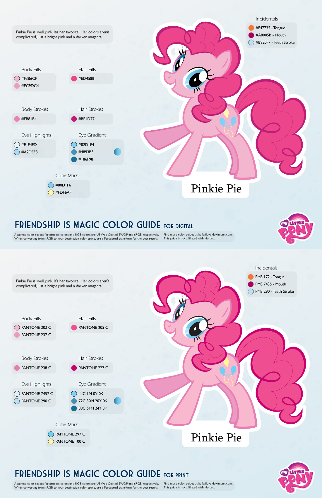
New and improved!All of the color guides are getting a revamp. The guides are all now two pages, one for digital applications (such as vectors, painting in Photoshop, 3D modeling, etc) and the other for print applications (customs, merch, T-shirts, et cetera). The PNG preview for the digital guide should be OK to use as well, so the PDF is optional.
If you use Google Chrome or Safari, they will attempt to open the file in-line with Google Docs PDF viewer. DO NOT EYEDROP THOSE COLORS. SAVE THE PDF FILE. The Google Docs viewer displays in a very low bit depth that results in dithering of the colors. Until Deviantart gives me a way to disable this, you should use the download file link to view the guide!
They are also now more space efficient, and will be able to scale better with ponies that have more colors than normal.
The Digital guides aim to be as close to the show as possible, while the print guides aim to be as close to official merch as possible. When there's no merch of that pony (e.g. background ponies) then the print colors will be based on my conversions which will aim to reproduce the show without looking too weird or have obvious gamut problems.
It is safe to eyedrop the digital colors or use the hex/RGB codes - the swatches should match up just fine. Just make sure you're working in sRGB color mode.
For the merch guides, the spot colors are rendered using CMYK alternate color space. This is based on my own examinations of the merch boxes, where the spot colors are simulated straight to process anyway.
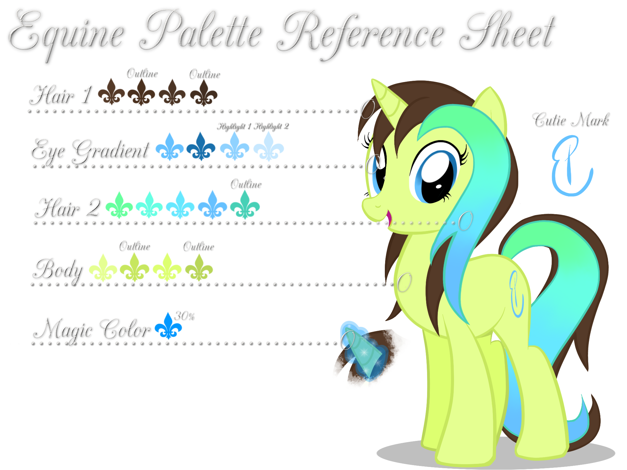
A note about Lyra: As one of the background ponies, her colors were designed primarily with TV in mind. Her normal colors are generally unprintable in standard four color process gamuts. You might make out better with eight-color printers (e.g. the newer Epson wide formats) but since I haven't tested that, I can't tell you for certain. You've been warned.
The vector image used in this guide was provided by
Related content


Comments: 12


 (Smile)")


Oh, thanks for the guides, they're really neat! At the risk of exposing my ignorance, though - how come the colors are so markedly different for screen and print use? (Lyra's coat in this one is the most extreme example of that I've seen.)
👍: 0 ⏩: 1

Lyra's green is impossible to render in standard four color process. Inks on paper just can't produce something that bright.
You can get closer by using a spot color but even proper pantones don't have something that bright. It's just the nature of how light produced from a source behaves versus one reflected off a pigment.
👍: 0 ⏩: 1
Ah, I see. Thanks for the explanation!
👍: 0 ⏩: 0


Thanks! It helped me draw a correctly colored Lyra! [link]
👍: 0 ⏩: 0

Amazing, but we need a Bon Bon one as well...
👍: 0 ⏩: 0

Perfect, absolutely perfect. Exactly what I needed for my design. Thank you!
👍: 0 ⏩: 0