HOME | DD
 lantairvlea — How I Use Colored Pencils-P6

Published: 2006-08-23 16:30:03 +0000 UTC; Views: 11367; Favourites: 110; Downloads: 134
Redirect to original
Description
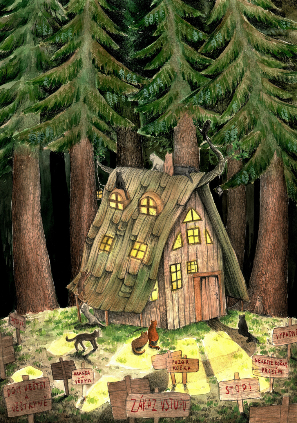
Multi-part tutorial for how I go about the use of colored pencils. I admit straight off that I'm not terribly organized in my method and it generally consists of changing pencils every ten seconds or so. I'm not one of those people who can use one pencil completely, call it done, and then move on to the next one. No, I have my pile of pencils and constantly switch. It is not uncommon to see me with a few pencils in my mouth as I really get into it.I hope this is helpful, or at least entertaining. This is part six of six.
Finally finished! And, of course, a lesson on why it's better to view art in person rather than seeing a digitally rendered, or printed version.
Images taken with Olympus Evolt E-500 digital SLR on manual mode. I used Pentax's digital spot meter to take the exposure readings, and it is an amazing little tool. The camera was mounted on a tripod and using very low exposure speeds.
Images are © CERT
Part One - [link]
Part Two - [link]
Part Three - [link]
Part Four - [link]
Part Five - [link]
Part Six - [link]
Finished Image - [link]
Pieces completed with help from this tutorial:
created [link]
Related content


Comments: 34


You're most welcome, I'm glad to hear it!
👍: 0 ⏩: 0

Aw, thankye. One of these days I need to do another one...
👍: 0 ⏩: 0

Great tut! Everyone has problems with those pesky trees. great advice on color theory and just basic colored pencil stuff!
👍: 0 ⏩: 1
Thanks! I'm glad the information is sound and it continues to prove useful!
👍: 0 ⏩: 0

Thank you, glad to know they're useful!
👍: 0 ⏩: 0

this tutorial is the best ive seen
thanks so much for the help :3
i've used this tutorial to do a little bit of a tree XD but of course it doesnt look so good like urs, cause i was lazy and i rushed it xD here it is, if u want to see ^^: [link] 

👍: 0 ⏩: 1
Aw, thankye! You're most certainly welcome and I'm glad to see that it has been beneficial to you!
👍: 0 ⏩: 1
no problem  (Smile)")
👍: 0 ⏩: 1

Thanks a lot! =3
I was looking for a pencil background tutorial... And I got really surprised when I saw that this tutorial was teaching how to do a forest, 'cause that's what I'm gonna do!
Your layering style and the way you use the colors are awesome. And it gaves me a really good base to work on.
Thank you again for the tutorial, it solved my doubts ^^
👍: 0 ⏩: 1
You're most welcome! I'm glad you've found it useful! I'd love to see what you do with it!
And Thankye! I've spent a few years developing and learning how to use them!
👍: 0 ⏩: 1
Yeah, I imagine it took you a long time...
Well, if you don't mind, I can tell you when the drawing is ready, so you can see it... ^^
👍: 0 ⏩: 1
Thank you, I'd love to see it when it's finished!
👍: 0 ⏩: 0

This was just amazingly helpful from start to finish! This must have taken quite awhile with every step, but it was extremely worth-while. I am just fascinated with your shading, especially the folds in the clothing, it's given me a new perspective on how to render fabric.
I'm always struggling with coloured pencils and how to make everything blend together, ..I've never really had a good grasp on the method of blending colours. I did recently purchase a colourless Prisma blender, but I wasn't quite sure how to use it properly. But with your suggestions, I'm going to keep peeking back at this whenever I have a sketch ready. I never knew that black was a no-no (it drowns out the rest of the picture I assume), so now I know to use either Indigo blue or shades of grey for shadows! Does it matter what kind of paper you use? Usually I just have plain computer paper, but the finished product always turns out looking grainy and not as smooth as I hoped.
If you were worried about repeating the same method over and over, no worries.. it wasn't tiring at all. It kept the pace steady and held my attention until the very end. And your finished composition is just perfect, 'rounds out
the whole tutorial.
Thank you for sharing your wonderful colouring method!
👍: 0 ⏩: 1
Thank you for your thoughts and taking time to go through it! If you could, let me know when you've done something using it, I'd like to see it.
Black can overpower an image, especially if it is in just one spot and not spread throughout the image, but that's not always the reason to avoid it. Some colors are particularly sensitive when it comes to shading, especially the warm colors (like yellow!), it often muddies the color and doesn't mimmick the true colors that are actually in a shadowed area. If you look carefully, with a warm lightsource you'll often see cool colors in the shading, green, blue, and purple, it's said the opposite rings true with a cool lightsource, the shadows will be warmer. Be sure to play around with your colors on a scrap piece of paper, what you use to shade often depends on the base as well as the type of light that you're trying to portray.
The type of paper can really help when it comes to working with colored pencils. Computer paper really isn't made to hold colored pencils. Most of my art is on bristol board and I jump between the vellum and smooth (one's hotpress and the other's coldpress, I don't remembe which is which, though). Vellum has more tooth and will hold more of the pencil on the paper, whereas smooth, as the name suggest, doesn't have as much grain and will take less effort for a smooth finish, but, so I've been told, it won't hold nearly as much pigment. Most sketchbooks have descent paper (run your hand along a page before you purchase one, if it's slick or waxy it won't be good for colored pencil), drawing paper will also work well for colored pencil and it's less expensive than bristol board (The Mineit Deities picture was done on drawing paper). Pastel paper can work as well, but it often has A LOT more grain than the rest of the papers mentioned, but can still produce interesting results (that and it comes in a lot of colors).
Some of it is really touch-and-go, and the best way to do it is to try everything you can and then stick with what works best for you (of course, as your skill builds you might go back to some of the things you tried before for variety).
I suppose the key to it all is to have patience and build your layers! It seems to be the same way for most any media you work with, but each still maintains its own personality and quirks. You'll also notice a difference between the different types of colored pencils. Prisma is fantastic and has a huge range of color, but others are worth a look at too. Staedtler's Ergosoft colored pencils don't have near the variety of colors, but they have a unique feel that makes them fun to work with. It takes more to get a smooth finish as the have a harder lead, but they also won't break like Prisma does and I haven't noticed the "wax bloom" when working with them as with working with Prisma.
A word on the colorless blender: I used to rely heavily on it, but now I don't think I could tell you the last time I used it. It does alllow you to fill in the little stubborn white spaces, but it also adds on another layer of pencil and wax, which can make it harder to rework and area after you've used it. If you do use it, make it your last step, something to smooth over any spots that don't seem to want to hold the pencils.
And remember! Scotch tape can be your friend! You can use it to "lift" the pencil from the paper if you make a mistake. You can also use masking or artist's tape. I've done it before, it works!
And you're most welcome, I'm glad you enjoyed it!
👍: 0 ⏩: 0

Eeee, this was brilliant to go through, I love to see other the methods of other artists especially in such a versatile medium.
👍: 0 ⏩: 1

As you'll have noticed (hopefully) by your notices, I have +fav'd all six steps of this tutorial. I had also +fav'd the original picture when you had submitted it as the coloured pencil-work made my jaw drop. In this long ramble of mine, I am tring to say THANK YOU SO MUCH!!! I have tried again and again to teach this stuff to myself, being kind of obstinate in not wanting to learn through others 
On a side note: What kind of paper do you use, and where would I be able to find it? I've tried most kinds of paper, but none seem to really work in that I either can't layer my colors or else the finished product is grainy and just ick.
Thanks in advance
👍: 0 ⏩: 1
You're very welcome! It gives me warm-fuzzies all over knowing that people appreciate the work I put into this tutorial and have benefited from it.
Colored pencils have a definate learning curve, as I mentioned replying to Peachfuzz.
The stuff I used for this piece in particular is Bristol Board of the Smooth variety (hot pressed). I've been told that the Vellum (cold pressed) has a little more tooth and will "hold" more color, graphite, or whathaveye. I haven't had issues with the Smooth yet, but I tend to switch back and forth depending on what I grab while I'm at the art store (very unscientific). I've also used them ontop of watercolors on watercolor paper (examples of this are my "postcard" images) and colored art paper and pastel paper, which I don't have examples of here as I haven't played with it in a while. Mat board is also fun to mess with as well. Watercolor and pastel papers do have a lot more grain to them due to the nature of the media that they are meant for. Mat board varries, but it's a lot more expensive than the bristol. Even with the smooth bristol you will probably get a little texture as you saw in this picture, but that's part of the nature of the medium.
It shouldn't be "noisy" enough to distract from the image, though. You could also get a colorless blender, but that adds another layer ontop of what you've done. I've experimented a little with turpentine in the past, which gives them a "painted" appearance, but in the end I prefer the look and feel of just using the colors and allowing them to blend themselves rather than forcing it with a blender or other method. You should notice as you add more layers, even lightly, it tends to smooth out.
That was lengthy, but hopefully helpful! Feel free to ask me whatever questions you have, I'm more than happy to answer.
👍: 0 ⏩: 1
**purrs** Glad to know I help spread the warm-fuzzies
Yeah, I guessed it was Bristol (well, actually, you said it right in the tutorial
Unfortunately, the grains in the paper I'm currently using doesn't layer at all >_<* So everything looks really "noisy", as you put it. What is this colourless blender? It may help my current situation until I can find some actual Bristol Board >.>;
T'was extremely helpful! ")
👍: 0 ⏩: 1
You're very welcome!
Michael's usually sells Bristol, but I don't know if they're in Canada and they're generally evil and expensive. You can order from Utrecht.com, they will ship to Canada and they tend to have really good prices. I think they actually have a sale on their bristol pads right now.
The colorless blender matches it's name. It's a color-free pencil (Prisma makes them) that graps nearby pigment and blends it.
👍: 0 ⏩: 0

So awesome watching this piece happen step by step! Seeing the steps taken by another artist to me are like trying to learn a foreign language. Your pencil coloring style is very alien to me and hard for me to get a mental grip on. I think my pencil artwork is poisoned by my preference for markers... I've been told over and over to use layers and start lightly but I always seem to barge through in one thick layer trying to get my poor pencils to work like markers! This really helped to clear up for me the wonderful effects to be had using pencils like what they are, not what they aren't.
I'm already imagining how to warp what I've been shown to benefit my personal coloring style. 
I really enjoyed the richness of color and shadow in the finished piece and it was particularly helpful to watch them develop step by step here. Even with my markers I have known that avoiding black (I once did a floral mixing my own black from Violet and Dark Green) and using complements and other colors for shadows is best, but this is by far the best example I've had the privelege of seeing. It really gives me ideas for how to improve the richness of both my marker and my pencil art by incorporating more colors.
I'm especially enamored of the way you've shaded the green areas of tree foliage. Leaves often come up in my floral work and they're a thing I've long struggled to add shadow and highlight to. Leaves annoy and bore me but this gives me ideas (Like I've said) for how to spice up the annoying little things. I started using Navy Blue (A Crayola color) with my greens a while ago to slight improvement but I can see from the more advanced richness of your work that the addition of other blues (And reds?! That's news to me!) will be necessary.
Thank you for taking the time to make this wonderful tutorial.
Great work. I hope others find their way to this to get a handle on how you make your work as virbrant as it is, as well. And the new "next deviation" feature thanks to DA V5 made the series so much easier to read through!
👍: 0 ⏩: 1
I'm glad you enjoyed the tutorial and have managed to glean some new information from it! I was a little afraid that people would get tired of it towards the end as it felt like I kept on repeating myself in some instances.
It was also a little hard for me to pause and snap shots of the progress, especially since I work so sporatically. I'd get going and then realize "oh crap, I've done 40 minutes of work ..." I think I got a little better at that portion in the end.
Pencils definately take more patience than markers, at least in my experience. I did a marker piece not long ago and there very little that's the same when it comes to how they are applied and react.
I firmly believe that colored pencils, especially the softer ones like Prismas, have a long learning curve. I've been working with them for six years and am still learning. Even on this piece I learned a bit and experimented. I think one thing that I forgot to point out in this tutorial is how I used Indigo Blue in ALL of the shadows to help tie the whole thing together. It's in the trees, leaves, clothes, and his fur. I think having unity in a piece is important, it's one of the things that I learned in my college drawing classes. "If you have this nice, dark, rich black in this corner, you better have it in other shadows to help balance!"
👍: 0 ⏩: 1
Markers are the same as pencils in that, with layering, you get a richness and quality of color and shadow very similar to the technique you showed us all in your tutorial. Strange that I use layers insanely with markers and hardly at all with pencils! My brain seems to work in terms of ink, not lead. With markers I can always add another layer, on on top of the other. But when I barge through and fully saturate with the first layer of pencil (As if it was a marker), I'm screwed, so to speak. Therein lies my pencil-fault, I now see.
I think you're right that pencils take more patience than markers. Something about how markers work is much more simple to me. Maybe it's because, when I was younger, I used up set after set of markers, not pencils. They're my native media!
What types of markers have you tried? My favorites are Prismacolor markers. Despite my preference for markers I own many types of pencils and can't quite pick a favorite because they don't satisfy me like markers do. I end up doing a lot of pencil art because pencils are easier to take out and use than markers, and are far less paper-specific. Maybe I'd like them better if I was more satisfied with my performance with them.
Thanks for the tip concerning balance by using the same color in all shadows.
👍: 0 ⏩: 1
Pencils are also less intoxicating than markers. The last marker piece I worked on (couple hours solid work) left me light-headed at the end of the day.
I've used Prismas and have a set, but I really prefer Pantone's Tria markers. They actually have three nibs (broad, a medium tip, and a fine) and allow you to refill individual markers and also mix your own colors if you have an empty pen and the inks to mix. They're more expensive than Prisma, but I like the feel of them better (in2art.com has them at the best price I've been able to find).
As far as pencils go I really do like the Prisma and have used them the longest. However, I've come to thoroughly enjoy Staedtler's Erogsoft pencils, which are insanely spiffy primarily because they have a "soft" barrel that's really nice to hold. They aren't as soft as Prisma so they won't lay out as smooth at first. They have an entirely different feel from Prisma and I enjoy both. I've tampered with Derwent's Studio and Artists a little, but not enough to give a firm opinion.
You're very welcome!
👍: 0 ⏩: 1
I'm only experienced with Crayola, Sharpie, and Prismacolor markers. Sharpies rather suck, and Crayolas have only half the elements of a good marker brand. They actually work pretty respectably and even blend! But, they just don't put out the amount of ink needed to do the calibur of marker art that I do. That means big pages, large gradations and whatnot. Right before I got my first twelver of Prisma markers, I was running Crayola markers dry at an insane rate trying to get them to do what I wanted. To get enough ink to blend, I had to run the Crayola tip over the paper so many times that it would tear. But they really can blend and mix to an extent and that's actually how I got the foundation for how I use Prisma markers.
I want to get a pack of Crayolas some time and use them with my Prismas. Sounds contradictive, I know, but Crayolas can do one thing Prismas just can't: Water effects. Using things like a fine mist spraybottles and splatters of water can do really awesome things with water-based Crayolas.
Trias, eh? Sounds interesting! I went to your site and found them, and laughed because my favorite art site is cheaper! Individual Trias are $4.19 at in2art.com and $3.78 on DickBlick.com! Blick doesn't have the replacement inks, either, but it does have a wider selection of Tria sets. The twelvers are about $6 cheaper at Blick than in2art. Maybe you should consider Blick for your next order? I'm definitely not going to use in2art over Blick unless they have a much lower shipping charge.
Trias are a bit less than double the price of Prismacolor markers. Cheaper than Copics, though! Prismas do the multiple tip-widths thing as well, but Trias interest me to increase my color range. I wonder how much ink they hold? They're going on twice the price of Prisma markers, so I'll feel like I'm getting a worse deal if they don't last twice as long. Though, I may try them and love them. Who knows? At any rate, you've convinced me to nab a few on my next order. Prisma markers have a crappy range of purples (And getting crappier!), so I can't go wrong grabbing some purple Trias for a first trial.
Though, Trias don't have that many purples, either. Took a peep at the Copic range and it's the same deal. I'm beginning to think that purple is a color that's a little harder than the others to make into ink...
It says on the sites that Trias are hazardous material! Yikes! I'm used to my good ol' AP non-toxic Prisma markers. Prisma markers stink, certainly, and the fumes can't be that good for a person, but I've used them at close range for hours straight as well and never gotten light-headed. Sharpies have made me light-headed, though, so I can imagine what it's like with Trias. I'll have to be more careful if I get some and try to use them...
I have the 120-color wood box set of Derwent Artists pencils. Bought them on a whim when the set was on sale and I've barely touched them. Right off the bat I like their hard dryness, since smeary Prisma pencil softness has long irritated me. They don't get wax bloom (That funky cloudiness) either, since the Derwent Artists pencils are clay-based!
I like Crayola pencils a lot as well, because of their firm lead and transparent nature. I often use them hand-in-hand with Prismacolor pencils to get the best of both kinds in one drawing! Often I find myself bringing Prismacolor pencils into Crayola pencil pieces only because of the superior color range. I sure wish Crayola made more colors... But they take pride in their position as a scholastic art supplier, not an artist's one.
👍: 0 ⏩: 1
Sharpies are definately meant for practical use, not artistic.
You know, since Prismas are alcohol-based, you could probably get the same effect usuing rubbing alcohol with the prisma.
Thanks for the link! In2Art can get the replacement inks for $6.13, I'm assuming you can refill a couple of markers with that. I'd shop around for someone who has them in-stock to see if you can get them cheaper, though. I have a good set of Prismas and still like Tria's three nibs better than Prisma's two. You'll definately get more color range from the Tria. Prisma has, what, 140 colors? On the other hand Tria has 290 colors, plus the ability to order the inks and mix your own (purples).
Is says they ship as hazardous material. That could simply be the alcohol content. Alcohol=flammable. I think the toxicity is if you eat them, not through handling, at least to my knowledge. I wouldn't recommend them for body art *grin.*
You're thinking of the Prisma and the verithin. The Artists are the softer lead, similar to Prisma pencils, whereas the Studio are a harder lead.
👍: 0 ⏩: 1
I used to do whole drawings with Sharpies.
I saw that. 
I'd like to check out that third nib the Trias have as well. I got my first few sets of Prismas back when the thin nib was useless (They rennovated it some years ago and now it works fine), so I trained myself to do everything with the big end of a Prisma marker. That one nib is surprisingly varied in the line widths it provides. By holding it at different angles I can get all sorts of widths and shapes. But I still want to check out the trias and see what they can do.
👍: 0 ⏩: 1
I think it's the same with pencils: you can mix on the paper for a lot of colors, but if you have the pure pigment it still works a bit better.
Do let me know how you like the Trias!
Also, if you tackle colored pencils again, I'd like to see what you come up with.
👍: 0 ⏩: 0
