HOME | DD
 mikemayhew — Vampirella 7 Cover Painting

Published: 2009-08-08 20:59:09 +0000 UTC; Views: 8270; Favourites: 161; Downloads: 496
Redirect to original
Description
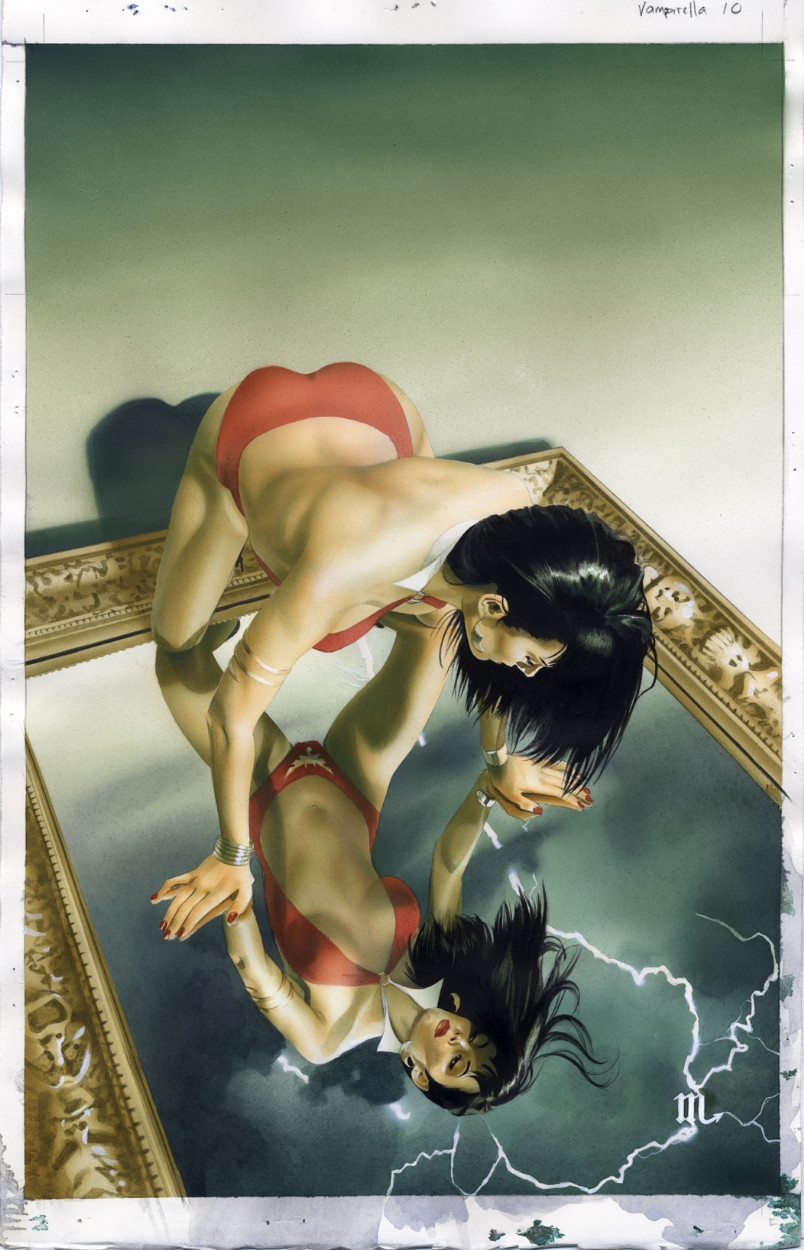
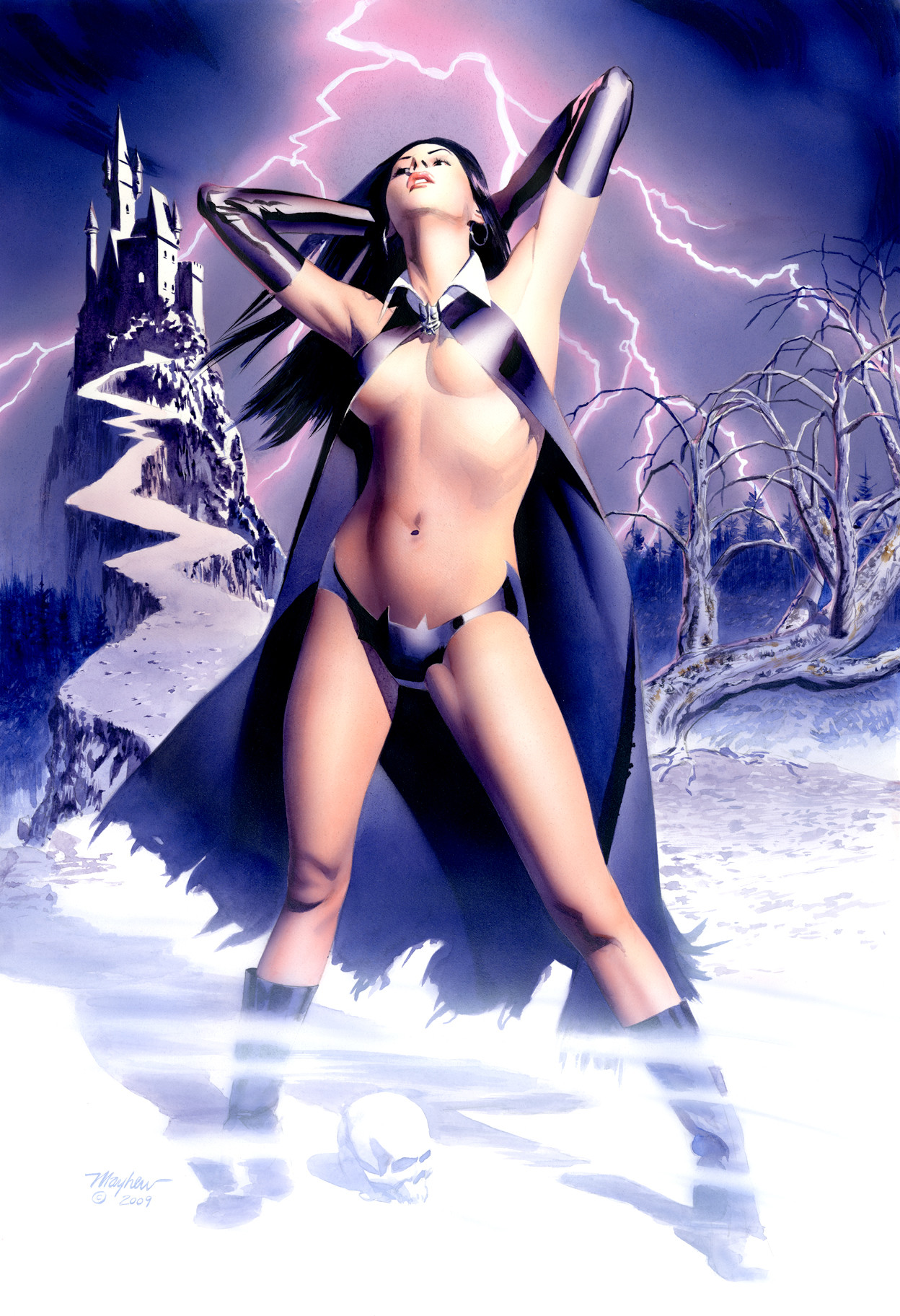
11X17 in acrylic.This one is up for grabs on eBay:
[link]
Related content


Comments: 13


First off Mike, very nice. While I agree with some of what [link] Lexaris said I disagree with the comments on the font type. If you look at posters from the period this looks like it is set in they did not have a wide variety of fonts. If you look at older King Kong posters they are a basic font and still have appeal. I do think there is too much black and maybe a light silhouette of the tent, if its under a tent, or the audience in the background to break up the image. After looking at her shading and her proportions the only real flaw i can find is the indention behind her left thumb. It is to dark. I love the Scorpio symbol for your signature, nice choice. Overall i think it is a very appealing image but yes it is too dark. Thank you for sharing Mike.
👍: 0 ⏩: 0

Originality
Impact
First of all nice job. Your technique and contrast is always good as possible. The idea and application is quiet successful. I like the left bottom portrait, typography; color, size and hierarchy.
Lets start to criticise some. The proportiation as an poster is quiet wrong i think. Cause of the balance between typography and the woman figure. The hierarchy and contrast of typography as itself is good but it needs more attention. Maybe the layout grid could be better. The blank area at top is disturbing. And the fontfaces of right side typography could be more compatible about time period and sense. It could be a western, some serif or demi serif font. Your choose that sans serif is not making sense i think.
Sorry for my bad english. I guess i look it like a graphic design job but anyway. Kind regards..
👍: 0 ⏩: 0

I loved the wood texture and the oldie paper looking concept. They really give the scene character and unique feel.
👍: 0 ⏩: 0

Another great cover. But her left hand is a little wonky.
👍: 0 ⏩: 0


I like the right-side lettering, especially your signature. The black-on-black hair is neat, and the paper and wood textures are amazing.
👍: 0 ⏩: 0
hey Mike I forgot to say how much i liked the wood grain on the background. It looks real when you first glance at it. Good job.
👍: 0 ⏩: 0


in regards to the critique, the blank space at the top is for the "Vampirella" logo. Most of my comic cover work has space at the top for the logo placement.
👍: 0 ⏩: 1
i just realized that, anyway goodwork.
👍: 0 ⏩: 0

 (Smile)")

I am a fan of your art, I recently got the Dark Reign (the Goblin Legacy) just because of you, but in this awesome Vampirella work I will mention, with all my respect, one of her hands looks kinda weird (please don't take me wrong)
👍: 0 ⏩: 0