HOME | DD
 Nsio — How Nsio would fix the new deviantART logo
#deviant #deviantart #fixing #logo #update #art
Published: 2014-12-05 18:42:48 +0000 UTC; Views: 67975; Favourites: 1108; Downloads: 444
Redirect to original
Description
I know nothing can stay unchanged to the eternity, but it doesn't mean that we should just accept everything that's brought in front of us. DeviantART is quite a spectacular example of this, but rather than bashing their actions, I wanted to explain myself why I don't like the new dA logo. I'm already in terms with it, but I'm still uneasy with it. Here is my analyze why the logo doesn't work and also an example how it could be fixed. Feel free to call me just typical whiner, but before doing so I kindly ask you to read my arguments")
Similar alterations:
Analysis of the situation etc.
To close, what happens now?Art By yuumei
The logo has been brought up to the staff & also the fact that it's similar to Platzkart will most likely be addressed. It obviously wasn't stolen, but still. If they wanted to try & sue us, lets be real. Lol, it wouldn't be good. We brought it to their attention. & they know about it. Whatever happens from here on? Well it's up to the staff to figure it out.
The balance between staff & the members of this site, has been restored. (or at least more close to being equal)
Overall? I think it all went well.
I'll be honest.
Some of the staff like Ikue, (not a bad dude) even saw this as "rebelling". But I disagree. We're not supposed to just sit here & just agree with every single decision that's made. Like Drones. But, you SHOULD speak up.
Most of the people in this community here were afraid to speak on what they feel & know to be truth.
(If I had premium, I could have linked thumbnails, but these will do for now)
"New DeviantART logo - Why it doesn't work and how to fix it" by Nsio
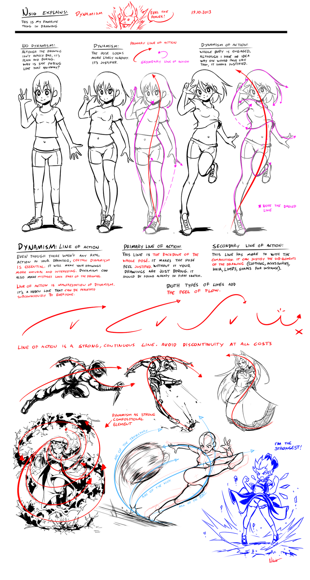
I’m sure people have already noticed the new dA logo. At first I had no idea what I was seeing. Then I figured “of course, it’s an A letter”. Shortly after I also realized there was an upside down A as well. “This one must form some sort of pattern” I thought. I wasn’t very happy about the design though so I went and read the “Our Story” section.
The logo was indeed designed for tesselation. Okay fine, so we have an “A” letter, standing for Art. It’s also upside down. “Challenges perceptions and perspectives”, “by literally turning the art world upside down”. Okay, I can deal with that. But still, I’m not convinced. Something is missing with the new logo. “We love it because, like DA, people might not get it right away”. I find it weird that dA actually wants to make us confused. If you ask me, art should offer the sensation of realization, not confusion. Or if there is initially confusion, it should still offer some way to turn the confusion “upside down” into sensation of realization. Even though I got the message, I’m still confused. I don’t like the new logo but why?
I understood the reason right the moment I saw the youtube video about the story behind the logo. At one point, there was a logo where it says “dA”. The moment the logo is separated, the problem occurs. DeviantART becomes just ART. It’s not the DeviantART we know anymore. It’s just ART with cool tesselation effect.
I thought I would let it go, since I now know that the logo can be thought as if it reads “dA”. But it was still bugging me. Although I can force myself to think it like “dA”, I still see only “A”. I pondered this for a while and then I realized the issue: amodal completion.
Although we are intelligent beings, our brains are rather simple when it comes to visual perception. Our brains have an ability called “amodal completion”, which allows us to “see” the form of partially hidden objects. That’s why we can tell a person peeking behind the corner is a human, even though we see only half of the face. Our brains can construct human figure fairly well even if it’s partially covered, but with everything else, brains just lack the imagination.
If important details of an object is hidden, our brains can’t construct such complex or abstract things. Instead, the brains just rely on the visual cues to parse the image. A lot of data is lost and the image is greatly simplified. I drew few examples about the phenomenon on the left. For example, if there are arcing details, but no visual cues are offered about it, arcs are discarded in favor of continuity of the lines.
This happens even if you knew there were such details. Instead of seeing one complex object, you see only two lines. On second row I show the arcs. However, our brains are more likely to treat the partially hidden object as two separate objects. This behaviour is exaggerated because of the symmetry, since humans are naturally attracted to symmetry.
So basically this is what happens with the dA logo. Even if we know the logo can be thought to be partially covered “dA” logo, our brains fails to comprehend this because the “d” is discarded in favor of “A”. There are not enough visual cues to support this way of thought process, which leaves us just confused and unsure about the logo. It’s cool, but it doesn’t have any bonding with DeviantART.
However, I find that the new logo could still work, if there just were such visual cues present. In fact, the actual logo could be kept intact by just adding shadow images of the d and A. I made a quick test if this could work and I found that it looks pretty cool now. By using dark green for the shadow image, the visual cues are strong enough to make the dA logo visible while still allowing the real logo to stand out clearly. All the benefits of the new logo are retained, no confusion taking place and the bonding with DeviantART has been formed.
If this change was made, I would gladly accept the new logo. Right now the logo doesn’t feel justified. I’m not saying that my proposal is perfect, but it’s one way to fix the issue. Even if there is huge difference in artistic capabilities between dA members, our physiology is the same. We are humans and we function in a way that’s typical to humans, no matter how much we try control ourselves. I believe that even if people don’t agree with the proposed fixing, they at least acknowledge the need of fixing in one way or another.
Nsio
Related content


Comments: 404


It's just quite a coincidence. In fact, the two logos are actually very different if analyzed deeply. Platzkart logo can't be perceived as "A" letter, because the angled line extends further and is steeper than in dA logo. Due to this, the Z shape is even more pronounced in platzkart logo. But well, how ever you look at it, it indeed looks way too similar. I hope this is a good reason for them to change the logo, and hopefully take the community in account this time
👍: 0 ⏩: 1

To be fair it could be from amodal completion. It obviously wasn't stolen but because the platzkart logo is the closest we can associate the new dA logo to, the human brain cannot help but to have one see the platzkart logo instead of the new one.
That's why I think this is a legal issue here. XD The companies have nothing to do with each other but I think it's something to keep an eye on. (no pun intended) Since this controversy is becoming more widespread people cannot help but to see the logos as one in the same even if they are not. At least I can't unsee it. That's why I had to install the old logo extension on my browser. It was getting jarring to my eyes and I kept forgetting I was on the correct site. (I am dumb I had to...)
👍: 0 ⏩: 1
Exactly. The logo in platzkart is actually working. It feels right in its context. The dA logo is too similar with it, so it appears to be stolen, even if it wasn't. People are quick to perceive the coincidence as thievery and uncreative design. That has to do with human psychology. And since people hate the new logo so much, it's even easier for them to end up in these conclusions
👍: 0 ⏩: 0

i think it wold look better with the whole dA
👍: 0 ⏩: 0

Now it looks like shit.
I'm just not buying the current Z for the logo. Just WHY? It was more than perfect as it was!
A window into the magical world of ART!! Give it back damn it!!!
👍: 0 ⏩: 0

Although the new logo doesn't bother me, I do think that you
have a really great point and your idea would be an improvement!
👍: 0 ⏩: 0

well i really like the idea of a new identity for dA, but yeah, this logo seems quite random and unrelated. Yours is better, you can see the d finally
👍: 0 ⏩: 0


Yeah I like your design better ^^ I'm not too picky when it comes to logos on websites so I don't really care all that much.
👍: 0 ⏩: 0
Thanks for the knowledge of how shapes are perceived. It is interesting and it makes me want to make my own version of the logo. Still ironic how an out of place logo can bring people together. XD
👍: 0 ⏩: 1
Isn't it! The users of dA act like a community more than ever
👍: 0 ⏩: 0

Yeah I'm glad I'm not the only one who couldn't readily find the letter "D" in the logo
👍: 0 ⏩: 1

I totally thought it was a "Z"...
Unless it's somehow Zeviantart now, they should probably change the logo.
👍: 0 ⏩: 1
Don't think they will. Sounds like they were deeply influenced to keep it that way...
👍: 0 ⏩: 1
Ooh, that's unfortunate. I don't really think I want a Z like symbol representing this website...
👍: 0 ⏩: 1
It's a D and A cut in half. Makes no sense, but then again artists are the ones who run this site too, and this symbol is what they think of this site...
👍: 0 ⏩: 0

Yes. All of this.
'Course there really wasn't anything wrong with the old logo anyway. They had plenty of other things to address with their time :\
👍: 0 ⏩: 0


I love your version with the shadows. I don't think the new logo is bad, it just struggles to represent deviantart.
👍: 0 ⏩: 0

Let's hope the people who changed the deviantart's logo take your idea very serious
👍: 0 ⏩: 0

Thank you for writing this! I actually no idea what the hell it was until I read your piece. My best guess was an equals sign with a slash through it.
👍: 0 ⏩: 0

I totally agree with you... I thought the same thing when I saw it (even after their explanation), that it just shows the A but removes the d entirely. Even seeing the images showing where the dA was supposed to be didn't change that fact, but now thanks to your explanation I understand why I couldn't visualize it without some cue. Honestly I was wondering if with DeviantArts popularity they were trying to disassociate themselves from the Deviant part of the name entirely? I think your suggestion has a lot of merit and is a good compromise allowing the site to move forward while still staying true to its roots.
👍: 0 ⏩: 0

maybe it would have been much better if they'd done this into a contest, for the members here to design the new logo and image. There are many talented people here more than able to do a good job and it eould have been something the members would love to contribute in
👍: 0 ⏩: 0

MY GOD, YES! New one reminds literally NOTHING of dA (not the old logo, but dA in total)
👍: 0 ⏩: 0

god bless man! We need this to be changed! I had the exact same feeling as you did!
👍: 0 ⏩: 0


Well, that's actually a nice improvement, although I don't think that the actual logo is that bad
 (Smile)")
👍: 0 ⏩: 0

um, why aren't you on the dA planning team? This problem would of never happened if they asked the sites members for their input first before changing everything we came to love.
👍: 0 ⏩: 0

I like your proposition. It really makes a lot more sense than the logo that is now. At first I thought it some reading of the pulse or something, later - cross and no matter how long I looked at it, I couldn't even see A... :/ Your logo is much more better since it shows what it is all about. And honestly - I hate changing logo over and over. Coco Channel or Vuitton haven't changed them for ages and nobody complains.
")
👍: 0 ⏩: 0

I think it's awesome that you could see an A in the new logo before reading "Our Story". I thought it was a Z and I also thought it was just a temporary change of icon for some special occasion/holiday thingy of which I knew nothing about. But still my initial reaction was "what the hell....I thought I accessed dA".
I agree with your proposal. I liked the old logo a lot and I'm generally averse to change. I don't like this new one not only because all I'll ever see is a Z but also because it resembles the Green Lantern's logo in color. It makes me imagine a rip-off superhero named the Green Zantern. So I'd add a slight change in color too to your idea.
👍: 0 ⏩: 0


The logo is slanted in the same way the typography is. Your solution leaves a nasty gap between the logo and the type.
👍: 0 ⏩: 0

Shhhhh. Just let this slowly become the new newgrounds.com. Shhhh
👍: 0 ⏩: 1

You mean Facebook, yeah?
👍: 0 ⏩: 1
Maybe? Not sure how many people are leaving facebook, but it's still one of the big ones. I'm probably being too harsh on DA. It's not sinking as bad as newgrounds. It's probably not sinking at all, but for as long as DA has been around there also hasn't been much innovation. Newgrounds is just the example I used because it feels similar - a website that has been around a long time and feels a little stagnant. DA is no Myspace, which was crushed by facebook. I think Newgrounds lost a lot to YouTube and the switch to mobile as a lot of the users making games switched to making games for app stores.
I'm being too harsh. I just feel DA is not much different from 10 years ago when I found it. It's basic purpose is giving artist a place to make a gallery. It is stale but no one else has come up with something better... yet.
👍: 0 ⏩: 1
I see what you mean.. I kinda missed your point before lol
But yeah
What happened to Newgrounds exactly?
👍: 0 ⏩: 1
I don't know exactly what happened to Newgrounds, but it was probably a combination of things. Maybe it was inevitable that it would become a shell of it's former glory. It started as a place for flash animations and then flash games. Youtube and other video sites came along and took away the best flash animators. The world moved toward mobile platforms and now most people play games on their phone or tablet. Newgrounds didn't seem to adapt to that change well. Other websites like Armor Games and Kongregate adapted.
It was probably a combination of times changing, competition arising that had adapted, and a lack of direction or foresight from the people behind newgrounds.
There are a lot of features I could think of that are missing from DA but they do seem to be trying. I just noticed they are going to have some type of mobile platform on December 10th. A step in the right direction, but still not much of an innovation. They introduced prints which is probably a big money maker for them. It appeared that they were going to try and do some kind of artist commission website but it must have fizzled out. They introduced the points system and the contests but those are just forms of marketing that I didn't particular like. The one thing about all those introductions is that they are just trying to squeeze money out of their existing users in all those instances instead of really giving their users more features to expand their audience. That is the reason artists post their work, they want their work to be seen. The portfolio websites introduction was a decent idea.
It feels like DA is afraid to let their users expand beyond DA. For now it works for them, but their users are definitely not waiting around. They post to facebook, tumblr, their own website, youtube, and everywhere else. DA is just another place to post. It's fine, but it feels like it could have or could be more.
It is a failure of vision by the higher ups in DA. Their vision for the last 10 years has been "What can we do to get more money from these people?" rather than "How can we help these people be more successful?"
The contests are the most glaring example of this. I get that websites need money to run and I can't imagine what DA needs for servers, but the tone I get from DA is more "get money from these artists" rather than "help these artists".
👍: 0 ⏩: 0

This would be so much better than the current logo, but TL;DR (sorry! didn't have the time)
Your version of the logo would actually make sense unlike the current one, and keep the modern look it has too.
But in my opinion the biggest problem with the current logo is that ugly neon green, it doesn't fit in anywhere on the site, it's out of synch with the rest of the color scheme of the website.
👍: 0 ⏩: 1

The rest of the site is going to be changed to grayscale, so the clashing color won't matter.
👍: 0 ⏩: 1
Grayscale... I wonder if they'll get it right... or if it'll just look like crap

👍: 0 ⏩: 0

I think this might work if you just made the dark colors solid and returned the whole thing to it's original color. The color it's supposed to be. A logo shouldn't take explaining!
👍: 0 ⏩: 0
Your design is way better than what they created ovo
👍: 0 ⏩: 1

Actually they created this design, but they had to ruin it by cutting the edges
")
👍: 0 ⏩: 1
Wow deviantart
What kind of epic fail is this supposed to be
👍: 0 ⏩: 0

I really don't mind, my only complaint is the color. When it's next to the Deviantart greens it hurts my eyes
👍: 0 ⏩: 0

i like your design!
the first thing we see would be the new logo
but when we look closer, the confusion fades
and we realize it is part of the word "da"
i think this does a much better job
since the new logo do bring in confusion and curiosity
and that part is good; but it doesnt bring us realization
and only leaves people in confusion.
👍: 0 ⏩: 0

I'm bad at tracking time so when i first saw this new DA logo, i checked the time thinking maybe it's the 1st of April. Now i'm not sure which stage of grief i'm at right now, but not acceptance.
👍: 0 ⏩: 0

This is an awesome idea! WHY ISN'T THIS HAPPENING.
👍: 0 ⏩: 0

I couldn't agree more with this accurate and sharp analysis!
And I must say I find this new DA logo just the ugliest logo I've ever seen.
I'm sure the design team has put lots of effort in it and I do not want to be harsh.
But this time I think someone should take a breath and, hand on heart, rethink it from scratch.
DeviantArt should be a place were one can find inspiration and strive for the beauty of things.
Some words about ART: it is my personal opinion that art should be something understandable, something that touches our emotions.
But when art becomes too difficult to be understood without proper explanation, then it loses spontaneity, it loses its purpose.
Now you could say: "well, you stated that the new logo is ugly, so it moved some feelings even inside you".
Not really, I find it ugly just because it is meaningless at first sight, and even at second and third sight.
It is not the logo in itself that hurts me, but the fact that, after being a proud member of DeviantArt for more than 10 years, it appears to me like a scar on every page.
I hope you will understand.
👍: 0 ⏩: 2
<= Prev | | Next =>