HOME | DD
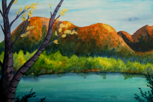
 Peachfuzz — View Across the Kenai
#alaska #kenai #kuretake #landscape #painting #river #traditional #traditionalart #watercolor #kenaipeninsula #kuretakegansaitambi #cooperlanding
Published: 2017-09-17 21:44:56 +0000 UTC; Views: 317; Favourites: 27; Downloads: 0
Redirect to original
Description
Another painting I did while in Alaska. Specifically, at a fishing lodge on the Kenai River in Cooper Landing. Every evening, they light the fire next to the river where there are wooden seats and whoever is staying at the lodge can hang out and visit. The view across the Kenai River was really pretty, so I was inspired to practice my watercolor skills attempting to portray it.") I had fun mixing the colors for the foreground tree. The Kuretake white is reasonably opaque!
I had fun mixing the colors for the foreground tree. The Kuretake white is reasonably opaque!Kuretake Gansai Tambi watercolors, Fluid hot-press watercolor paper, 4x6"
Artwork © me, Peachfuzz .
Related content


Comments: 15


Awww thank you for your support! 
👍: 0 ⏩: 1

You're very skillfull Peachfuzz!! The background looks very stunning and even the smaller details, like the green leaves at the river (as if the river was a mirror), and the tree colour are really stunning!! Keep it up Peachfuzz, find a meaning on what you do!!
👍: 0 ⏩: 1
Wow, thank you so much for adding this painting to your favs and leaving me such an encouraging comment. ^__^ Very appreciated. Happy 2018 to you!
👍: 0 ⏩: 1
You're welcome Peachfuzz, very kind your answer!! :3
👍: 0 ⏩: 0

on this art, I notice you make a good light and shadow effect, and it make the near and distant effect. the trees with brighter green color is wonderful, I love the river reflect some part of the shape of the close trees, and the close trees show their thick trunk in subtle. and I think the good light and shadow effect is used on the mountains, and I love the autumn color of the mountain.
on the near tree and leaves, you use the different color touch, it's more powerful than the distant place and it express the difference of each object, and the trunks and yellow leaves is more outstanding, I think the watercolor have much possibility.
on seeing the mountain and trees, I notice this art have good contrast, the trees and the mountains are painted in detail, and the sky and the river is quiet, and it express the difference if the each objects, and I think the color of the river is beautiful. I think this place is really beautiful place and you express it with painting this art.
👍: 0 ⏩: 1
Wow, thank you so much for the awesome comment! The white in my Kuretake watercolor set is fairly opaque and I used it to mix the colors for the foreground tree. I also used black in the foreground tree, and the Kuretake black is so pure. With my old watercolor set, I never used the black because it was muddy or the white because it was useless.
The Kenai river truly was a beautiful turquoise color when the sun hit it. It is fed by a lot of glacier melt, and every glacial river I saw in Alaska had unique colors and a strange, opaque quality to the water. I wish the sky and river were plain by artistic design, but it's actually because I am poor at painting those things. 
Again, thank you!

👍: 0 ⏩: 1
I've noticed the black isn't work well on colored pencil, it affect to around pale colors and it become bad, and I've heard the black and white on the watercolor don't make the pure color and I don't use the black and white on the watercolor. so this time I'm very amazed you use the white and black on this art.
👍: 0 ⏩: 1
This is a real scene I painted and the foreground tree was gray, but the Kuretake set has no gray, so I had to mix gray. I am very impressed by the Kuretake color range because of how well the colors mix. I won't be so afraid to use black and white with them now.
👍: 0 ⏩: 0

WOW. You got great saturation and color mixing on this. Nice!
👍: 0 ⏩: 1
Thank you! My Kuretake watercolor set doesn't have a gray, so I mixed it with the black and white. I also made the leaf color with yellow and the white. The white is surprisingly opaque and the black is very pure so it doesn't make muddy tones.
👍: 0 ⏩: 1

Love the contrast between the greens and the orange hills! Sounds like a lovely place to stay and find artistic inspiration.
👍: 0 ⏩: 1
Thank you! Alaska was lovely indeed.
👍: 0 ⏩: 0