HOME | DD
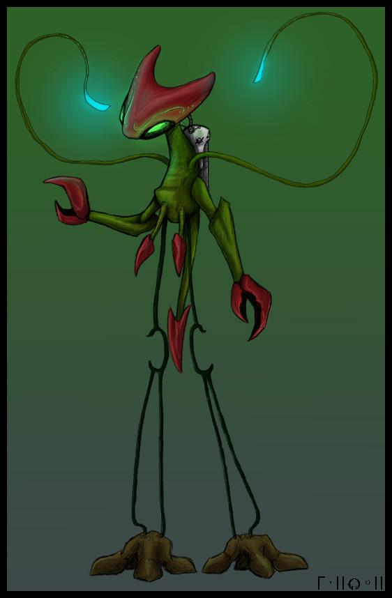
 Pseudolonewolf — Pyrosimos Redesign 2

Published: 2012-10-19 18:00:17 +0000 UTC; Views: 924; Favourites: 19; Downloads: 12
Redirect to original
Description
The other one didn't seem to be well-received... but I wouldn't be surprised if this one wasn't either. Maybe I should just stick with the original design...Related content


Comments: 15

Ooh, I like this one much better! My problem with the other one was it was too... angular. Polygonal. Whichever. It looked to mechanical. This one looks more like a dragon, or a wolf, both of which are fairly awesome. I especially like the markings around the eyes.
👍: 0 ⏩: 0

I like this one much better than the other two! It fits with the Protonculus theme, and it definitely appears beastial and fire-y.
👍: 0 ⏩: 0

I think this one is the best design for it so far.
👍: 0 ⏩: 0

This one looks better, in my opinion. Looks more streamlined.
👍: 0 ⏩: 0


I really like the look of this one. The other one looked a bit chunky, but this one looks more streamlined. And stuff.
👍: 0 ⏩: 0

I love the sort of head crest, for lack of better description. This would be my preference, although I took no issue with the previous one.
👍: 0 ⏩: 0

This looks quite cool, I wonder if you plan on keeping it, as I would, along with many others, much prefer it.
I especially like how you did the head, it looks like some bug-samauri thing. Myes.
👍: 0 ⏩: 0

I really like this one - the design is elegant and focused but still powerful and seems to fit the whole fire thing much better than the first redesign, whilst also looking distinct and better overall than the original design.
👍: 0 ⏩: 0

I like this one better; it's kind of like you took the best from the other two.
👍: 0 ⏩: 0

I like this one a lot more! It seems much sleeker, while the previous one seemed blocky! It makes this one seem more synthetic, yes! [Although Porygon was also blocky, but then it was in a polygon-ish way, which seemed virtual, interesting.]
Hmm, I also suppose that it having no mouth, none that can be seen anyway, makes it seem like it belong to the same family as Protonculus too! The previous one seemed a little too different for me, while this one looks both more interesting than the old Pyrosimos, but also more belonging and fitting than the other redesign! I definitely would prefer this one over the other two!
It's also discernibly Fire-elemental! The head shape, the markings on the body, it really fits its type, but also remains synthetic and remains true to its original form.
The claws also look nice to me. I also prefer the more varied colours of this form!
👍: 0 ⏩: 0

Funny, I was going to comment on the other redesign that I like the first one better, and it turned out that it's actually the second. ^^'
But yes, I like the design right here better than the original or the first redesign. Somehow, with three horn thingies on head instead of two it seems more... firey? Like, it makes me think of flames moreso than the previous ones. Which is what I suppose Pyrosimos was lacking in comparison to other forms - even if they got greyed out and their names were removed, you could probably still guess what is their element just by looking at them.
(I'm not sure whether this image would be so easy to guess as the firey Miasmon one, but I feel that it still would be easier than for the original design; so yes, I find this redesign much better than the original O.o')
👍: 0 ⏩: 1

HMM... Maybe that's something I should think about in future when designing monsters; whether they look like whatever they're supposed to be even without colour, or even as a silhouette! Or something!
👍: 0 ⏩: 0

I prefer this one's [link] claws and certain elements about its face, but overall I think I like this one better.
👍: 0 ⏩: 0

░░░░░░░░░░░░░░░░░░░░░░░░░░░░
░▀█▀░░░▀█▀░▀█▀░▀█▀░░▀█▀▀▀▀█░
░░█░░░░░█░░░█░▄▀░░░░░█░░░░░░
░░█░░░░░█░░░█▀▄░░░░░░█▄▄▄░░░
░░█░░░░░█░░░█░░▀▄░░░░█░░░░░░
░▄█▄▄█░▄█▄░▄█▄░░▄█▄░▄█▄▄▄▄█░
░░░░░░░░░░░░░░░░░░░░░░░░░░░░
👍: 0 ⏩: 0