HOME | DD
 Pythosart — Comm: Falx

Published: 2012-04-23 12:53:03 +0000 UTC; Views: 2565; Favourites: 82; Downloads: 49
Redirect to original
Description
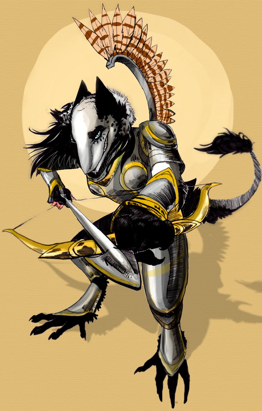
Commission for ~Lady-Tempest of her Tiefling character Falx.I quite enjoyed painting this, but I'm really not satisfied. Critiques welcome, but I'm not promising anything as far as fixing it goes. I'll do my best, though.
Falx ©
Art © Me
Here's my preview image. I'm leaving it up because I quite like the lineart by itself.
Related content


Comments: 11

You did a very good job on her, especially her face. I really like the armour and pose, and pretty much everything.
The background looks rather sketchy, but we agreed on that.
Do you think you would be more satisfied with cell shading? I like this picture a lot and would be willing to pay a bit more for a alternate colour version, if you have time.
👍: 0 ⏩: 1

I might go back and cell-shade just to quell my own frustration. You need not pay extra C: I'll leave this version up if you like it.
👍: 0 ⏩: 1
That's awesome. It's too bad that you are frustrated with it, I like it but I know that some pictures just don't turn out how you expect them to.
If you do a re-colour I look forward to seeing it.
 (Smile)")
👍: 0 ⏩: 0

I think I need to put some critique here.
The coloring seems unfinished here and I have hard time seeing where the light-source is, as according to the shadings, there're at least three of them. I also spot light lines around the character. D: Overall, this is kind of messy.
👍: 0 ⏩: 1
It is definitely very messy, but I honestly don't have a clue what to do about it. I may try to go back and recolor with a simpler method, should I have the time.
👍: 0 ⏩: 1
You could try blending to make the colors smoother. Here, I blended the sky to show what it'd look like if you blended them: [link]
👍: 0 ⏩: 1
That's a good idea. I'll give it a shot and see how it works out for me. Thanks!
👍: 0 ⏩: 1

You can also try moving the light source as well. It does seem very dark in some areas, but overall, its a great conceptual piece. And from what I've heard, all very good and brilliant artists, will never be satisfied with their work. You'll probably be trying to perfect this for several months. As for Thunderskull, I like how he blended the sky together, it helped smooth out the colors and keep them from being so solid and stained-glassy. I notice the skirt to her armor sticks out extremely in the this dark scene. But I still love this piece. The highlights are a little inconsistant with the light source. Where it looks like a moon or something is sitting at the far upper-right corner, she should have a little more highly on her cheeks.
👍: 0 ⏩: 1
There were suppose to be two light sources, but the main blue one is definitely too weak. I might try adding stronger lit areas and sharper shadows.And I will probably blend the colors the way Skull did if I can find the flash drive I stored the .PSD on.
Hopefully the skirt problem will be fixed with a little more light.
👍: 0 ⏩: 1
I went back and looked at the picture later at night. The only source of internet right now is a neighbor who has a not so secure network. When I made this comment earlier, I didn't have the best visual because of sunlight. When I looked at it later at night, I noticed I was looking at a totally different visual. As far as her face, she seems fine. If it were me, I would add more of a little highlight on the front of her person and a little less to her back since the light source is coming from ahead instead of behind. But that's just me. So far, I think Skull has a point with adding a little bit of blending. The skirt just seems to stick out to me. Maybe a little bit more shading or something? Some fabric folds or tears? Other than that its still a great piece. I just love the detail to the armor. And I don't know what the little shadow creature is on the rock, but it's sooooo cute! @W@
👍: 0 ⏩: 0