HOME | DD
 Raven30412 — super logotype
Published: 2007-10-12 14:07:10 +0000 UTC; Views: 17774; Favourites: 183; Downloads: 478
Redirect to original
Description
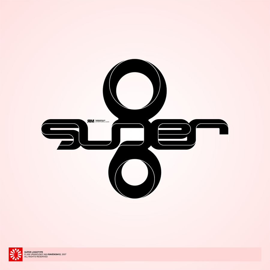
yet another logotype...this time a little play with fake 3D look and lines... I kind of like this one.
Related content


Comments: 58

Super! 
👍: 0 ⏩: 1

beautiful visualation but reading of type is like sunger.
sunger in turkish sponge
👍: 0 ⏩: 1

thaks...
I know, it's rather a visual experiment than a logo.
👍: 0 ⏩: 0

Seriously, this is one of the best works i have seen for logos yet. You are very talented!
Take care and good luck on future projects
Marius-
👍: 0 ⏩: 0


nice effect. did you just expand that out from a stroke? looks good. not sure on the two shapes top and bottom though. great flow as usual though
👍: 0 ⏩: 1
thank you. yeah, I did, basically. the original logotype is longer, say's "superlover" and is without those shapes. But since the guy I did it for didn't want to use it anymore, I turned it into more "picture-like" logotype by making it shorter and adding those two shapes. They are making it much more 3D, in two more dimensions, it really works better with them then without. thanks for the comment...
👍: 0 ⏩: 0

Stunning, after 2 months, still my favorite on here. AMAZING!
👍: 0 ⏩: 1
No problem....you are one of my faves on DA!
👍: 0 ⏩: 0

thank you very much, i'm glad you like it!
👍: 0 ⏩: 0


WoW!!! Really nice logotype!
Can you help me to make small logo for free?
👍: 0 ⏩: 1
thanx a lot mate, I'm glad you like it!
I'm sorry but I'm drowning in work right now, i don't do logos for free anymore becouse there's too little time and too many people who want something...
👍: 0 ⏩: 0


")


diky!  (Smile)")
nevim jestli napady, vse to vznika zasadne prirozenym vyvojem a citem, nikoliv silnejma vizema
👍: 0 ⏩: 0

thanks a lot mate, glad you like it...
👍: 0 ⏩: 0


logo for no use except of my portfolio...
personal logo-practising.
👍: 0 ⏩: 1

I love the way that the logo is displayed, the prespective idea is really nice and its pops the logo, +Fav
")
👍: 0 ⏩: 1


Just some simple lines takes this mark to an entirely new level. This is great.
👍: 0 ⏩: 1
that was the point
👍: 0 ⏩: 0

nj nejak jsem nemel co delat v poslednich dnech... tak to dopada kdyz clovek nema net
👍: 0 ⏩: 0

| Next =>