HOME | DD
 spiceofdesign — Phone Concept (elementary)
by-nc
spiceofdesign — Phone Concept (elementary)
by-nc

Published: 2013-05-27 13:36:16 +0000 UTC; Views: 15567; Favourites: 97; Downloads: 166
Redirect to original
Description
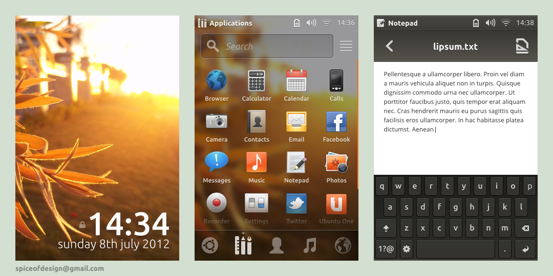
An elementary phone concept design, using a single physical home button. (Numbering top to bottom, left to right)1. Standard application view (application name & symbolic ion in top left, system indicators on top right, then main toolbar and application content)
2. Application launcher (opens on single press of home button, double press auto selects search field)
3. Notifications (standard drag from top, possibly add WiFi/Bluetooth/Rotation etc toggles here)
4. Incoming call (same as standard popup view)
5. Running applications/application switcher (accessed by long press of home button - needs work since it is basically the same as android currently)
6. Lockscreen (could do with notification support)
UPDATE 28/5/13
Changes
1. Smaller status bar, app name removed, clock centred.
2. Function toggles and larger notifications.
3. Full screen call interface with icons instead of text.
4. New application switcher idea. Far from done, but a definite improvement over the previous one.
5. New lock screen with notifications, emergency calling and quick camera access.
Related content


Comments: 45

👍: 0 ⏩: 0

I feel like the bars are too big. The idea is cool though
👍: 0 ⏩: 0


")

This is pretty cool! I was thinking this days of a eOS Mobile concept, got a lot of ideas but not the time to make a mock up, hope we can see more of this
")
👍: 0 ⏩: 0

This is the concept design that I live for. Amazing work!
👍: 0 ⏩: 0

Nice! An elementary launcher for Android with the same design as this would be sick!
👍: 0 ⏩: 3

No, a whole rom would be sick.
👍: 0 ⏩: 0

Make two replies about this, hehe and a version for tablets would be great too!!
👍: 0 ⏩: 0

will be better when you doing launcher on android
 (Smile)")
👍: 0 ⏩: 0


I just can't handle how everyone keeps using the old Twitter logo, despite the new logo being already included in the elementary icon theme.
👍: 0 ⏩: 1

I'll fix it in the next iteration. I managed to fix the Facebook logo, but my copy of elementary icons must be out of date.
👍: 0 ⏩: 0

Hahaa, I was going to make a elementary phone concept....Now you have already got there before me...
Awesome job anyways!
👍: 0 ⏩: 0

Cool updates- I really appreciate how much detail you put into the simplicity, here. It's really coming together. I definitely like the lock and app switcher screens more. The consistent use of dark bottom toolbars for system-side navigation is a great idea, I think. Helps the user 'feel' what mode their in instead of guessing.
👍: 0 ⏩: 0


this should be ported as a MIUI theme, could be possible?
👍: 0 ⏩: 1


Very cool!
I think maybe the vertically padding in your toolbars is a bit too much.
I'm not sure I'm in love with the statusbar. It feels too tall (I think it's about half that size on iOS) to me and I'd like to see the e logo removed.
I think the notifications screen is your strongest one here. It looks really slick. But I wonder if we can't fit more notifications on screen with a more minimal design and I agree it could be handy to have other kinds of quick actions available.
I would definitely consider adding things to the lock screen that you'd want to get to quickly like music controls and the camera. Another thing to consider is getting rid of the statusbar background and overlaying the icons directly to the wallpaper. Also, your clock is duplicated ")
I think I'd definitely like to see incoming call buttons with symbolic icons instead of text and with the primary action on the right side. What do you think of having a more photo-centric design like this? [link] also what about taking it full screen like this? [link] Another thing to consider is a way to decline the call, but still take action such as reply with a text message or set a reminder to call back (killer features in iOS)
There was a super kill multitasking video concept floating around but I can't find it right now, I'll try to dig it up so I can link you.
👍: 0 ⏩: 2
The vertical padding is to emulate the look of elementary OS as closely as possible. The click able area for each would still be the full height of the bar, and so would not suffer from the smaller appearance, but would still have the slicker small appearance opposed to a larger clumsier button.
I think the main reason is due to the symbolic icons and text indicating what application you are in that makes it so large (although I've just realised one of them is wrong). The e logo is really necessary, I just didn't have a replacement icon for each of the other things (ie I don't have a logo for incoming call, slingshot, notifications, running applications or a lock screen). Moving the clock would make sense in that it would be the same as elementary OS.
I think the notifications could easily be made larger with a cut down design and the addition of switches should be fairly easy.
The lock screen is one I am note entirely happy with. I think rather than worry about duplicated text it would be better to just get rid of the bar on the lock screen and utilise larger indicators beneath the clock along with notifications.
Incoming call with icons make sense (although I cannot find elementary phone symbolic) and is what I would have used had I got the icons. I also was going for a much larger photo, if not full screen, but I was too lazy to get another photo that was big enough. I think the options for declining can be a separate page, since an action like speaker phone would not be useful until the call was answered, and so sending a message would wait until the call was rejected, otherwise the primary function of the page (answering or rejecting a call) would be confused.
I would say the multitasking is my least favourite of the different screens, since there is no much potential to me innovative here.
👍: 0 ⏩: 1
If you look at the toolbars in the desktop apps, there really isn't that much vertical padding. I think you could save a few pixels there
I'm not sure having window titles is really important, to be honest. I feel like most apps should be fairly recognize-able by their contents.
I dunno, I actually scaled down the clock a bit in my mockup as compared to what is in the desktop lightDM just to make more room for notifications xD But definitely I want to explore some more lock screen concepts. Especially unlocking. I hate to just grab the more-or-less iOS and design and say "yep this is good."
Ah, we inherit GNOME icons in some places. I'm still working on making the theme completely independent.
What do you think about the swipe-menu thing that iOS does? I saw a concept where someone showed options for answering the call as well so you could for example answer a video call as "audio only".
Did you see that page I linked? The concept seems really cool. I'm wondering though, if it wouldn't be good to just use the same kind of window overview as we have on the desktop. Would the thumbnails just be too small?
👍: 0 ⏩: 2
Updated with some of your suggestions implemented, with some semblance of a card system implemented without the scaling issues to make it blurry.
👍: 0 ⏩: 1
Hey I just updated my mock. I've been thinking about the lock screen a lot. Let me know what you think
👍: 0 ⏩: 0

The vertical padding on his mockup is 12px, which is the same as in your unified titlebar and toolbar?
👍: 0 ⏩: 0
Found the app switcher concept: [link]
👍: 0 ⏩: 0

It looks very nice, but can be improved. For example, I think that a "slingshot" should be always fullscreen in a phone, because with that margin you loose too much space. Also, I like the concept of the "gear" icon at top, but the "back" button at top is not a good idea, because people use's a lot, and it's hard to reach with fingers, it should be at bottom... it's a big design/usability problem.
The best of this concept here, to me, are the notifications, it's just gorgeous, simple, clean.
👍: 0 ⏩: 1
The slingshot as a popover makes sense as opening another application does not close the other application, and so being able to view the running application in the background allows you to see this. The size reduction in either dimension is very small (24px) at even 320px across, which is a fairly low res screen by today's standards.
It doesn't make sense to have a place to go back separate from the application since you are going back in the application, so it is clear how to return to a previous screen. A universal back button can have multiple meanings, for example undo, return to previous app, or a simple return to previous screen as it shows here. Having a back bottom specific to the application but not on the top toolbar just wastes more space.
👍: 0 ⏩: 1
I didn't said it would be an universal back button, it can still be an app button, but at bottom, with the "gear" button at bottom also, for example, in that way, it uses the same space.
About the margin, I still think it's too much space reduction.
Usability > Design
👍: 0 ⏩: 2
The touchable area for the button is still the full height of the toolbar, and so the touchable area is not too small and the sleek look is maintained. Moving all the buttons to the bottom would not make sense from a hierarchal point of view since the content would be be above the navigation controlling it, not to mention that it is meant to mimic the desktop experience. I don't think that the design should always be compromised for the usability, and as I don't feel the usability has been compromised has here then the design is fine.
👍: 0 ⏩: 0
Usability *IS* design
"Good Design Makes a Product Useful : A product is bought to be used. It has to satisfy certain criteria, not only functional but also psychological and aesthetic. Good design emphasizes the usefulness of a product while disregarding anything that could possibly detract from it." - Dieter Rams
👍: 0 ⏩: 1
Im talking about "graphical design"
... context
👍: 0 ⏩: 1
Yea no. That statement is nonsense in any context. You could say it's bad design or that he's prioritizing aesthetic over functionality, but usability is part of design.
👍: 0 ⏩: 1
The confusion is because in spanish (or at least in my country) we sometimes use the word "design" for the "aesthetic" design, or graphical design as we say, depending of the context.
👍: 0 ⏩: 0


I love the SMS app and Notification panel. Great work all around!
👍: 0 ⏩: 0

I'd say this looks very elementary- iOS is far too gaudy in comparison. I like how you've taken some of the core concepts, such as Slingshot for launching apps instead of wasting the homescreen by showing shortcuts there. I will say, though, that the running apps list looks a bit distracting. I understand why you have so much horizontal space between them, to be aligned if you have an especially long app name. However, the half-hidden slab implies that you're supposed to slide it over, or there's something yet to be seen on the right edge.
Unless that is the plan, I think you could simply place the app title above each slab to separate them, showing the whole slab. The issue with that, of course, is how much extra vertical space you'd need for it to feel comfortable- it wouldn't look so much like a stack of cards, anymore.
At any rate, awesome imagination of a consistent eOS phone experience. It's very difficult to adapt, even with elementary's focus on minimalism.
👍: 0 ⏩: 1
I'd say the application switcher is one of my least favourite screens along with the unlock screen. The application switcher is one of the harder screens to design, although I may move it to a more webOS card style switching with a plank style dock.
👍: 0 ⏩: 1
I'm especially fond of webOS's cards and stacks. It's a multitasking model I don't think has been replicated in a good way ever since. Of course, the way Sailfish OS handles minimized apps looks appealing and serves an actual function beyond a preview, which I like. It's sort of like having a bunch of simple, minified apps in case you're not really planning to get deep into the device- I wonder if something like that would be relevant to elementary on a phone, like acting on dock indicators. Then again, that feels somewhat contradictory to a minimal attitude.
👍: 0 ⏩: 0


Nice, although perhaps borrows a little too heavily from iOS in some respects (the lock screen for example, which looks nice but would probably be very easily to accidentally unlock).
👍: 0 ⏩: 1
I would say much of what makes it look iOS like is probably due more to the elementary style, as certainly both the application switcher and the notification centre are far more android inspired, and the call screen and launchef are both fairly generic. Although the application shown is quite iOS like, this design is still largely based upon the recent elementary designs with integrated titlebars. The lockscreen I'm not that happy with as I wanted a reasonably unified experience with the desktop and this is the screen I feel diverges the most. I also wanted to integrate notifications, emergency calling and quick phone access, but that will have to wait until a later revision.
👍: 0 ⏩: 0