HOME | DD
 spiceofdesign — Presentation Software Concept

Published: 2010-09-26 20:24:27 +0000 UTC; Views: 10959; Favourites: 31; Downloads: 864
Redirect to original
Description
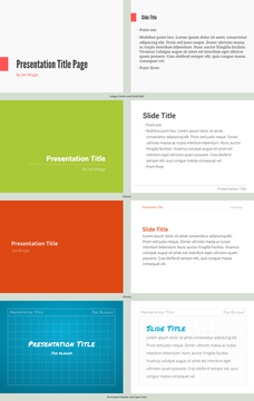
This is a concept for a presentation app for Linux. Currently there are no simple, easy to use solutions, and so I decided to make this concept.Edit 27/9/10
Changed print button to show presentation. Fixed text on sideshow.
Made in Inkscape 0.47
Related content
Comments: 23

With some tweaking you can make libreoffice impress into a very impressive presentation app visually. Dare I say it compares to keynote even...
👍: 0 ⏩: 1

Yes, but with some tweaking. I should just be fast, easy and beautiful by itself, without having to be hacked apart. We should design and develop for the new, inexperienced user primarily, as this is how the open source grows, with new users, not existing ones. Have you seen my LibreOffice Impress template concept: [link] Also I'm working on a new interface for the computer that the presenter is using to control the presentation.
👍: 0 ⏩: 0

[link]
i once tried this for a school presentation. filled with bugs but a very promising project.
👍: 0 ⏩: 1

I have used ease, but it just has too many gaps.
👍: 0 ⏩: 0

This is _such_ a necessity for Linux, and Ubuntu/elementary in general.
OpenOffice/LibreOffice, for the time being, are laughing stocks compared to Keynote for Mac and PowerPoint for Windows.
Linux NEEDS a good presentation app..
If I knew a solid heavy desktop-grade programming language (I know python and web stuff), I would LOVE to write/collaborate on the writing of this app.
Heck, I even feel inspired to learn Vala just to write this app..
Fantastic work; Linux needs more visionaries like yourself.
👍: 0 ⏩: 1

Thanks, I do think that Linux severely lacks a decent presentation app. If this mock up becomes reality then I need to make it simple, because most of the other ones shove in features you don't need.
👍: 0 ⏩: 0

Interesting stuff!
My main problem with this one is how crowded the toolbar is. The text-formatting looks kind of shoe-horned in. I would instead put "Add textbox", "Add list", "Add image" in the toolbar, and use modal toolboxes for formatting, as you mentioned in the comments.
Apart from that, good work!
👍: 0 ⏩: 1

I think that what you say is true, however many end users do not use many of the advanced features and are confused by all the options and so this makes them feel frustrated. I have come up with the solution of when the insert object button is clicked a toolbar with all the options will appear, until the user decides to close it. I think most of the user interface should be available through modal windows (ones that only appear when an option is selected ie a text box).
👍: 0 ⏩: 0

Yep. Another everyday app that needs to be redesigned. The only thing that's missing is some tools for creating things like textboxes and stuff. But it's pretty clear as to how you'd probably implement those. Good work! The Elementary way very much works with presentation software
👍: 0 ⏩: 1

Thanks, I'll consider that. It is a commonly used feature, and it might be useful to add a button to do that. Another option is to have a toolbox, for things like text boxes, picture, charts
👍: 0 ⏩: 1

One thing that does bother me about alot of elementary-ish mockups though is where does all the in-depth options and configuration go, or is that not to be implemented at all? The idea so much is probably hidden away in right clicks and dialog windows is kinda concerning because the user might end up digging through alot of the interface to find something. Or perhaps you feel confident that that can all be done consistently and be intuitive?
👍: 0 ⏩: 0

Nice. What are the lines next to the font name? What is the button with all of the stuff on it and a plus sign and the one next to it? Don' think there should be a print button in the toolbar; no one prints presentations.
👍: 0 ⏩: 1

The lines are the alignment i.e. Left, Right. The first on with a plus is insert. This button would bring up a dialogue box, where you could pick which file you wanted to insert, and depending on the type of file, how you wanted it to act. The one after it is insert new slide. I think I'll take out the print button and change it to start presentation.
👍: 0 ⏩: 1

Insert button has too much stuff on it. Use a regular plus sign? Nice update.
👍: 0 ⏩: 1

I'm still working on this one. What I am doing is changing it so that a toolbox comes up when the insert button is pressed, which could be very useful when inserting lots of things at one time. I'll also consider your idea to revamp the insert button, but I think that just a plain plus symbol might be confusing to users.
👍: 0 ⏩: 1

Thought the plus sign would be confusing too. That's why I had the "?" Anyway, if I come up with a better solution, I'll comment. There's a lot more to mock up in a presentation program. How are you going to handle all of the actions contained in menus, toolbars, and in ms office 07 & 10, ribbons?
👍: 0 ⏩: 1

Most feature are not used, so I think most of the interface will be in modal windows and toolboxes, more like Adobe software. One thing I still need to sort out / come up with a solution for is animation, which is fairly high up on most users wants (although in my opinion simple fade in/out). The look of a slide show will be defined by a theme, which will be chosen when a new presentation, with the ability to create custom template in other software (I'm thinking in SVGs (with embedded .pngs if necessary) or html & css with custom blocks). This theme could also be changed later on via the preferences button.
👍: 0 ⏩: 1

Keynote inspiratoin, huh? It'd be cool to use html and css and svgs. Totally open and this could enable the viewing of presentations cross-platform with no other software. (As long as you didn't uninstall all of the web browsers on your system, including the default ones) IE9 can do svg, but most people won't be using that...but image being able to to gradient text and stroked elements with shadows with little developer work (use code from inkscape or something). I think the custom template should be made in the presentation software, so it'll be easier for users. The thing I don't like about themes is that it makes people have a bunch of presentations that look the same--no originality or uniqueness. Yeah, doing animations would be harder if you use html and css, though css transitions are getting implemented in browsers, but as always, IE is a huge brick wall. Javascript could accomplish this, but IE has a super-slow javascript engine and I'm wondering if more complex transitions would lag. Again, thanks to the guys at microsoft.
👍: 0 ⏩: 1

If we went with HTML and CSS, the advantage would be be the ability to share it virtually anyone online.
👍: 0 ⏩: 0


