HOME | DD
 spiceofdesign — Tablet OS concept version 4 ideas
Published: 2012-01-07 13:10:16 +0000 UTC; Views: 3267; Favourites: 23; Downloads: 66
Redirect to original
Description
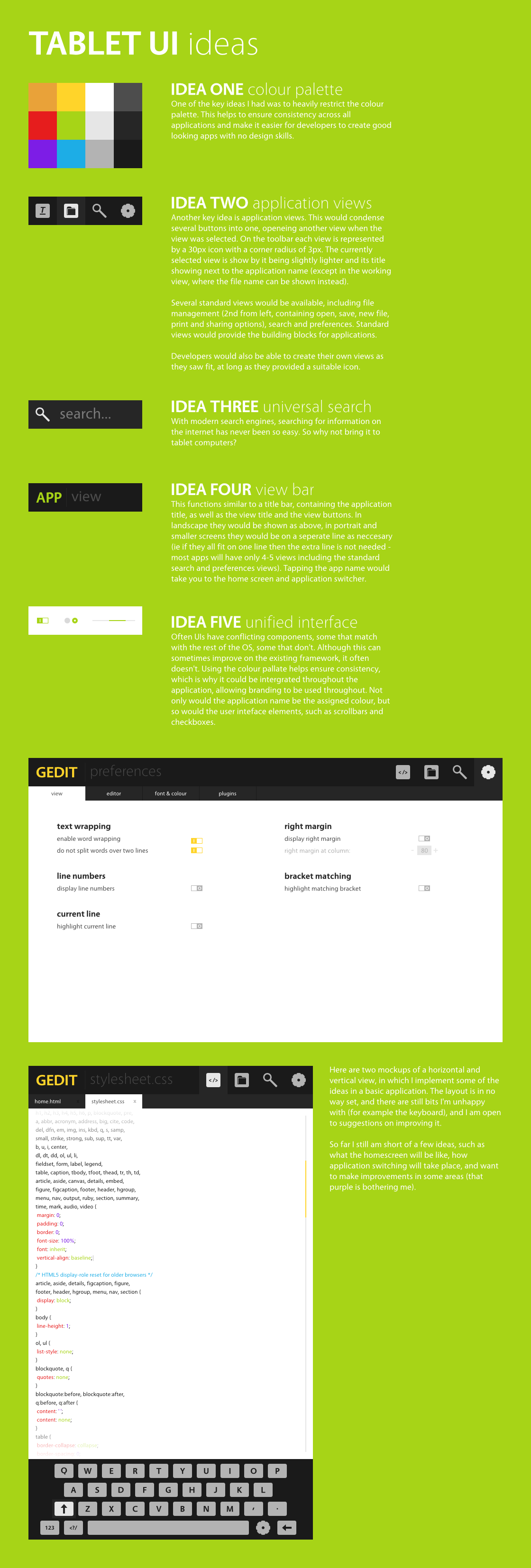
This is just some ideas I had written down, put into a massive image.Made in Inkscape 0.48
Time: 6 hours
Related content


Comments: 23

Hi, would you mind if I used this as a design for a website? It won't be commercial, but I would love to use it as a foundation as it looks stunningly amazing to me.
The website is supposed to be a way of administrating a multi-purpose server and is intended to be expandable with the help of plugins.
👍: 0 ⏩: 1

Sorry, but I'm currently working on using this (or something similar) for my website, so its a no. Is it sort of like Fork CMS, but for servers rather than websites? I would be interested in designing a mockup though (as long as it is an open source project). Send me a note with more details.
👍: 0 ⏩: 0

I like your abstractions. And UI. yess it really looks like zen mood. Awesome
Do you touht about other screens like home screen or the launcher screen?
👍: 0 ⏩: 1
A little, mainly the views (applications, notifications, running, search and preferences)
👍: 0 ⏩: 1
 (Smile)")
Well currently I'm working on Tap (176 48px icons, if you count all the sym-links I have to put it) and my new term starts back tomorrow, so it may be a while (not to mention the 2 exams I have in the next fortnight).
👍: 0 ⏩: 0

I wish I was in a position to hire you! Lovely interface you've got going there. Those ideas are spot on. Oh and it's "opening" not "openeing"
👍: 0 ⏩: 1
Thanks for pointing out the mistake, I'll correct when I can find it.
👍: 0 ⏩: 0

I imagine that this has come from noticing all the bits and pieces in Android and such that annoy you. I often do that, I get so obsessive about clutter and having control that I put my phone down for a day and get it out my system by redesigning it ")
I have to say i was confused when I simply read the design specs but when I saw it, obviously it was clear. I really like the idea of the program name and a descriptive subtitle of the view your in on the left, with toolbar buttons to the right that act like a menu, and tabs on the next line down that pertain to the toolbar button you currently have clicked. It's a great use of space I haven't considered before. It's a titlebar and menubar (but iconised) in one.
I don't see what the problem is with a colour scheme, you may find it limiting if you need an item to be represented by an appropriate colour and you don't have it but it'd maintain consistency and it's not like android and others don't try to have one.
Any chance I can trouble you for the hex colour codes of the greys?
I'd love to see another program mocked up on this interface, a web browser would be a challenge, just thinking about all the tabs and toolbar buttons.
Keep it up
👍: 0 ⏩: 1
The colour palette shown isn't final, and not necessarily that small. I hate that purple and I'm not too keen on the red, and there is still a lack of some colours (ie there is no brown).
I also can't think of where I'm going to put the toolbar buttons. I would probably split it up into browser view, search view with custom search engines as tabs and the standard preferences view, with maybe a joint history/downloads view.
I am also puzzled as to how many physical buttons this interface would require. So far, I think a view bar button, that hides and shows the view bar, possibly a menu button, and maybe a home button.
Colour Hexes
Orange - #e9a239
Red - #e61d1d
Purple - #7d1de6
Blue -#1dade6
Green - #a7d417
Yellow - #ffd42a
White - #ffffff
Light Grey - #e6e6e6
Medium Light Grey - #b3b3b3
Medium Grey - #4d4d4d
Medium Dark Grey - #262626
Dark Grey - #1a1a1a
👍: 0 ⏩: 1
So are you thinking about hardware as well as software? I prefer the idea that all the tech sites are rumouring for Apple devices, no physical buttons (I.E. [link] ).
As for toolbar buttons, you've turned many useful menu items into toolbar buttons so what not reinvent again? What can't you do with a long-press/right-click or gesture that's served better as a virtual button?
I'd definitely like to see some more.
And thanks for those codes! I'm building my own palette at the moment and a few of these are the shades I want.
👍: 0 ⏩: 1
I have started on the browser mockup, although the icons are taking forever to design. I'll send you a note when it is nearly finished.
👍: 0 ⏩: 1
Awesome
They always start small and grow
I'd love that, thanks.
I just wish I could mock up as good. I've got about 30-40 pages of designs but in pencil. Inkscape is archaic and complicated and the rest just aren't good enough. I've tried to learn but after some time away I've forgotten it all
 (Wink)")
")
👍: 0 ⏩: 1
Most of it is just being very strict with measurements and using the grid and guides LOADS. The best tool is probably Align and Distribute, probably followed by the path operations. Feel free to send me anything you want me to have a look at.
👍: 0 ⏩: 1
It just takes more time than I have to learn. Everything has fallen by the wayside due to a lack of time, except for paper mockups because I can do them whilst sitting around at work or on the train or in bed. Is it sad when you're life is defined by those three places? Bed, train, work, bed? lol.
The best I did was the web browser mockup in my gallery but that used a mockup kit that I just hacked in inkscape (and not well). I found a cool app called "Pencil Project" that's very useful.
👍: 0 ⏩: 0


I think your widgets are too small for a tablet interface.
👍: 0 ⏩: 1
Maybe, but I'm still just playing with ideas
👍: 0 ⏩: 0

I agree! Although I think the notion of a limited color palette equating to good design across the entire system is a bit naive, unless more restrictions concerning spacing and fonts and such were imposed.
Overall, this looks really interesting.
👍: 0 ⏩: 1
This is only the first set of ideas, and the spacing will will be included in the next set, although I did mention it somewhere.
👍: 0 ⏩: 0
