HOME | DD
 spiceofdesign — Ubuntu Concept 2
by-nc-sa
spiceofdesign — Ubuntu Concept 2
by-nc-sa

Published: 2012-03-25 19:08:25 +0000 UTC; Views: 21461; Favourites: 96; Downloads: 260
Redirect to original
Description
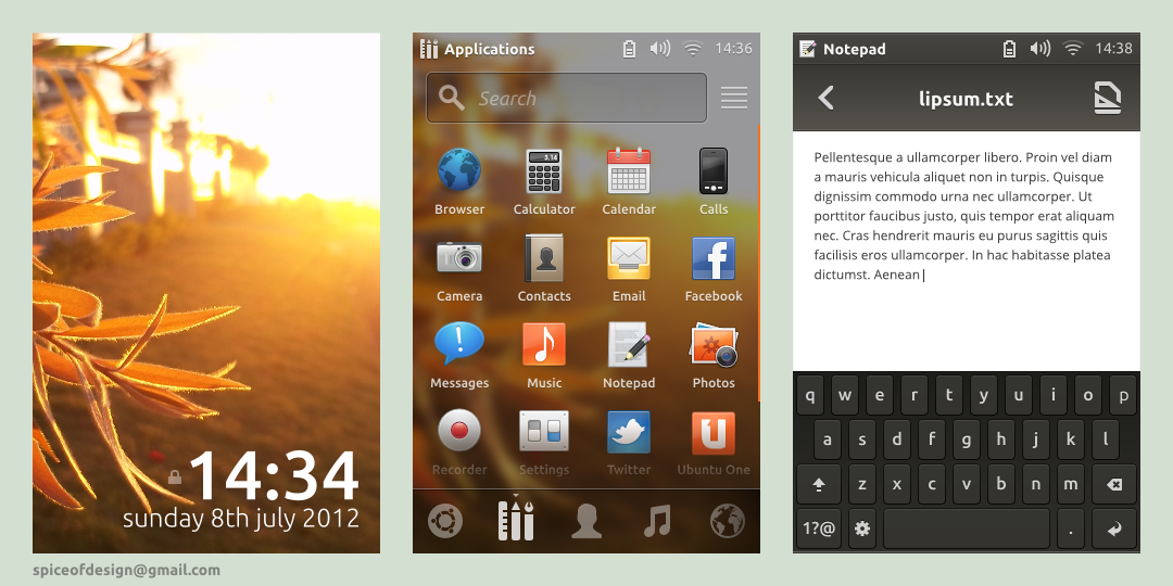
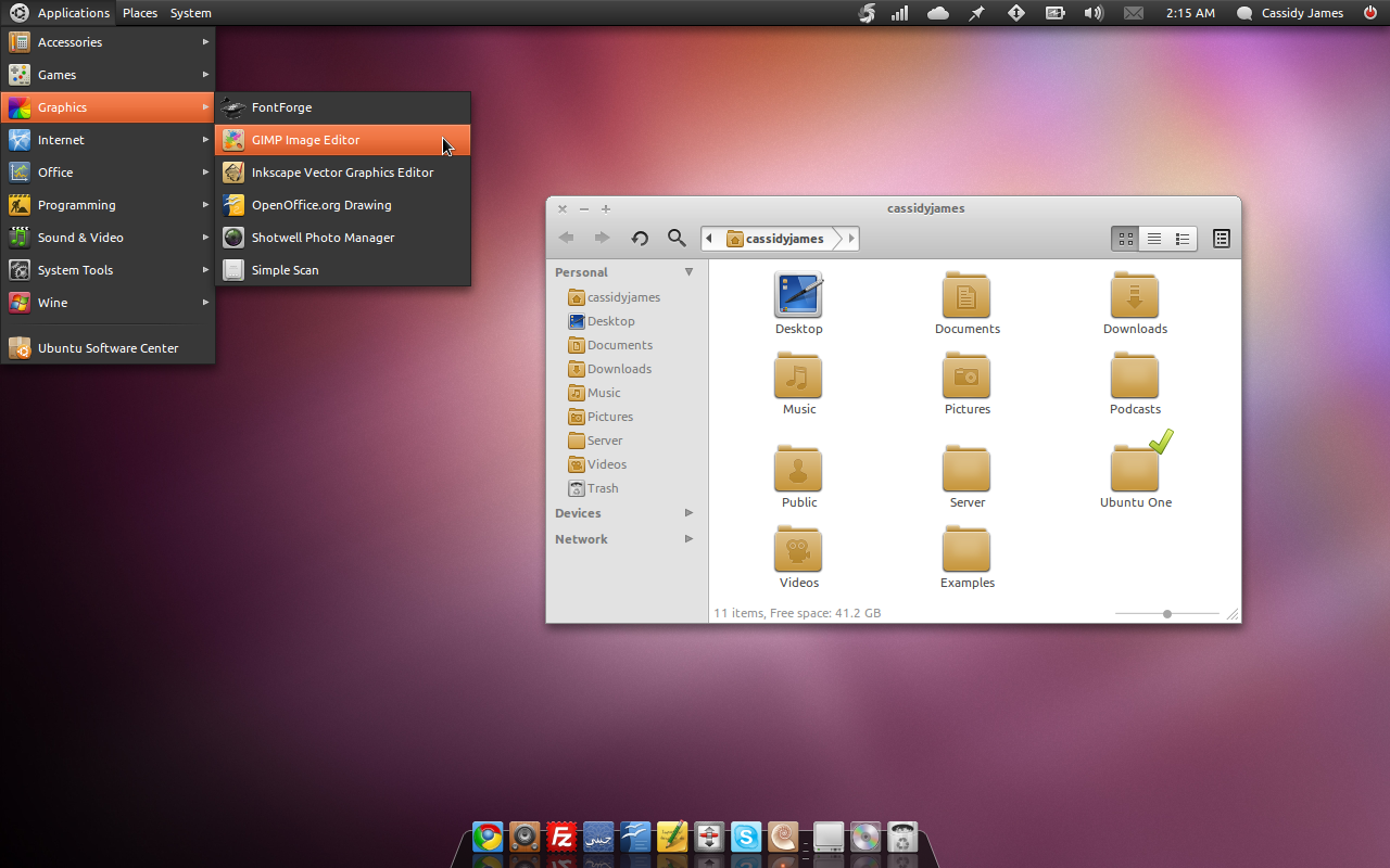
The first screen shows a login screen, with preferences and accessibility settings in the top right corner.The second screen show dock settings, with the option to add docklets (like docky has), including workspace switcher, trash and activate dash button.
The third shows a view where the dash has been activated and the applications lens has been selected, but no search has been made yet. This would show all of the available applications, letting users see what they have installed, which is more difficult to do in the current system. The application has its named displayed (but stripped of any purpose, eg Gedit not Gedit Text Edtor), so that each app has its own individual branding, but each with a short description that tells users what they can use the app for.
Made in Inkscape 0.48
Massive 21.3 MB svg
Related content


Comments: 53


(1) The Dock Settings (Launcher Settings in Unity terminology) tool is a must need. Unity Tweak Tool provides most of these settings but not in as straightforward manner as your concept. And also, Unity Tweak Tools isn't included in Ubuntu by default yet.
(2) The login screen looks great too. But, i'd rather have something similar to current Unity Greeter login screen, but with user icons and more Unity like feel. I wish if Unity Greeter was themeable and we could change themes like GDM. That being said, Unity Greeter is more like a theme for LightDM, with some GTK engine or HTML engines as alternatives.
(3) Your concept Application lens doesn't look so good to me. I like the one from Ubuntu 13.10's Unity 7. But, like you said, the App lens should show all available apps in a expanded view by default.
Great concepts, you should contact the Ayatana Project design team at launchpad!
👍: 0 ⏩: 0


i'm made a theme based on this concept and based on pantheon-webkit-gretter
👍: 0 ⏩: 0


I hope Canonical will use this concept for Unity!
👍: 0 ⏩: 0

Someone should develop LightDM's greeter...
Very good!
👍: 0 ⏩: 0

Very, very good. I like the indicator without panel which remains visible when the window is maximized.
In the dash, put Lenses on the left side instead of down.
👍: 0 ⏩: 0


Great work, I just published it in my Linux Customization pinboard on pinterest : [link]
👍: 0 ⏩: 1


This is a million times an improvement over the current Unity design. I'd surely preach this to anybody like a mad priest if this would be implemented.
👍: 0 ⏩: 2

I jumped off the unity ship the day elementary Jupiter arrived.
👍: 0 ⏩: 0
This would certainly break globalmenu though which is very important for apps such as Libre Office but I think a combination of LIM and HUD could more than make up for that. How would you integrate HUD into this awesome design?
👍: 0 ⏩: 1
Maybe like gnome search where the search box comes from beneath the title bar.
👍: 0 ⏩: 1
Globalmenu I think is very useful on small screens, but on large screens higher resolution is not practical especially when using the mouse.
The Menu Bar could be shown in place of the Title Bar when the application window has the focus. The title of the window only show when the window has no focus. Do you think?
👍: 0 ⏩: 0


very amazing, it will be good with the first concept you made and the mock-up of musl1m to be integred in ubuntu tablet OS
👍: 0 ⏩: 0

Wow, so high fidelity. You almost make me wanna' use it again. XD Great attention to detail- I'm sure it took a while. The number inputs might look neat with GTK's new spinbutton design.
👍: 0 ⏩: 0


I just want to point out AriOS, see a review here : [link]
It already uses pretty much the kind of interface you're presenting here (altho it's not as nice...).
Maybe you could try contacting the guy behind this distro to talk about your designs...
👍: 0 ⏩: 0


Excellent mock-ups @spiceofdesign! I hope Canonical take note, this should be the end-game for Unity in my opinion.
I do think, however, that the in-panel window controls should be as bright and of the same style as the indicators in your mock-ups. The current, faded, in-panel window control(s) look a little too understated in my view. Also, the in-panel window controls (i.e. Unity's top panel) should dodge the launcher along with the rest of a window (when maximised). Although you've not included a mock-up of a maximised window in this round of mock-ups, and I'm too lazy to look back at your first round of Unity mock-ups to see if you tackled it there.
👍: 0 ⏩: 1
Changing it to the same styling as the panel icons could be interesting. The first mockup had the solution (icons on top of the dock).
👍: 0 ⏩: 1
"The first mockup had the solution (icons on top of the dock)"
Well, not exactly what I was suggesting. What I mean is, that the launcher should encompass the entire height of the screen, such that when the launcher is revealed (whilst a window is maximised) both the window 'content' AND the window controls/panel dodge it. At present, Unit fixes the maximised window controls/panel.
Again, very beautiful mock-ups. I *really* want to see these implemented. Such might turn my head with respect to Unity (which I currently don't use).
👍: 0 ⏩: 1
Me neither (I'm still on elementary Jupiter, eagerly awaiting Luna)
👍: 0 ⏩: 0

True about the borderline, but I don't know could you add a shadow or something (just me being picky).
And about the dash I would like it to be on the dock by default and then remove it not vice versa.
I would love to see your interpretation of the dash button on the dock but that's all up to you.
👍: 0 ⏩: 0
hopefully the "dock" here isn't the default. Hiding the dash button could be confusing for first time users since it's purpose should be a hub for apps and other social, media, aesthetic reasons.
Also I'd like the dock to not have a borderline when there is no active apps. Make it blend in with the background.
It'd also be nice to have a back lights option to turn on and off. Hope I am not the only that likes it for default icons (hate it when it's enabled for faenza though).
👍: 0 ⏩: 1
The option to enable it is there, meaning people that want it can enable it, but those that don't can disable it. The hiding the background could be confusing since users from other operating systems would think they were desktop items, rather than a dock. The backlight option could be available (although probably looking more like the one Docky uses).
👍: 0 ⏩: 0

Your ubuntu concepts are really heading towards perfection. Minimalistic, Usable and Elegant
👍: 0 ⏩: 1

very good.
just wanted to say my unity launcher looks like that already, I cleaned the launcher icons of all the rounded squares, colored backgrounds, elliptical dash launcher icon, etc.
I hate the current dash, where you have to click 4 times before launching an application.
I really like your UI, even the wallpaper helps.
👍: 0 ⏩: 2
Thanks, the wallpaper was really simple to make (although a little processor intensive). All I had to do was draw some freehand shapes with the pencil tool then apply a massive blur to each one, export then add noise in GIMP.
👍: 0 ⏩: 1
the noise looks really good!
👍: 0 ⏩: 0

How, may I ask, did you do that?
👍: 0 ⏩: 1
simpler things like background color and border color I disabled in ubuntu tweak or compiz settings manager, I can't quite remember, one of them does that, maybe both.
but the squares and borders themselves, I found the .PNGs in /usr/share/unity/4. I substituted a bunch of them with blank PNGs, experimenting them one by one (some aren't so obvious), until I got the look I wanted. I could even design a completely different dash, but I wasn't into that, just wanted a more appealing launcher.
be sure to backup the original folder before you change anything.
👍: 0 ⏩: 1

I would love to see this come to reality! Your design manages to successfully separate the desktop environment's functionality and the running applications. Unity tries to incorporate these two areas into one - the global menu and other areas of Unity. They have two very different design directions which they try to merge but you instead separate these two, making it visible what belongs to the user (applications) and what belongs to the DE.
This is the same idea that is in GNOME-Shell, really making it apparent what's what (All the DE elements are black or transparent-black) while the windows have the GTK-theming. It looks like Pantheon is also attempting this approach.
I love that the workspace switcher is in the bottom corner, really making use of the of the screen's corners and edges (Fitt's law). Though I wish that the settings application get integrated into the shell (like Unity and GS) since it would further separate the DE from the user's applications. I also wish that there was a successful merge of the workspace switcher and the "spread"-view so that only one method/interface is used for window switching (except the dock).
The one thing which I've been trying to get rid off in Unity is the Trash in the launcher. People rarely access their trash so often that it's needed in the launcher but the main reason for it being there is discoverability and familiarity. Can't it be integrated into the Dash instead? Don't know if that would be a good idea since it's used for searching and not really managing stuff but it's an idea at least.
I'm still not entirely happy with that there is no way to access the Dash from the UI. If the trash was located within the Dash instead maybe the launcher could take it's place in the dock? Or maybe it could just be more apparently located in Nautilus?
Maybe the workspace switcher could a part of the Dash, like GS's overview is doing, and the trash be made more apparent in Nautilus (really quick and dirty mockup: [link] )? I think this can be done
I'm just throwing out ideas here and hope that you think some of them can be of use  (Smile)")
👍: 0 ⏩: 2
The only reason I separated setting from the dash was so you could see the effects on the dock whilst you were changing the settings. In the settings there are options for what applets you have available, as well as the ability to disable them.
👍: 0 ⏩: 0

I think that the Rubbish Bin is evident enough in Nautilus, but I agree with you, there's no need of an icon of it in the launcher.
👍: 0 ⏩: 0


| Next =>