HOME | DD
 T-Wiz —
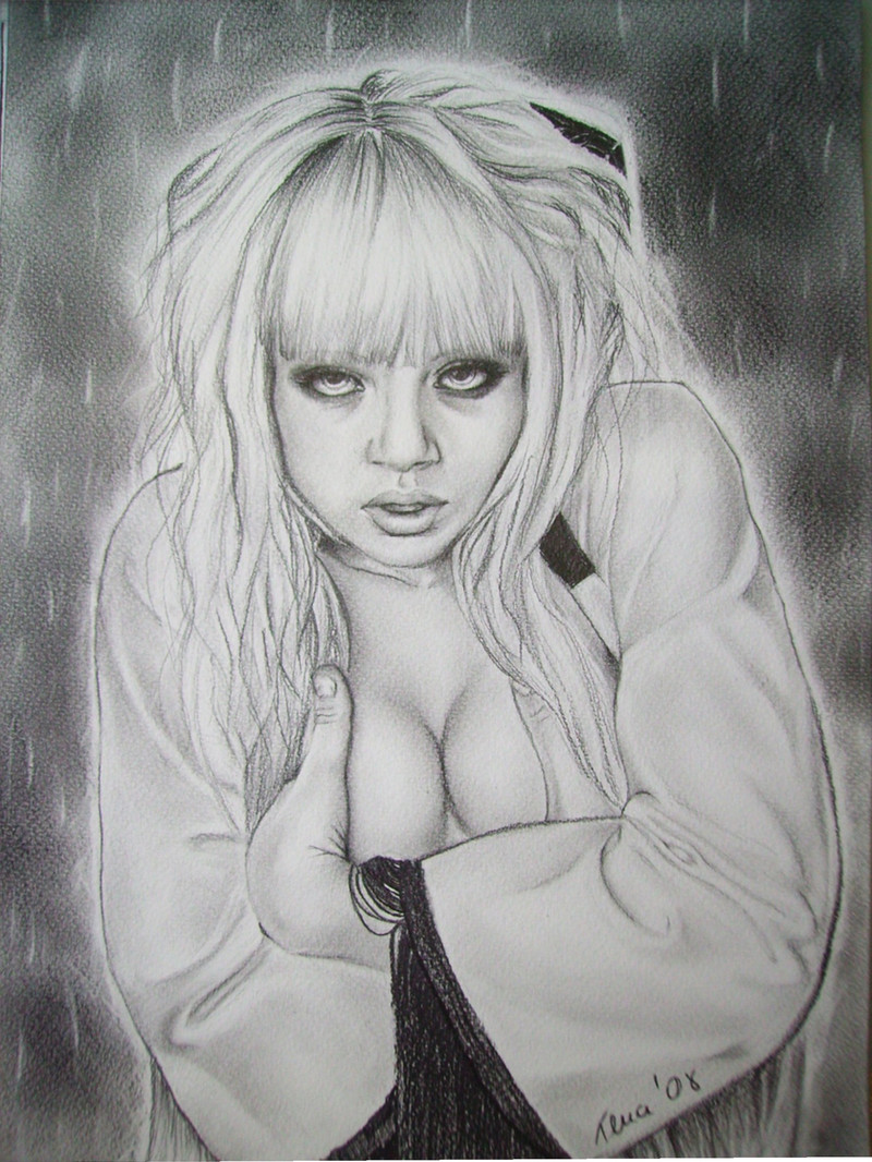
Tempted
T-Wiz —
Tempted

Published: 2005-09-03 18:38:15 +0000 UTC; Views: 10748; Favourites: 262; Downloads: 2588
Redirect to original
Description
TemptationImagery like this is expected to pull a lot of different feelings out of us pathetic creatures, the majority of which will most likely revolve around temptation. A look like this is bound to attract attention. Ask yourself without thinking too much, “Who’s tempted?” Is it her because of you, or you because of her? I suppose the answer depends on the ego of the viewer. And as it turns out, the circumstance of the viewer determines whether or not temptation is acceptable. How many of us are tempted when we shouldn’t be… and how many of us lie about it.
Jealousy
It makes sense that what makes for temptation in one sex makes for jealousy in the other. I do a lot of my drawing in public, usually at school in between lectures. I find it interesting that every male who makes an inappropriate comment about attractive subjects on my paper first asks, “Is she your girlfriend,” just to make sure he isn’t stepping on any toes, while every female seems to skip the pleasantries and jumps straight into the snide remarks. A fair warning to both men and women: being indirectly obvious about your own flaws, expressing either temptation or jealousy, makes you even uglier than you already think you are.
Etc.
It feels good to finally post this drawing without "WIP" attached to its title. I think I've been to every professional printing house in Toronto and have concluded that not a single one of them are capable of scanning something to look very close to the hard copy. So I finally gave up and had to spend the last two hours scanning this in pieces and putting it together in Photoshop.
Model and original photographer:
Thanks so much to @FixMeKnow for allowing me to use her original photo as a reference. This one has been one of my most enjoyed drawings yet, and so it was easy to devote as much time to it as I did. I also think I've managed to learn alot with this one as it's my first time using any graphite grades other than HB. Check out her gallery to see an excellent selection of original photography (and modelling), including a Daily Deviation Feature. Please note that her account is not stock.
Technical
Being my first ever drawing avec more graphite grades than HB, I tried to use everything to get a feel for it. In total: 4H, 2H, HB, 2B, 4B. Overall I think this image could have come out similar with only 4H and 4B. It's 11 x 14 inches on what is obviously grainy paper (something I need to change). The image was scanned in six pieces because my scanner is too small and, as mentioned, the '
 rinting industry' sucks (Gutenberg is undoubtedly rolling in his grave). The pieces were assembled in Photoshop 5.5 with curves and levels altered to smooth out the rough edges. Signature added in Photoshop. Note: If I ever come across a proper place to scan larger images, I will replace this image with a more fitting one. Approximately 50 hours.
Thanks for viewing. Critiques are welcome and encouraged.
Related content


Comments: 115

Wow this is beautiful, it looks like a photograph
👍: 0 ⏩: 0

great work of yours, i must admit it make a tremor on me at the first glance, but it just exquisite to see ")
👍: 0 ⏩: 0

Hey-ya! Good work, although (imo) you could have picked up a 6B or even 8B pencil and really gone at that background. The model's hair blends too easily with her backdrop, making parts of her head fade. Otherwize this is a really good picture, but really make an effort with those darker darks to finish it up.
Congrats on the DD, tis well deserved.
👍: 0 ⏩: 0

I know I'm tempted. 
👍: 0 ⏩: 0

Oh my god, first thing I said to myself when I saw this was 'This is a drawing right? Surely...looks like a photo'. This is absolutley amazing, beathtaking!! Your very talented!
👍: 0 ⏩: 0

Grapite? Pencils?
I hereby declare you to ba a god! Humans cannot do this in such a medium
👍: 0 ⏩: 0

the attention to detail, scale and proportions are just amazing! i honestly thought this was a photo to begin with. bravo!
j.
👍: 0 ⏩: 0

This looks great, I love the texture of the hair and the slight glimmer. All of it looks great!
👍: 0 ⏩: 0

It's very beautiful and hott but there's too much emphasis on the top two front teeth. But it's very beautifully done.
👍: 0 ⏩: 0

CONGRATULATIONS with DD ... 


You really deserve it ...
Amazing...
Stunning...
Splendid ...


👍: 0 ⏩: 0

Impressive! Congratulations on the Daily Deviation.
👍: 0 ⏩: 0

very nicely done, but the image feels flat.
👍: 0 ⏩: 0

Amazing drawing skill.
It takes a good drawer to make photorealistic drawings, a title which you deserve
👍: 0 ⏩: 0

that is amazing... real-like photograph... really nice...
if you like... you could stop by on my pageview and see some of my "models" that i have sketched in pencil... *not a perfection, but it's a start  (Wink)")
👍: 0 ⏩: 0

It needs contrast, you have almost no contrast for this drawing. Well, that's really not a fair statement...but your darks could be way darker. I would say maybe it's because you overblended the dark parts?? Maybe?? I don't know, it could just be me.
The thing I would say to do next time is to try a 6B or higher and try to get some darks that are black. The hair, eyes and dress just seem a bit faded to me. The other thing is maybe that's just the paper you use...if so just ignore me. I use Smooth Bristol so blending might be a lot easier.
Of course, trying to get a good scan/picture of your drawing can always be a bitch so that could be half the problem as well....besides if I ignore the contrast I really like the expression and proportions. I love the image for so many reasons, I just think it looks a bit ghostly.
Try taking a digital picture rather then scanning, might make it easier :

👍: 0 ⏩: 0

Femininity at its finest. I looked at the original photo and, not taking anything away from the gorgeous model, but this drawing seems even more vivid and elegant than the reference it's based upon. It just seems to glow. Very nice work!
👍: 0 ⏩: 1


The eyes seem a little small... but other than that, it's near flawless. I really like.

👍: 0 ⏩: 0

Great work and congrats on the DD
Sorry to hear about the printing industry here in Toronto as well.
👍: 0 ⏩: 0


Great finished product. The tonality and texture is great. Congrats on the DD!
👍: 0 ⏩: 0

Nice, I think beauty ,at least in drawing people, when not simple or cartoonish looking, is one of the hardest things to pull off and this is good and I give you an A+. I dig the shade job
👍: 0 ⏩: 0


*sigh* I don't know why my Boyfriend jumped on this as soon as it appeared, but this is an excellent piece of work. he's not a deviant, so count this Favourite from both of us.
he keeps telling me to wear low-cut tops
👍: 0 ⏩: 0

This is so good. Blown away and speechless here. She's beautiful.. It just has this really wonderful feel to it which i can't exactly name. >____< And yeah, I'd say jealousy makes a person uglier. Totally agree with that.  (Smile)")

👍: 0 ⏩: 0

I like most things about this picture, as I figure most other people who have commented do. Most of the picture is quite soft, as opposed to sharp, which is good as its uniform, but those two strips of hair that go down the middle of her forehead aren't as soft as the rest of the picture. They draw my eyes to that point, which I'm not sure is your desired effect. If it is, then no problems there! Over all, its a good work. Keep it up.
👍: 0 ⏩: 0

oh my god, this is my first favorite, i barely evr give faves, but this is buety at its best, this is just incredible!
👍: 0 ⏩: 0

Not bad, not bad at all. Her hair could use a bit more defining, but the tank top is nicely rendered & the way her hair & top blend into the background is a nice touch. The pose & cleavage make her very hot indeed, but you didn't need me to say that, right? 

👍: 0 ⏩: 0

I love the light shading and such on her skin, and the texture of her hair is beatiful as well... Gorgeous job dear, and congrats on the DD
👍: 0 ⏩: 0


yea...this IS one HOT pic...and 50hrs...WoW! this reminds me of Meg Tilly or Elizabeth Taylor in... 👍: 0 ⏩: 0
"Cat on a Hot Tin Roof" or "Who's Afraid of Virginia Wolfe?" not so much the look of Liz in that one,
but rather the 'Attitude' of such a female-type. And Man-0-Man, watch out when they get drunk...
(like Virginia Wolfe!)...that movie is some of the Very Best Acting I've ever seen, it actually kinda
shocked me how the story line just eXploded w/the Temper/attitudes & Fear! wow, what a flick!!!
> and what a stunning piece you have created T-wiz!
> Would YOU mind cheking my gallery! Trying to get input from fellow dev-heads to see whether they have seen anything like this before - I never have - since I've been doing this for almost 10yrs w/o any interaction w/other Artists...thanks!


You work is excellent, and extremely attractive. Also, thanks for stopping by my page.
~Ash <3
👍: 0 ⏩: 0

Masterful!
I'd love to know how you get the hair to sheen like that. I'm very impressed with your works.
This a definite fave.
👍: 0 ⏩: 0

If you took your art and put it in in photoshop and raised the contrast they would look better . .
because of scanning it fades it and takes away some of the darkness heh
but other then that
it looks amazing!!!
expecially the eyes and hair!! ilove the shine
well done
👍: 0 ⏩: 0

am i seducing or being seduced?
i love everything about this, from the drawing to the artist's comment.
👍: 0 ⏩: 0

DUDE! Your stuff rocks!
thanks for stopping by my page so that I could see yours!

👍: 0 ⏩: 0

What canm I say? What is there to say? You are truly an example of what deviantART is designed for.... to showcase art... and we are all lucky to see such an incredibly talented artist as yourself. Your skills are unbelieveable and are simply amazing.... your work is sooo breath-taking.... Thank you for allowing us teh chance to behold such a work, such a talent.
👍: 0 ⏩: 0


.......... great title and a lovely drawing, it certainly tempts me!! ......... your comments about first reactions are interesting........what reaction where you seeking with this work..........admiration for your technical skills and artistry?!.............
Rockon
👍: 0 ⏩: 0

this looks really amazing.
my favorite parts of this would have to be her hair, shadows, and her dress... i think you really got those parts down.
👍: 0 ⏩: 0

very good painting! :]
I love the expression on her face, the sloping bra & shirt..
awesome
👍: 0 ⏩: 0


")


Wow this is fantastic, well done.
Youre really good
👍: 0 ⏩: 0
| Next =>