HOME | DD
 TobiasRoetsch — Transitorius
Published: 2008-04-21 19:57:00 +0000 UTC; Views: 25320; Favourites: 507; Downloads: 912
Redirect to original
Description
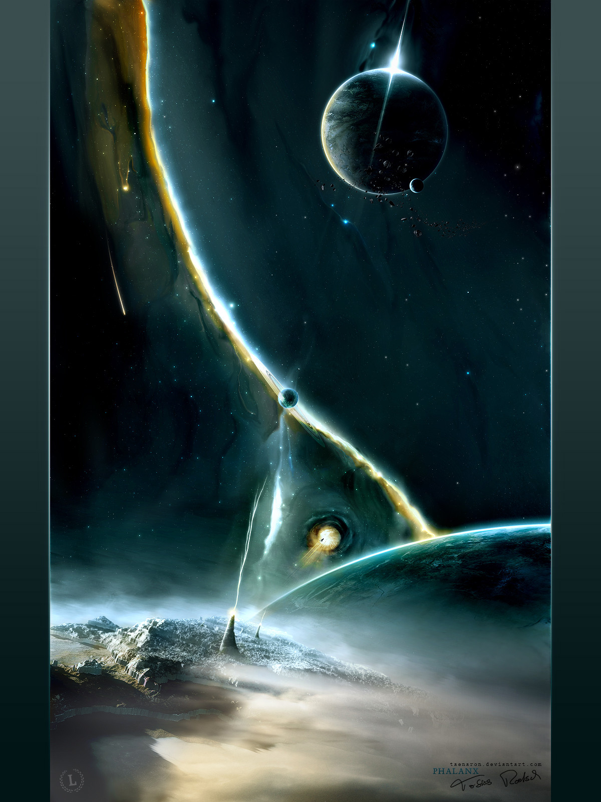
Transitorius I wanted to try something new and that's the outcome. Some new colourcombinations, some new elements. No wallpaper this time (maybe I'll add a pack if there are a lot of wp-requests). And it's a part of the first artpack of ~theluminarium .
You can see the artpack at [link] or at the dA account (later).
Technical informations
4000x6000 @ 300dpi 100 layers 600mb psd 12-15 hours worktime Adobe PS, 3dsMax9, Wacom Graphire 4Wallpaperpack (via download)
1024x768
1280x1024
1440x900
1600x1200
1920x1200
Thanks for favs, watches and comments

edit: changed some color things, sized upper left asteroid down, changed the flare and the beam of the gate (made it softer) and some little other changes, added wallpaperpack
Related content


Comments: 223


der obere Bereich vom Bild ist ne echte Granate!
Das rote Dingens wohl aber Geschmacksache. Das zerstört dir den Bildfokus packt das Bild zu voll, zieht den Blick nach unten und dort wo jetzt eigentlich der Mittelpunkt vom Bid ist (zwischen Sonnenaufgang und dem roten Dings) ist ne schwarze Fläche. Jetzt weiss ich mal wieder gar nicht, wo ich hin schauen soll. Sollte das so geplant sein, dann war es ein Geniestreich. Da ich dir mal unterstelle, dass es aber nicht so sein soll, ist das Bild eben unbeabsichtigt unruhig und unausgewogen.
Sicherlich geht dir der Spruch "weniger ist manchmal mehr" auf die Nerven, weils ein dummer Spruch ist, aber er passt bei vielen deiner Kompositionen.
Gott, würde dieses Bild ohne die rote Qualle GEIL aussehen!
(oder färbe sie komplimentär zum orangen-grünlichen Sonnenaufgang ist eiskalten Blautönen)
Technisch gibts natürlich nichts zu meckern, gibts eigenlch nie
👍: 0 ⏩: 1

hehe danke für deine ausführliche meinung  (Wink)")
 (Smile)")
👍: 0 ⏩: 1
einen Bogen sehe ich da nicht. Als erstes fallen mir zwei ziehmlich gerade linien auf
Nur, dass wir uns nicht falsch verstehen, ich finde das Bild mal wieder super
👍: 0 ⏩: 1
hmm jo ist doch ok wenn du das so siehst
danke dir trotzdem
👍: 0 ⏩: 0

wasn das fürn gefährt da im vordergrund ?
👍: 0 ⏩: 1
soll eigtl ein gate sein
👍: 0 ⏩: 1
axo deshalb kann man da durch gucken ^^
hab wegen dem langen strahl auf ein gefährt geschlossen
👍: 0 ⏩: 0


realy great man breathtaking a bit creepy
👍: 0 ⏩: 1


Wie schon in msn geschrieben fave!
Hammer Work mal was anderes, sehr fresh!
👍: 0 ⏩: 1

*o* ooo awesome job on this! 8D very nice!!
👍: 0 ⏩: 1

WALLPAPERZ WANTED!!
I have no idea what the image depicts... but its f'in AWESOME. :clapping:
👍: 0 ⏩: 1


CITY PLANETS! And a spaceship thing! ")

👍: 0 ⏩: 1


Pretty sweet. It looks like a cosmic jellyfish.
This kinda reminds of that scene from Starwars Ep2 when Count Dooku
flies to Coruscant on his geonosian spaceship.
👍: 0 ⏩: 1

be prepared to getting assimilated
👍: 0 ⏩: 1


Dude that's amazing. Looks like the Death Star from Star Wars! I love the red beam and the contrasting red and green colors. Amazing job!
👍: 0 ⏩: 1

Interesting colur combination, and that ship is something new, looks like its charging up to something big ( maybe that beam coming off it isn't in full swing yet ")
👍: 0 ⏩: 1


")

<= Prev | | Next =>