HOME | DD
 TobiasRoetsch — Transitorius
Published: 2008-04-21 19:57:00 +0000 UTC; Views: 25320; Favourites: 507; Downloads: 912
Redirect to original
Description
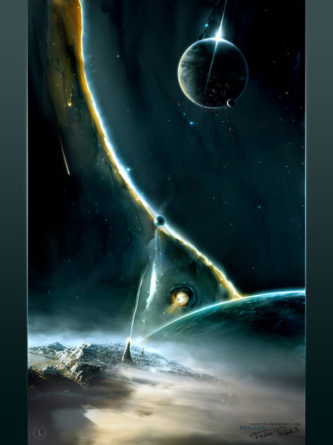
Transitorius


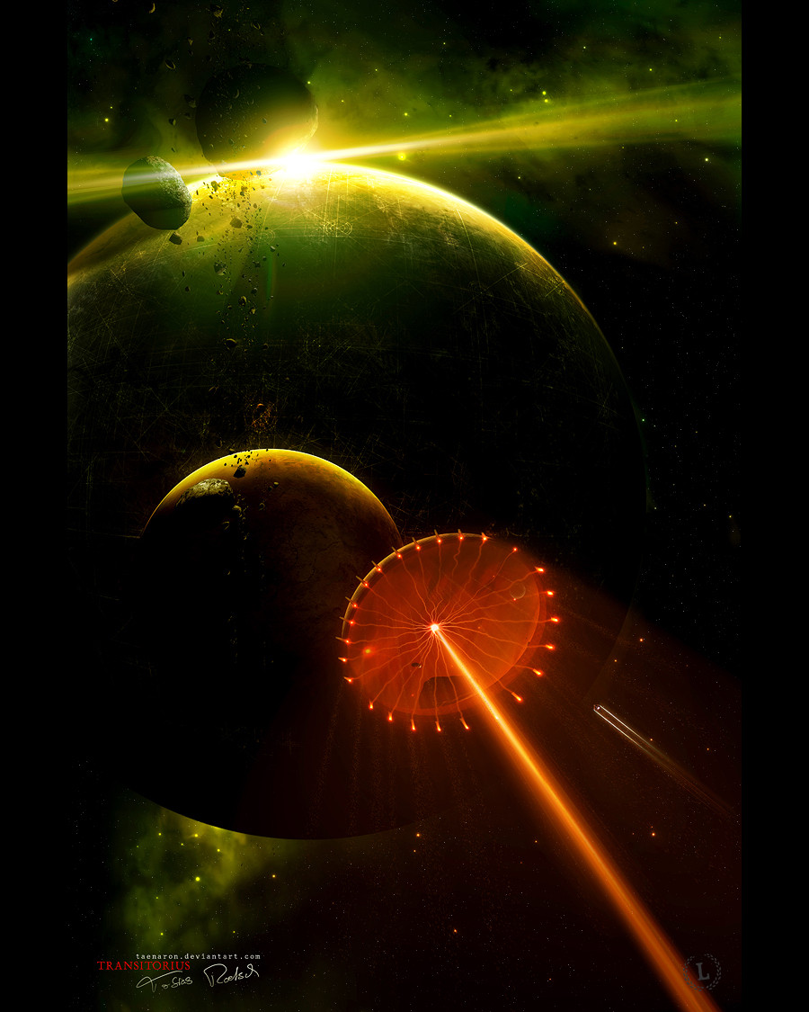
 I wanted to try something new and that's the outcome. Some new colourcombinations, some new elements. No wallpaper this time (maybe I'll add a pack if there are a lot of wp-requests).


 And it's a part of the first artpack of ~theluminarium .
You can see the artpack at [link] or at the dA account (later).
Technical informations


 4000x6000 @ 300dpi


 100 layers


 600mb psd


 12-15 hours worktime


 Adobe PS, 3dsMax9, Wacom Graphire 4
Wallpaperpack (via download)
1024x768
1280x1024
1440x900
1600x1200
1920x1200
Thanks for favs, watches and comments


edit: changed some color things, sized upper left asteroid down, changed the flare and the beam of the gate (made it softer) and some little other changes, added wallpaperpack
Related content
Comments: 223

also ich hätte da wirklich gern nen wallie davon
mir gefällt der planet besonders gut, das muster ist echt geil : D
👍: 0 ⏩: 1

danke 
👍: 0 ⏩: 1

What did you mean the vehicle to be? It reminds me of a solar sail, but now I'm thinking more ramscoop...
👍: 0 ⏩: 1

haha, looks like I was pretty far off.
👍: 0 ⏩: 0

When I watch this image, it looks like it would be done only by your pc, but you used wacom tablet here..xD
👍: 0 ⏩: 1

That ship is amazing, really adds to the whole image
👍: 0 ⏩: 1

Wow this is briliant man, love the background planets and that gateway type thing up front, WIN!!!
👍: 0 ⏩: 1

the colors are fantastic! Amazing work on the planets surface!
👍: 0 ⏩: 1

The colour is awesome in this one, effects as well
👍: 0 ⏩: 1

Sick, cool colours and composition. Holds the eye and lets it wonder the page at the same time.
Planet texturing is really cool, and I love the lighting.
👍: 0 ⏩: 1

Looks great.
I like the green at the top.
👍: 0 ⏩: 1

WooW! Your work it's like the world i wanna be~ Amazing job!
👍: 0 ⏩: 1

mm irgendwas hat sich bei den letzten paar Bilder an deiner Technik geändert oder bilde ich mir das nur ein? Deine Bilder sind klarer als früher.
Haben ein wenig was von Phoenix-06 's Bildern.
Gefällt mir!
Ist das ein Schiff?
👍: 0 ⏩: 1

Hmmm kann schon sein dass sich was verändert hat 
Sollte eigentlich ein Gate sein
danke dir
👍: 0 ⏩: 1

Wie gesagt, die Entwicklung gefällt mir
Und ich hatte gedacht es ist eine Art organischen Schiff. Wie ein großen Qualle oder so. Die im Dunkeln leuchten.
👍: 0 ⏩: 0

Very nice man, there's some odd lighting but it's your first try experiment this seriously so i'll forgive ya 

👍: 0 ⏩: 1

Truly incredible. The space theme you got going is wonderously aweing - the planet/ball-thingy in the back made me think of Star Wars, particularly Coruscant or the Death Star.
👍: 0 ⏩: 1

Wie theinsidenoob schon gesagt hat: viel zu dunkel.
Davon abgesehen find ich es schon sehr stylisch. Endlich mal wat bunteres
Was macht das "L" unten rechts? oO
"L"uminati?
👍: 0 ⏩: 1

Hmm auch bei dir kanns am Monitor liegen. Zuhause ist bei mir auch bissl dunkel, aber geht eigtl. Hier auf Arbeit siehts herrlich aus
Das L steht für Luminarium... guck ma die links in der Description 
👍: 0 ⏩: 0

Glad to see you submit this. Just checked it out on The Luminarium web page and it caught my eye. So first, to get it out of the way: /applause
I think this piece demonstrates a much more captivating use of light than I have seen in your other works. The lightsource has a fair bit of bloom that makes it seem more realistic and dynamic. Also the composition is almost spot on, with some clever choices concerned the planet placement.
But i'm going to nit pick, I guess because I can, heh.
Firstly, the colour. Green is always dangerous to work with: I know that from personal experience. But of course because of its lack of popularity in this genre, it often seems very striking at first. That is what I saw when I first viewed this. However, looking at it again I would be inclined to suggest you tone it down. There are some nasty colour issues surrounding the immediate area of the flare, where they band off into yellow too quickly (very noticeable where the top asteroid is.) There are also hints of this in the BG space, where the yellows and greens are too saturated for eachother and as such don't merge as they should. I think the easiest remedy would be to tone down either the green, or tone down the yellow, because atm, with them both so so saturated, they clash in places. (admittedly they work in others, such as the planet's surface to atmosphere mix.)
Second qualm I have is with the odd flare artifact protruding from the lightsource (these large beams of light.) They seem unrealistic, and a little like a flashy add on. Have confidence in the feel of the flare itself, I think it holds the dynamic without needing the inclusion of these flare diffractions, which seem a problem rather than an asset.
I'm not really sure what the orange object is at the bottom (ship?) but I can't say the design is working for me because I simply find it hard to know what it is. Heh, I know you won't remove it or anything seeing as I imagine it is integral to your vision of the work, but still it may be something to think about. When it comes to ships, I find it pays to have it easily recognisable, such as in Gary Tonge's Arrival [link] or even your friend Gucken's To Our Destiny [link] In those works, the ships worked tremendously well in conveying depth and scale.
My last point would be the large asteroids at the top of the image. The general feel of the asteroid belt is good, it works and strongly ties up the composition between the planet and moon (which is strongly implemented anyway) but the largest two asteroids actually screw up the scale of the work; they seem as though they are sat in between the planet and the moon which would make them huge...obviously I assume this was not the intention but it definitely feels that way.
Well, I'll leave it at that. It is a good work, and I hope you recognise the weaker aspects of the image as to improve. I'm excited to see where you will go with your work next.
👍: 0 ⏩: 1

Monstercomment 
First part: yea green isn't an easy colour but that's why I've chosen it. I'll try to tone it down, maybe it looks better
Second part: hmm you mensioned those lightbeams at my last pic too. I think it's just you. Some people like those beams, others don't like them 
The thing at the bottom should be a gate. Maybe you recognise Cor Tauri (one of my works) through the gate. It was a first try to paint such an object... I'm going to improve my skills
To the asteroids: I'll try downsizing those both.
Thanks a lot for your fav and your honest critics Sam
👍: 0 ⏩: 1

Oh its a gate?! My bad, heh.
Um yeh, with that last piece I picked up more on the diffraction spikes (they were more classically done.) I have no problem with diffraction spikes per sé, in fact i'm quite inclined to say I enjoy using them myself, but here they kinda look like they were generated in some 3D program. The reason I say it may be better to remove them is I think this particular lightsource, in this piece, in this setup, is more than able to stand on its own.
But hey, each to their own.
👍: 0 ⏩: 1

Hehe yea 
👍: 0 ⏩: 0
<= Prev | | Next =>

