HOME | DD
 Arenheim — Some notes on color

Published: 2013-03-07 03:45:38 +0000 UTC; Views: 22883; Favourites: 1481; Downloads: 284
Redirect to original
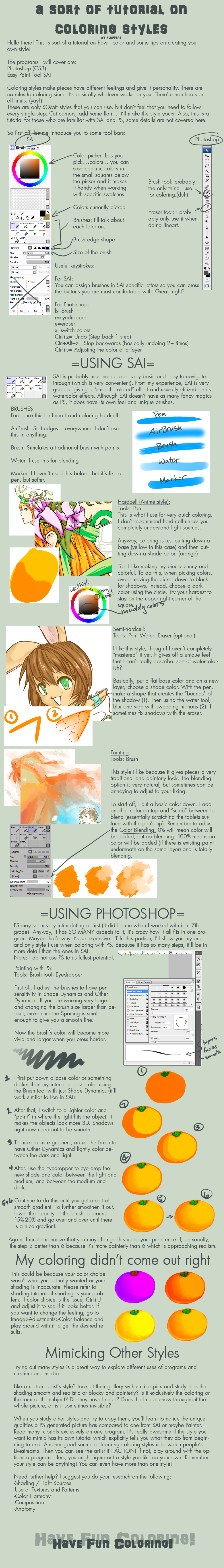
Description
These are some ideas I wrote down a while ago with the intention of making an actual tutorial on color ('cause I was asked to), but as they so often do, time and energy got in the way. Plus I'm just not sure which direction to go in. There's a lot to color...but when you work with it to a point where you're semi-comfortable with it, it's not really something that's consciously thought about a whole lot.. You just start picking the appropriate colors instinctually, or you can see that colors aren't working together, without fully considering why. So I just wrote down my personal approach. Color is just something I do, not so much something I think about....though I'm trying to change that.Spekle and I have been talking about color harmony a bit though, so this kinda focuses on that I guess.
SO! If you have any questions about this, or want me to pick a specific color idea to make a specific tutorial on, please let me know.
Edit: I didn't really think this would get such a large response, but since it did I just wanted to clarify a couple of things. This isn't really a complete tutorial, more like notes that I wrote out trying to get my thoughts on color in order. I just decided to post it 'cause... I don't know, thought someone might get some use out of it. I understand color, it's tutorials I'm not so good at...
So here's a couple of significant points I didn't bring up,
- This is relevant to digital coloring specifically. Mixing colors is very different depending on the medium you're using.
- That said, you can quite successfully mix colors digitally with a roughly 50% brush (at least in SAI and PS, which are all I use)
- You can also get a Key Color by working with colored paper/colored canvas. This mostly applies to traditional media, unless you do most of your coloring on one layer for digital.
- Color is all about trial and error, in my opinion. You just gotta jump into it, throw colors together, and see what happens. However it's much easier when you understand the nature of the color wheel. Once you can integrate that information into your thought process, that's when it becomes something you consciously think about less. You'll know what colors work together just like it's common knowledge. But again, that's just my opinion.
And eventually I will make a proper tutorial on color. >.<
Similar things,
And some art by me,
Related content


Comments: 61


wow that's pretty incredible I need to come back and look at this again naturally insightful to have colors that harmonize, key colors too way cool ya'll
👍: 0 ⏩: 1

I'm glad you found it useful!
👍: 0 ⏩: 0

Hey, this looks really useful. It's sure gonna help me working with colours.
👍: 0 ⏩: 0

very...very...very useful!my palette is so awful.i'm vietnamese in my country,nobody tell me like this and how i can improve it!can you help me? i realy like it. you are my inspiration! .i hope to learn more from you!^^ thanks
👍: 0 ⏩: 0
very...very...very useful! i hope to study more! thanks.my palette is so awful!how could i improve it? i'm vietnamese,in my country,nobody tell my like this !can you help me? you are my inspiration! thanks
👍: 0 ⏩: 1
Thank you! I'm glad you found this useful. I'd be happy to help you however I can.
 (Smile)")
👍: 0 ⏩: 0


Very helpful indeed, thank you!
Man, I wish I had more time to work on digital stuff.
👍: 0 ⏩: 0


This is really helpful :w;
Does the idea of how the colour palette works come in naturally? I've been experimenting for a long time but my colour still looks very out of place .A.
👍: 0 ⏩: 1
I think it's just a matter of learning which colors work well together, and why they do. I've been coloring for a long time, but I also went to school and learned the logic behind color. There's a lot to it, but it becomes more natural once you understand the basics.
👍: 0 ⏩: 1

O.O this is really helpful! ")
👍: 0 ⏩: 2
Umm..I'm not sure that you can? 
👍: 0 ⏩: 1
Oh ok! I can try that too ^.^ thank you.
👍: 0 ⏩: 0

You don't. Consider GIMP (free, similar to Photoshop. PM me if you need help with it and can't find your answer on Google.) or PaintTool SAI (approx. $55, originally in Yen but converted through PayPal. Can be found for free without too much work if you're cheap XP.) as alternatives that actually work.
👍: 0 ⏩: 1
Oh alright. I have gimp, I just don't really like using it for my pixel art :/ but maybe I'll try making color palettes there, or utilizing the program in another way... Thanks
👍: 0 ⏩: 0


This is actually a lot more helpful than any other color palette tutorial ive ever seen
👍: 0 ⏩: 1
I'm glad! ^^ I noticed when browsing tutorials on here that there wasn't a whole lot that deals specifically with these kinds of solutions.
👍: 0 ⏩: 0

This is a really helpful thing!!! Thank you so much
👍: 0 ⏩: 0

Oh so this is what my art teacher was trying to get me to do. Shucks I'm more visual then verbal
👍: 0 ⏩: 1
Most artists are more visual learners. I am too.
👍: 0 ⏩: 0

Haha thank you, he's my character, Faron. ^^
👍: 0 ⏩: 1


"You just start picking the appropriate colors instinctually, or you can see that colors aren't working together, without fully considering why. "
huh
that's so very weird to say
because as an artist you should be fully aware why some colors aren't working out together
did you read Itten's "The Elements of Color"? all artists, designers and illustrators have to read this book in their first months of studying
i also strongly recomment to read it to anyone who's ever trying to draw anything in color
👍: 0 ⏩: 1
lol That's not really what I meant. It's not that we're not aware, just that we're not thinking about the logic behind it at the moment we see that some colors aren't working. Being aware is different than always consciously considering why something works the way it does.
I did study color, I have a degree in illustration.
👍: 0 ⏩: 0

Thanh you! I always have problems with the colours because I just don't know which colours match each other
👍: 0 ⏩: 0

yeah, color theory is quite complex, especially once one starts studying it in depth (the more I studied the more I get confused ç_ç).
👍: 0 ⏩: 0

This might be a stupid question, but how do you actually mix colors in a graphic program? I really want to try out that "give them something in common" trick, but wouldn't know how to actually add a certain color to all my other colors. I imagine it must work with some sort of layer type, but it's certainly not multiply. (Note: I use SAI, so I don't have quite as many options)
👍: 0 ⏩: 2
I use SAI as well, it's actually really great for mixing colors in a close-to natural way. The Brush or Watercolor tools at around 50 percent opacity work well, you'll just need to switch back and forth between the colors you're mixing to get an even mix.
👍: 0 ⏩: 1
I will try that, thank you very much
👍: 0 ⏩: 0

You can use the watercolour tool to blend the colours together with sai I believe.
👍: 0 ⏩: 0

Thank you for making this! It will help me a lot! :3
👍: 0 ⏩: 0

Awesome work! Nothing to tell it's almost perfect above all the contrast!
Can you just look my work please? if you like take favourite or watch anf if not tell my why
[link]
👍: 0 ⏩: 0

...I'm sorry, but why was my comment flagged as spam?
I'm just wondering, because I was trying to give advice with my link. I wasn't criticizing your tutorial at all. |:
...could be pushing my luck, I guess, but here's for those that might want it for reference. This is for color, as well. Mainly on primaries and color mixing.
[link]
👍: 0 ⏩: 1
I'm sorry about that. I had several spam comments, with weird things written and questionable links, I thought yours was one without really looking at your link. That was my bad. :/
👍: 0 ⏩: 1
that's okay! I noticed a few above me linked without showing a description, from tiny URL. I didn't notice until I saw just how many were spam on a bunch of other deviations. You can usually tell from the 'new member' part above their usernames.
👍: 0 ⏩: 0

aha! this is my biggest problem in coloring,so i always manipulate my coloring in photoshop after coloring
thx for the tutorial
👍: 0 ⏩: 1
I do too usually. :3 But yeah, using these ideas makes it less necessary to change your colors completely through editing, since there should already be a balance in your palette. Photoshop is still good for minor adjustments and things.
👍: 0 ⏩: 1
and that is better if we do not adjust brightness and contrast.the drawing will be too sharp and pixel
👍: 0 ⏩: 0

you are lucky, i have such a hard time on colors, since i am red and green color blind. alot of the colors look alike for me and i can't do much with the blending of colors since it might come out wrong D:
👍: 0 ⏩: 1
Aww, I'm sorry! I imagine there's ways of working around that though. One thing you could try is monochrome color schemes, maybe... I've seen really great art done with only one or two colors.
👍: 0 ⏩: 1
| Next =>