HOME | DD
 DanRabbit — About Dialog

Published: 2011-07-17 00:05:58 +0000 UTC; Views: 11304; Favourites: 41; Downloads: 116
Redirect to original
Description
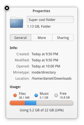
Playing around with what the standard "About" dialog could look like.I merged in my "modal dialog" mockup
 (Wink)")
I wanted to try including the Help, Translate, and Report items in this dialog instead of having them in the AppMenu. That makes a little more room in the AppMenu for other functions, but still gives these functions a nice place to live.
Related content


Comments: 53

Yeah it is nice, but to be honest there is something I don't like about the close button. Imho the close button should look like the close button in your light theme variant (like in your bookworm mockup)
👍: 0 ⏩: 0

Close icon is unnecessary. More beautiful without it.
 (Smile)")
👍: 0 ⏩: 4

Agreed. Having both seems unnecessary. I think the close button in the bottom right corner is better then the icon simply because it matches the whole dialog better. The contrast between the icon and the rest of the dialog seems to be too drastic.
👍: 0 ⏩: 0

No, it would be better if you just put close icon, not button.
👍: 0 ⏩: 1


This reminds me of the Omgubuntu image pop-ups. Would be definitely nice to see this in action on the deskotp too...
👍: 0 ⏩: 0

Really nice. Not to sure about the close icon though.... Its the same design as one of the web modals. Maybe something a bit more unique and not so bold would be good. Either way i actually love this and think that those buttons are way better here then on the AppMenu.
👍: 0 ⏩: 0


I was staring at it for a second too, tbh. But I'm not sure if it'd be "the right thing to do" to remove one of them. Dialogs are usually expected to have a button that will dismiss it (without doing anything else) and windows are generally expected to have a button that will dismiss it (without doing anything else). So, for dialogs, the close button does seem redundant.
👍: 0 ⏩: 1

The problem is that it looks like a window, but it is supposed to be a dialogue. In my humble opinion, I think the [X] button should leave. Also, this style of drawing buttons makes them almost *invisible*; yes, they look good, but they're buttons, so they are supposed to say "click me!".
👍: 0 ⏩: 0

Love it. Those options don't get used enough to be directly in the AppMenu, imo.
👍: 0 ⏩: 0

Neat. I wonder, is there a way to activate a separate theme just for modal dialogs like this? GNOME 3 does something like this, and Ubuntu had a plan to, but I'm not sure if the technical background has been worked out, yet.
👍: 0 ⏩: 1
The most difficult problem we've run up against is with the window decorator. I believe that the latest builds of Mutter color changing is implemented, but I'm not sure if work is being done in Compiz or in Unity-window-decorator for this.
We have talked about making this sort of About dialog a widget in Granite since we're all very displeased with the About dialog in stock GTK...
👍: 0 ⏩: 1
Yeah- it's always nice when you can fully rely on upstream components, but sometimes it's just not flexible enough. :\
Hopefully development doesn't slow down too much after GNOME 3.2.
👍: 0 ⏩: 0


I dont like the new postler icon :/
also, good idea to have variants of elementary, dark, light, etc..
")
👍: 0 ⏩: 1
keep in mind that the theme variants aren't a user choice, they are a developer choice. The app decides which variant it uses.
👍: 0 ⏩: 1
yes, I know, it's a good idea only if there is something like HIG about it.
👍: 0 ⏩: 0

I really like this light theme variant idea. Man, if GTK won't support it, we should find something that does... or make our own.
👍: 0 ⏩: 0


I think the conventional Help menu makes more sense, if I click "about Postler," I'm just looking for the version number, credits, and license.
The windows resize hotspot should have more vertical padding, its too close to the "close" button. On a last note, the icons shadow doesn't look right, its too round... instead use the icons shape and nudge it down a few pixels. I really like the new theme.
👍: 0 ⏩: 1
We don't use the old menubar widget in elementary apps. We feel it wastes space and encourages developers to continue bad habits and duplicate UI. Instead we have entries in the gear menu (formally called the AppMenu). However, this is an exploration in keeping that menu clear for more relevant entries.
It's the standard 12px padding used in all apps, something not likely to change.
indeed, I agree with you here. I just haven't had time to revamp the shadowing for elementary icons. Blur is something that tends to render incorrectly, so whatever the solution is needs to be done without it, unfortunately.
👍: 0 ⏩: 0

Do we really need the ability to re-size this window? I feel that making this window bigger doesn't really give the user any more, so it's an unnecessary feature.
👍: 0 ⏩: 2
Okay so I made the min size of the window larger and got rid of the resize grip.
👍: 0 ⏩: 0
well if you're really interested in reading the license agreement you probably want a larger window. But it's a function of the window manager so it's not really an extra feature, it just is.
👍: 0 ⏩: 1
Well you can use set_resizable(false) in gtk.Window, can't you? If this is used the window decorator shouldn't show a resize button, right? Btw, do you mean that the only way to read the license agreement is by re-sizing the window? I think it's pretty bad if you can't scroll. Wouldn't it be better to have another button to read the license agreement?
I'm also wondering if a close button is really necessary since there already is a close button in the window manager? Can't we replace the close button with a "Read GPL" button?
👍: 0 ⏩: 1
you can indeed scroll, but it may be nicer to read in a larger space than a smaller space. I'm not sure why this is causing such a problem for you. I think most people expect to be able to resize the window.
Yes a close button is necessary. It's mandated in HIG and most user expect it to be present in a dialog.
👍: 0 ⏩: 0


oh how we need a nice window decorator. This looks awesome, btw
👍: 0 ⏩: 0

Like the rounded Help button idea - saves space and looks good
👍: 0 ⏩: 1


Where are the Credits for the Authors, Artists etc. ?
👍: 0 ⏩: 1
I didn't add a complete list of credits because I wanted to make sure the license was visible. But it would go in the same section as where it says "Written By: Christian Dywan"
👍: 0 ⏩: 0


It's nice how the Elementary team makes concepts for even this kind of stuff. It shows you really care about making this very polished and complete. Nice
👍: 0 ⏩: 0

✉ Good ideas with the buttons, but Postler's design is still unimaginative when it comes to accepting and sorting through email. I need a better email client than either Evolution or Postler.
👍: 0 ⏩: 0

I like the all white window for about, it looks nice and helps to distinguish it from other windows, this with normal windows and a black terminal and video player would have nice contrast with the desktop!
👍: 0 ⏩: 1
Thanks. I was thinking it could be nice to have three styles available. The normal style for most apps. A dark style for "Pro" apps. And a white style for things like an RSS reader or a PDF Viewer or this about window
👍: 0 ⏩: 4

I hope a dedicated theme changer would be implemented. Also if the API allows theme designers to specify all (wallpaper, icons, cursors, the colours for 3 types of apps, other colours, etc.) would be awesome! Something like how gnome did it. This way, I can download a single .zip or whatever file from the interwebs (or by clicking a 'get more themes' button within the theme changer), and installing it near all in one go. Ofcourse, the ability to customise it should be a given.
👍: 0 ⏩: 0

That is a brillant idea! I love elementary project, it's so perfect ald polished. But on Ubuntu 11.04 I don't have drivers for my graphic card(RADEON X1150 integrated). I have to buy new PC or notebook, and then wait for Luna
👍: 0 ⏩: 0

Good man. That's how it should be done.
/izo\
👍: 0 ⏩: 0

Love the new icon, always felt the old icon looked a little odd in the dock it was much smaller than many of the other icons.
👍: 0 ⏩: 0
| Next =>