HOME | DD
 darthmongoose — FDG ch2 page 11

Published: 2006-01-28 06:49:25 +0000 UTC; Views: 314; Favourites: 1; Downloads: 18
Redirect to original
Description
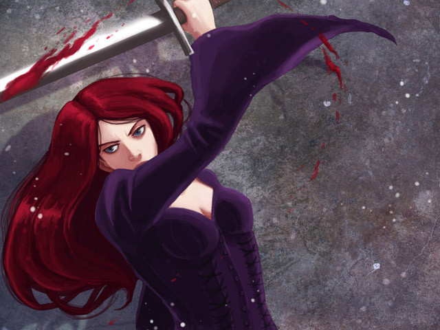
Finally updated. There's something tough about full page comics without cels. Normally I do a cel, take a break, do another cel etc. The amount of inking on this page made it a herculean task to finish, but I'm moderately pleased with the finished product, it tells the story well enough.Rekki actually looks really cute like that. You don't often see her helpless. It's nice to show that underneath it all, she's still just an angry teenage girl....er...with super strength....and a big sword... 0_o'
Oh yeah, for the 'I could have used spikes' sign, credit goes to my friend Alex, who suggested it. I wish I'd thought of it myself!
Related content
Comments: 13

she's one mean sister... ey, you're art is improving! nice.
this reminds me of evangelion for some reason, must we the cruciform...
👍: 0 ⏩: 1

Juliet was being artistic with the trap. She wanted the victim to be in an aesthetically pleasing pose when captured! ^_^
👍: 0 ⏩: 0

Hehe, that "I could have used spikes" line is a great touch. : P And Rekki must be pretty darn talented to come up with PG-13 British-flavored smack talk off the top of her head like that! I'd probably feel more sorry for her if I didn't think Sol was the one who was gonna get an ass-pounding next time they met up. XD
Oh yeah, great job on the inking on this page! It's so amazingly uniform, and, and, CLEAN. O_O How do you do that? (Mine always gets messy, even when I'm trying to keep it neat... <_<; )
👍: 0 ⏩: 1

Listen well young kiwi as I impart to you my secret inking technique!
I'm assuming you know the basics, do the thing in pencil, ink it, rub out the pencil. But I have refined the whole thing down through practice!
1. Unless it's for a REALLY fine line like the mouth, or some eye detail, always use at least a 0.5 size fineliner (sometimes a 0.8 or even a 1.0 will give beautiful strong, smooth lines!) The smaller a nib you use, the more the paper will catch the natural hand shaking and also the weaker and more scratchy lines will look.
2. Once you've done the lines all over once and rubbed the pencil, redo all the lines, paying special attention to areas that look weak, and enforcing the lines, smoothing them off, stuff like that. Sometimes I'll ink a single line as many as three or even four times.
3. Few people are aware of it, but you can use a pen just like a pencil, you can press soft or hard, and use the tip or the edge. With experience, you'll find you barely need to resort to finer tipped pens except for the most fine and detailed work.
Um...that's really everything there is to it. I started off absolutely terrible at inking. It's really just something you need to practice.
👍: 0 ⏩: 1

Ahh, no wonder, for some weird reason I always thought it was supposed to be a bad thing to use a thick-tipped pen when inking. After trying it out, though, sharpie actually looks a lot nicer and less scribbly than micron on the major lines. (Which just goes to show that when it comes to manga, if it looks nice, then I guess it doesn't matter what people say you 'ought' or 'ought not' to do anyways. : P) And #3- interesting, I'm gonna have to try that out now. Thanks for the tips, senpai! ^_^
👍: 0 ⏩: 1

Any time! I think people view thick pen as 'bad' because a lot of manga artists draw in a very delicate, doujinshi style, which if inked with too thick lines just looks really clumsy. Back when I used to go in for big, Clamp style eyes and pointy noses and chins, I would always go for the thinnest possible pen. However, when I saw Clamp's newer stuff, like Tsubasa Resevoir, with those lovely strong lines, I thought 'I want that effect!' and started to try with thicker pens. It turned out that the thicker lines really compliment the bolder drawing style that I was starting to develop. You can see from looking at the comic though, that I hadn't really got the hang properly until around page 10, where you see the line quality suddenly improve.
I hope to see something good from you soon! ^_^
👍: 0 ⏩: 0

I love the little "I could have used spikes" note.
👍: 0 ⏩: 0

Hahahaa. Well, I had to get around the fact that on hyper comix where I put the comic, FanDanGo is one of the few comics without a 'mature 18+' logo next to it. In order to keep the comic with a wide age range, I have to be pretty creative with the dialogue sometimes. Since Red Dwarf is a superb series, I couldn't resist using 'Smeg Head', especially since it's an English comic so having a homage to a British sitcom makes sense! ^_^
👍: 0 ⏩: 1

Yeah, Red Dwarf is just the best thing ever. It's a great drawing too.
👍: 0 ⏩: 0

ohh what a intricate trap... I was expecting something more simple!
Is she blushing? o.o I tried reading her dialogue with a quick tongue but its tough
👍: 0 ⏩: 1

Hahaha, it's faster to read if you have an English accent, apparently the conversation on the last page is easier with an English accent due to use of the word 'percent'.
Rekki isn't blushing so much as flushed. She's very angry and also is upside down, so the blood has rushed to her head hahaha!
👍: 0 ⏩: 0


