HOME | DD
 DawnFrost — Hero development
Published: 2014-02-13 22:32:20 +0000 UTC; Views: 2806; Favourites: 96; Downloads: 0
Redirect to original
Description
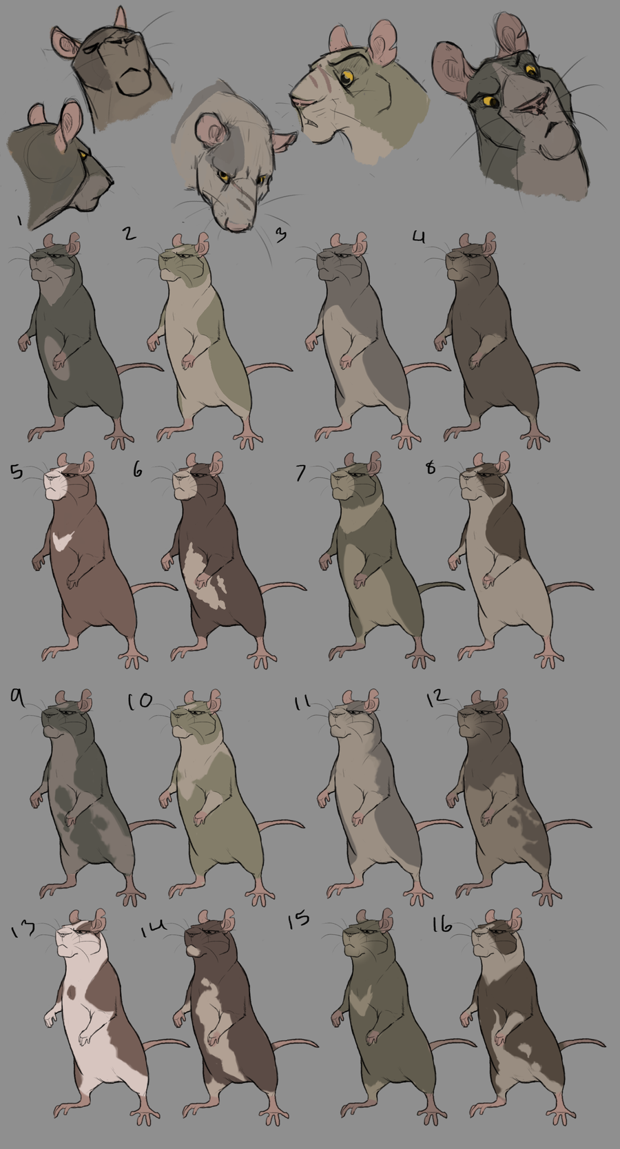
Some concept work for the character Hero
Brave. Self aware. Thinks more with his strength than brain. Self righteous. Bossy. Intimidating. Dominating.
If you have a suggestion or a preferred coloration let me know. and if you can tell me WHY you chose it.
Also if I auctioned off the designs I don't use would anyone be willing to buy them? Just a thought. Let me know in the comments.
ALSO ALSO
I have posted animatics to that blog I started up. So check them out.
Related content


Comments: 35

What's up with their faces?
They look more like a a Lion King character than a rat/mouse face.
👍: 0 ⏩: 0

8 or 12 would be my choice. Eight is so simplistic but very unique, and I just like the patterning on twelve.
👍: 0 ⏩: 0

I love 16, from the moment I saw a thumbnail I spotted him and wanted to see it bigger but 13 is also catching my eye : )
They both look awesome ^^
👍: 0 ⏩: 0

I like 9,14, or 16 because they are both look bad but are good deep down. The spots to me make him seem more 'rounded' in personality while the darker pelt colors make him still dark.
👍: 0 ⏩: 0

I really love the design and boxy face.  (Smile)")
👍: 0 ⏩: 0

I really like the sketch at the top in-between 2 and 3. I like the tones of the colors and I really like the spot above his eye. He is not so dark that he would necessarily be seen as evil but not so light that he doesn't fit within his personality. I agree with what some people have said that a bold, stubborn character who relies on brawn over brains tends to feel like they should have a darker, more neutral coloring.
I would pick one that doesn't have a full body option wouldn't I? XD
I guess I could say I like the colors of 11 with the pattern of 13 or 16.
I suppose if you wanted to you could go and just really throw people off by giving him a design that doesn't fit within his personality. That could be interesting too. I always think of lighter characters as being more innocent, friendly types but there's nothing saying you couldn't make a strong, bossy light colored character.
👍: 0 ⏩: 0

1. Dark colors always come across as "bold" to me. Bold and brave. Plus is a basic design, and makes it easily duplicatable.
15. Simple design for same reason as above. Something about the chest mark seems to me like a badge of honor. Like an officer in a military.
👍: 0 ⏩: 0

I like 5 or 15...because of that chevron mark. Kinda gives off a military-ish feel or something

👍: 0 ⏩: 0

I like 11. It just stands out as a "tough guy" sort of pattern. The colors work nice and it's more simple.
👍: 0 ⏩: 0

I'm liking 13 the best out of all of them. It has some really nice contrast going on there between the lighter and the darker cream and brown, though looking at it my brain is really wanting to see the brown a little darker, maybe even black?
I don't know, but for some reason I think really striking contrasts would fit this character nicely. He's got such a bold and expression face, which is a bit of contrast to what you normally thing of rats and mice like (narrow features, fragile, etc.), so I really think a more contrasting coloration would complement that about him really well.
Bold colors would also go well with the brave aspect of his personality I think~
I really, really like the shape of his head though. It reminds me a little bit of a lion or other powerful animals, and yet he still looks rodent-like.
👍: 0 ⏩: 0

I'd choose 11. It's bold and simple. I think it would best fit his character because of it. That or 4. c:
👍: 0 ⏩: 0

I think 7 or 15 give off not only a domination feel but a leader feel to it.
👍: 0 ⏩: 0

15 cause it looks like he has a goatee...and i imagine anyone sexily intimidating with a goatee~
👍: 0 ⏩: 0

I really like 13 or 14, they're both good so it's tough to pick!
👍: 0 ⏩: 0

i think 4, just because i feel it fits his image better, i dont know how to say it... it just spoke to me more than the others, and i like the simplicity of that design. hope i helped ;u;
👍: 0 ⏩: 0

I love the more complicated(I guess you could say) darker designs towards the end like #16, but when I looked at #5 I thought of the mark on his chest as if it were a badge of his bravery he wore to remind himself and others. Hmm...honestly I love all of these designs xD, but I hope someone's input will help you develop him more.
👍: 0 ⏩: 0

I personally prefer #13 ")
 (Wink)")
👍: 0 ⏩: 0


I really like the designs for 3 and 11. I think they suit the personality you're going for, but I might like 11 more! I'd like to see another character with the markings of 13, those colors are great.
👍: 0 ⏩: 0


i like 5s design the best.
5 because of i just really adore the crest on his chest and face marking. Its simple and not too detailed. is you were to do a colored comic or animation. its not alot of work in the final details. I find that a darker pelt will seem more inimidating especially if his eyes stay as a bright gold
👍: 0 ⏩: 0

2, 5 or 13
I'm a sucker for Irish markings and the lightness would suggest a softer character but it a great contrast because hes such a stronger, bigger, more aggressive character. 14 & 16 sit well with me as well
👍: 0 ⏩: 1

That's a good point with the lighter colors. I was just telling Sky lily that i was worried about the darker colors because I don't want him to be seen as evil. Though I am some what partial to 14. Though I think that's because I had for a brief time a rat that looked like him, and he sort of fit hero's personality. Also yes to the Irish markings.
👍: 0 ⏩: 1
Hmm, don't be too worried about the darker colours because they're not "truly evil" colour, imo - they hint to a possibly devious nature and as his personality will shine through, I think the muted tones will help in the curve of the storyline

And gods yes, no 14 is beautiful <3 I want a rat, but I just don't have the space or time.
Irish 5eva
👍: 0 ⏩: 0

I love 1 or 4 and 5
*_* It fits his Character the Best!
Awesome Designs btw :3
👍: 0 ⏩: 1
Yeah I like the simplicity of those designs. It would make it a lot easier down the road when I animate them. Thank you for the comment =]
👍: 0 ⏩: 1
You´re very welcome :3
I´m happy when I´m able to help ^^
👍: 0 ⏩: 0

XD 11 pretty cool! I think its got a good look to it and fits the personality.
👍: 0 ⏩: 1
Yeah that's one of the one's design wise I'm leaning on. Not completely yay or nay on the color for that one though. Thanks for the comment =]
👍: 0 ⏩: 1
The top color of the head shot sketch is what really turned me on for that one. I really love the way you draw rats!
👍: 0 ⏩: 0
One worry I have with those designs -I do really like them- is that I'm wondering with those dark colors if he will be seen more as a villain.
👍: 0 ⏩: 1

Typically colored villains are overrated. Ultimately I believe the artist knows best, but if you do give him dark colors, it'll be a refreshing change from the stereotype ^^
👍: 0 ⏩: 0