HOME | DD
 DKF —
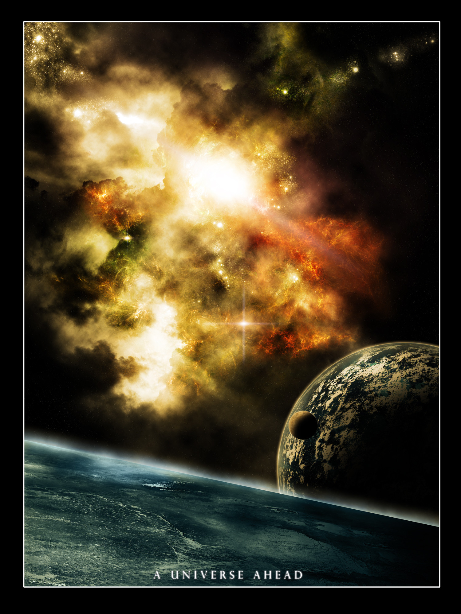
Fragment of Space
DKF —
Fragment of Space

Published: 2004-08-02 18:37:54 +0000 UTC; Views: 20247; Favourites: 503; Downloads: 6169
Redirect to original
Description
My submission for the new spaceartists pack. Tried to put about everything in there i could think of and that fitted together (Wink)") Used a lot of colors to give it an alive look. Lots of layers were used wich i won't count. The psd has a size of 222 mb. Metheors were done in 3ds max as well as the spaceship. rest is photoshop work.
Used a lot of colors to give it an alive look. Lots of layers were used wich i won't count. The psd has a size of 222 mb. Metheors were done in 3ds max as well as the spaceship. rest is photoshop work.Credits for spaceship go to Rick Snider.
Hope you all like it!! comments and favs are welcome.
Related content


Comments: 179

Seen it all before. One things for sure though, you have great talent for creating realistic textures.
👍: 0 ⏩: 0

I cant stop looking at it  (Smile)")

👍: 0 ⏩: 0

wow. amazing detail. very impressive scene. I really like it, all the colors are great and the stars looks amazing. and that planet in the foreground is even more amazing.
excellent work
👍: 0 ⏩: 0


THat... Is totally awesome!! It kind of looks like something from Eve n_n hehehe
👍: 0 ⏩: 0

Beautiful strafields and lighting... the detail of the meteors and the planets surface. Although the comets seems to need the blur ice and rock trail around the front too, and maybe blurred a bit.
Breathtaking work overall.
👍: 0 ⏩: 0

OH MY GOD! How beautiful is that? Man I wish this was available as a print ")
👍: 0 ⏩: 0

This is incredible. Love all the planets detail and colors. Amazing starfield. Everything is bad-ass, really like the typo too. Awesome job.
Congrats on the DD too.


👍: 0 ⏩: 0


wow, what a cool picture.
I like the asteroid-texture most.
good to see, it's a DD. Already thought, space art would never become a daily deviation.
👍: 0 ⏩: 0


sweet! you got a daily deviation.. congratz mate!
👍: 0 ⏩: 1

tnx mate, was surprised by it myself lol
👍: 0 ⏩: 0


Kinda reminds me of Star Trek: Voyager. There's a shot in the theme song that reminds me of this pic.
Very nicely done!
👍: 0 ⏩: 0


this must've been some helluva render boyo. awesome work, just love the way space looks, with all these diamond dusted look. so much detail. Great stuff!
love this, i wanna learn how to use PS now......


👍: 0 ⏩: 0


Lovely peiche aspessiale the strafield i also love the model of the ''plane'' and great metorites depth and planets +fav for sure
👍: 0 ⏩: 0


Spaaaace...
👍: 0 ⏩: 0


👍: 0 ⏩: 0

very nice , the idea to be so close to the stones is really nice. The starfield is also very nice great colours really nice. And i dont gone start about the details... really nice man.
👍: 0 ⏩: 0

this is awesome man
I love the progressive change of colour, this definately deserves a
very, very good job

👍: 0 ⏩: 0


very awesome piece! i realy love how the planets have there own source of light and that comet thats flying across space is very awesome and original! great job the the space dust also. very good job. keep it up
👍: 0 ⏩: 0

WOW!! i really cant say anything more than +fave for this one!! it's absolutely amazing! especially the planet down the bottom. That is one of the most awesome digitally created planets i have ever seen. I have no idea how you got everything to work so well together here, especially considering how you've used reds, yellows, blues and greens.. everything just flows. again, wow!
👍: 0 ⏩: 0

great stuff, coloring is nice, plenty of colors to see but all subtle and go together well
asteroids are sharp and well defined, i still am a bit picky on asteroids..they seem slightly unnatural cant really think why but they are still good quality stuff
probably one of your best peices
+fav
👍: 0 ⏩: 0

SENSATIONAL Work man!!! Very beautiful across many aspects of the celestial art thing. I especiallt love the space ship... it brings a real sci-fi feel to the whole thing... so real u can almost eat it! Hehe Another SOOPERB part of ur pic is the main bottom planet... the clouds and land are so yum. Do you have any tutorials or rough guidelines that u follow to create such a magnificent planet? If so could you please let me kno of them! If ya feel like it i'd appreciate it if u browsed my pic n gave some feedback.
Oh n if u didn't follow any tutorial for your bottom planet then I suggest u make your own... i think it would be really well recieved by many of this type of artist!
Keep up the rad work!!! :-D
👍: 0 ⏩: 0
oh this is just lovely
i didnt know you did 3d
lovely spaceship you got there... its really unique.
the texture on it is really nice. and the lighting on it is just perfect.
the starfield is really "DKF", its very nice, especially the space dust.
i still always find it hard to make starfields.. but yours aways turn out great.
it really gives a soft feeling , yet sharp.. the stars have all other brightness etc.
fabulous
The planet textures are just "wheeew" ( that means very good ")
the right-under planet is just beautifull. how you added those shadows underneath the clouds. really brings depth to it.
And not like the clouds are a part of the texture. its more like they float upon it... i find it really clever ")
though the land texture looks good, but i dont see mountains. maybe just a lil bit of change in height, but thats it.
It would be really cool if there were like huge mountains and all. maybe some even coming above the clouds texture
I know.. nobody goes that far with textureing their planets..
the upper big planet is a bit more blur than the other big planet.. but thats also cus its further away.
So i have no objection about that one.
Though its bigger moon looks very flat. maybe you should have soften the shadow a lil bit. so it seems more like a sphere.
i have a crit on the lighting of the planets though... since there are two suns in this solar system.. i guess the planets will be lit up on two sides.
But it seems that your planets only get light from their nearest sun.
like the upper planet and its moons. They should get some light from the sun in the distence. So the shadow on the back gets more tranparent and even at the side where the light hits the planet it should be atleast pretty bright.. not as bright as the other side.. but still.
ok now for the asteroides. the asteroides self look great. but whats all with the blue tails?
I dont know much about this, but the asteroide seems like an ordinary rock.
I dont know , it just doesnt seem right. I think these asteroides just must have a tail of grey dust or something.
the "rock belt" thingy at the underside looks very nice. I like the textures on them, and the lighting seems fine to me
they all look differnet from eachother, and that makes it less boring.
It really reminds me of this level in Starfox64 Lyletwars
Ownage game
was really fun!
as you can see, i like this piece very much ( otherwise i wouldnt bother writng this ")
This is a very good submission for the next space artists pack.
wheew
BTW YOU FORGOT TO PUT YOUR NAME ON IT
greetz Kamjar ( loves you

👍: 0 ⏩: 2

Oh oh oh, good on Kamjar!

👍: 0 ⏩: 0
tnx for the superb comment, really impressed with that

👍: 0 ⏩: 1
nothing is to much for my love
👍: 0 ⏩: 0

ZIEK
Het enige is dat alles is zoo mooi in detail en daardoor kloppen de 2 bovenste planeten niet echt helemaal er bij, ze zijn gewoon egaal, maar blijft ziek!
👍: 0 ⏩: 0


so sorry, I do not, I do not swear ...
usually. (KEYWORD) This is very un-usual ...
'FUCKIN AMAZING' YES I SAID FUCKING ...
woooo ....

👍: 0 ⏩: 0
Straight to my inspiration folder 
👍: 0 ⏩: 0

fascinating work to say the least... the color useage is excellent in here and really does give this 'living' feeling... great details overall, on the comet/planets and spaceship... just breathtaking achivements man, keep on producing
👍: 0 ⏩: 0

Gorgeous, the comet is what really completes this piece for me and makes it stand out from so many in a category that is otherwise standard fair (though usually excellent anyway). I only wish the spaceship had a slightly more prominent roll in the piece, maybe with more of a cold blue tone in order to provide some contrast, like the comet, to an otherwise warm piece. Also, I think you could really improve the visual by providing the spaceship with some bright lights-in-the-window type effects, to where we can see that this is a live ship going places and not dead in the water, plus it would stick out more in the piece. Maybe increase its contrast as well; in the thumbnail it was virtually invisible. Also the planet appears a bit too green... and while it may have been your intent to make it look slightly alien, how could it be so much greener than earth with less (blue) water? Unless the oceans are covered in algae
👍: 0 ⏩: 0

holy crap...great work
colours in the starfield are very nice...love the comets, and that spaceship...wow
great stuff

👍: 0 ⏩: 0

Great work bud, the depth in this is really awesome. I think what i'm most impressed about for the depth is the fact that you added a distant planet with another flare on the horizon. That made it look really deep, i dont recall people doing it in such a way, i should try it sometime
The detail on the planet is really nice, and the coloration is great. Though, i do have a few small things that could be done.
The starfield is nice, but i think the texture you used could be blurred a little bit, it seems too sharp. The flare could be more solid, right now it looks more like the glow of a flare without the actual sun. Lastly, the comets you have. I'd like to start off with, wow, the blue tails you've done are superb, i need to know how you did that. But the entire comet is surround in the gas and melting ice. It seems like you've only applied it on half of the rock. Maybe a few bits of debree would add the extra detail this piece deserves
You've done a splended job.
👍: 0 ⏩: 1
tnx. as for the flare, do you see the sun when you look into it or do you see a big flare??? i see a big flare and that is what i tried to do here. the blue tail of the comet is just some brush and texture work with a little smudging and motion blurr. and yea, some bits of debrie would be nice, tnx for the tip.
👍: 0 ⏩: 0

i just love that asteroid field and the lower planet - awesome texture, turned out very well
LOL, just happened i was rendering scenes with the same ship some time ago - u can´t deny: ROMULAN SHIPS ROCK
btw. i think a space station would make a nice addition to your work - maybe next time ...

👍: 0 ⏩: 0
<= Prev | | Next =>