HOME | DD
 FelisGlacialis — RoC Theory of Mind p32
Published: 2012-12-01 13:41:33 +0000 UTC; Views: 11321; Favourites: 181; Downloads: 0
Redirect to original
Description
<--- [link] previous- next [link] --->first : [link]
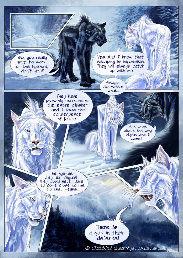
What to you think about the edges? aren't they too distracting? I need at least some 'safety margins' for the printed versions.
Help Reign of Cheederians growing and spread these stamps:
Opinions, critique and tips are welcome!! Let me know what you think about the page as it comes to panels, bubbles, readability of the text, colours, composition, atmosphere, story plot whatever. Help me improving the quality of the novel XD
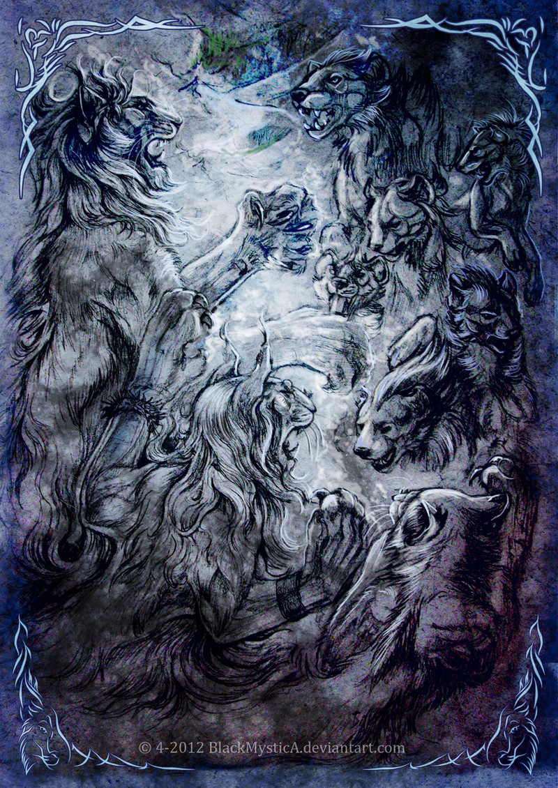
Cheederians are enormous felids; a horse sized mix between an Oriental cat, tiger and Eurasian lynx - see here some refs: [link] , [link] , [link] and , [link] , [link] .
Special thanks to , and for the critical view on the storyline, world and art and the whole team of English speaking reviewers!!! I also have to thank my cats Jayto, Neo and Nintu, the many other cats, tigers, Eurasian lynxes and hyenas as models and of course all other people on DA who gave me useful tips and critique.
Art, Cheederian species, character and story by me. Please don't copy and/or use it without my permission!
Related content


Comments: 45


Edges don't distract from the artwork at all. C: In fact, it a very, very good idea to get used to putting them in now; because once this is printed you may need extra wiggle-room one way or another for the spine of the book.
Hm, one thing about the transition between this page and the last, with the larger group dispersing: I feel like it felt a little too 'close up' in it's showing. But remember this is just my personal opinion and others may feel the exact opposite. After roughly twenty pages (give or take) of close-up personal encounter, you've more than proven you can draw your unique and rather beautiful species like the pro you are (not to mention the gorgeous winter backdrop).
But the flow of action has all been in their faces, shoulders, full-body in a close-up sort of way for so long as a reader I'm looking forward to more far-out shots, like the bottom panel showcasing the way out for them in this page.
Looking at the bottom panels of this page alone, you have three panels dedicated alone to just Yves' facial expressions for each dialogue bubble. While your mastery of facial expressions is a major strength, overusing facial expressions can become a negative thing.
Don't be afraid to let the dialogue speak for itself; even if this is a graphic novel, words have a power of their own, and your word bubbles are wonderfully expressive without the need to draw panel-by-panel how Yves looks all the time. Panels 5 and 7 could have been removed entirely, giving panel 6 the chance to expand into a full, big panel showing even more of the area they're going. A good panel to have IF the next page transitions into the two traveling, or having a skip between this conversation to down the road, or another area.
^All the above is the opinion and advice from a graphic novel reader, not a graphic novelist. Feel free to disagree. ")
👍: 0 ⏩: 1

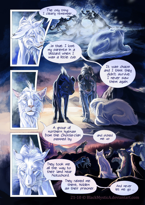
Thanks a lot for your opinion!! I have to say that because they stayed all the time on only one single spot I didn't feel the need to show the landscape - I chose for the expressions instead, because they tell in this part of the story more. But they are now going on the move after this page and it is indeed now time for much more landscape and overview panels. I sketched until the end of the chapter and I can reassure you that you will not be bored haha!! Therefore I take also a week ToM break - just to practise landscapes more so that it comes out nicely in the following pages.
Anyway when we end up in a stationary phase again in the story I will definitely take your comment into account- I see your point and I agree with it more or less. Only the last pages I wanted to focus on subtle changes in expressions to kinda activate people's 'theory of mind' and empathy optimally - but indeed maybe too much XD
👍: 0 ⏩: 0

One thing I just love about this comic, nex to the characters, is how well you manage to give them expressions and a great body language and yet keep them so realistic. I´ve rarely seen that in comic, many are so cartoony but your style is really different and nice!  (Smile)")
Well I really have no critique and looking forward what happends next! Just one question, will you do a character sheet for Yves as well? I really wish to draw him once

👍: 0 ⏩: 1
Thanks!! It helps also to hear what people like in the pages - all opinions help
But yeah the cheeds just 'live' in my head so I kinda see them moving and I just draw what I see XD. Next week I will submit the chractersheets of them
👍: 0 ⏩: 0

Sorry I didn't help on this page. I've been really busy lately, but I'll help on the next page.
👍: 0 ⏩: 1
hehe therefor I have a whole review team - so it is less pressure on individual people, so it is no problem if you're too busy. But I appreciate your help
👍: 0 ⏩: 0


ohh interesting page! 
and i don't think the edges are distracting i think they fit very well to the pages!
 (Wink)")
👍: 0 ⏩: 1
Haha you will see XD terrible to shut my mouth and not spoil
👍: 0 ⏩: 0

Edged? Oh! there are.. I didn't even realize it until the end, so.. Go with it if you need!
👍: 0 ⏩: 1
ha good that you even didnt notice XD I think I need them for the printed version
👍: 0 ⏩: 0

I like the safety margins. They don't distract at all. In fact I didn't particularly notice 'til you said
So yeah. Fine!

👍: 0 ⏩: 1

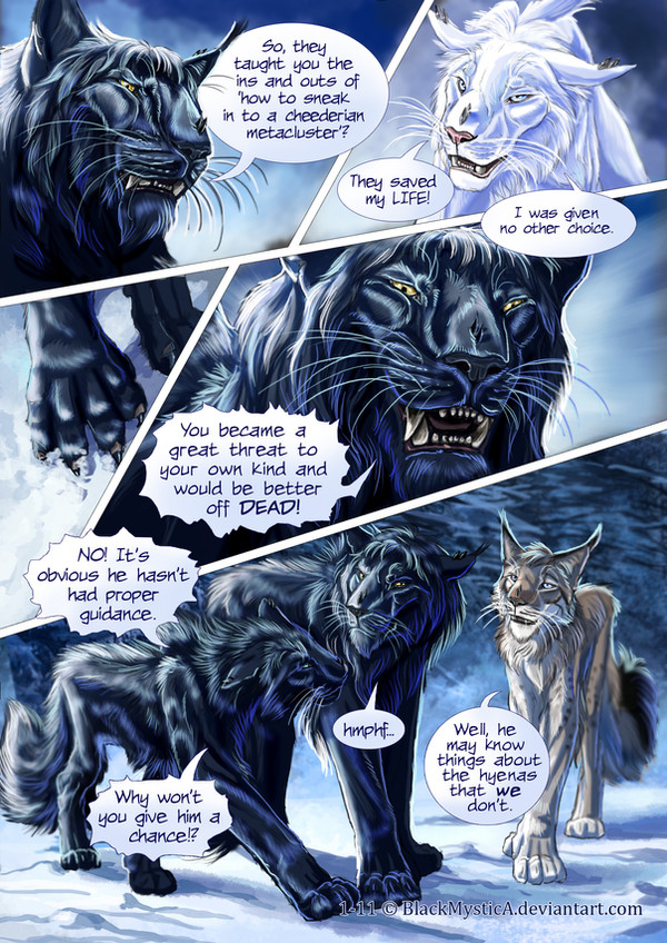
Yves is so cute. Love the last panel, that profile shot, absolutely gorgeous! His teeth, his whiskers, great work!
Shasha is beautiful, I love her long legs.
👍: 0 ⏩: 1
Thanks!! Ha yeah it's often those tiny detail like whiskers that make them so cute XD Ha yeah most cheeds have pretty long legs - the influence of the lynx XD Which makes them well adapted for deep snow and steep terrain
👍: 0 ⏩: 1
You're welcome and yes, that's so true, after all, details make them seem alive. I'm a sucker for details ^^
I see
👍: 0 ⏩: 0

I like the edges that way, but to be honest i didnt notice until i read it in the description!
👍: 0 ⏩: 1
Haha a lot of people even didn't notice
👍: 0 ⏩: 0

I can't really notice the difference, to be honest... your pages look fine.
👍: 0 ⏩: 1


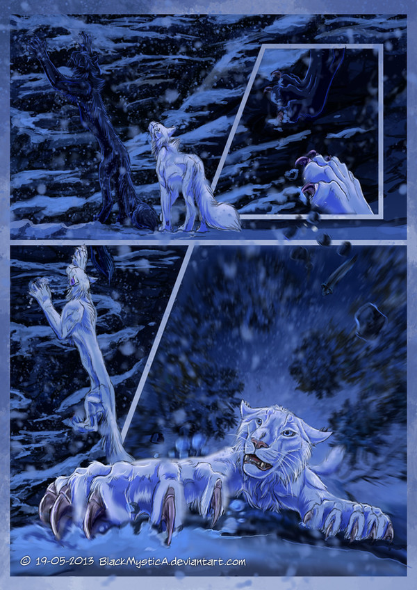
That's my boy! Run Yves! You don't have to spy on any of the ones you love!
👍: 0 ⏩: 1
Haha that is Yves' impulsive way of thinking XD ...but it will be not that easy.
👍: 0 ⏩: 1
*crazy Mineuh goes and creats a massive distraction/diversion so they can escape!*
👍: 0 ⏩: 0

Gorgeous as always, and I don't think the edges are distracting, I think they look very stylish and are a nice addition to the comic! <3 Gives a very professional look.
👍: 0 ⏩: 1
Ha ok! Good to hear that
👍: 0 ⏩: 1


Sorry I haven't been helping with the last couple of pages; I've been swamped with work! But I'm glad to see you're still getting support and the pages are looking (and reading) great!
👍: 0 ⏩: 1
Hehe you're often of great help so if you have no time it's no problem
👍: 0 ⏩: 1

Hmmm, I don't think so. They blend so well with the panels that I didn't even notice them until you mentioned it.
Also, A GAP!
👍: 0 ⏩: 1
Yepyep! Ok - good to know that the edges don't distract.
👍: 0 ⏩: 0

I don't think the edges distract at all. I didn't notice until you mentioned it. I believe they frame the art very well as a matter of fact.
👍: 0 ⏩: 1

Really amazing ... I love the design of your Cheederians. Such beautiful creatures.
👍: 0 ⏩: 1
Thanks! A pretty unusual feline hybrid XD
👍: 0 ⏩: 0