HOME | DD
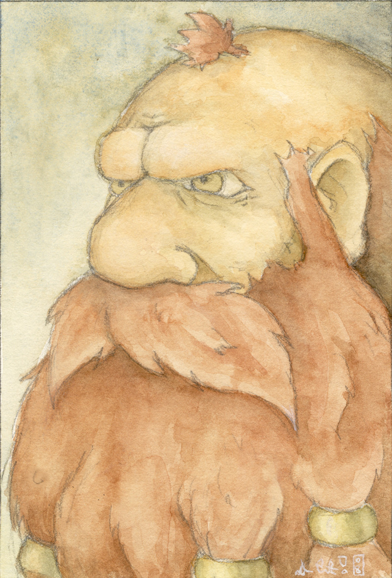
 GH-MoNGo — Myrmidon Mugshot
Published: 2008-03-10 01:15:31 +0000 UTC; Views: 1529; Favourites: 23; Downloads: 0
Redirect to original
Description
Just a quickie (1.5 hours). I've pretty much overhauled my palette so I wanted to try out some of my newer colours.Watercolour on Crescent 310 Cold Press Illustration Board.
Related content


Comments: 105

 (Smile)")

hmm, this one's nose is every interesting... this one is soft, very soft texture.
👍: 0 ⏩: 1
Thanks, for slow getting back.
👍: 0 ⏩: 0

Excellent work, well drawn, nicely coloured and full of character.
👍: 0 ⏩: 1

Awesome speed paint. I really have to agree with everyone on the nice palette.

👍: 0 ⏩: 1

I am talking about the palette not Myrmidon!! XDD
👍: 0 ⏩: 1


Nice speedy. I like the subdued colors, they give a somber feel to the portrait.
👍: 0 ⏩: 1

Thanks.
I've been fiddling around with more muted colours; I think they fit my approach better.
👍: 0 ⏩: 0

I love the brow in particular, it's very well-defined and really creates that 3D feel to this portrait. ")
The only crit I have is that the ear might be a little too far forward on his head
👍: 0 ⏩: 1
No problem - no idea if I'm even right but I know you accept constructive crit so thought I may as well add my thoughts ^^
👍: 0 ⏩: 0

Nice painting 
👍: 0 ⏩: 1
No, you're right. Thanks for pointing it out.
👍: 0 ⏩: 1

Now I want to get back to painting and water coloring...
👍: 0 ⏩: 1
Good thing I have the watercolor pencils and paper I had lying in the closet.
👍: 0 ⏩: 0
It just takes a bit of practice.
👍: 0 ⏩: 1

so I see. and as you can see I am working on this one. a very sad pic but hey it looks cool with the burn tool.
👍: 0 ⏩: 1
The Burn Tool is proof that God loves us and wants us to be happy.
👍: 0 ⏩: 1
or Dr...oh right *slaps forehead again* yes Morgan Freeman wants u t be happy!
👍: 0 ⏩: 0

Wow, I like this. You're good at profiles. The watercolor strokes(?) add texture to the beard and background, too.
👍: 0 ⏩: 1
Yeah it's all watercolour.
Thanks!
👍: 0 ⏩: 1
I thought so. I just didn't know if you'd technically still call 'em strokes... although now that I think again, I don't see why you wouldn't.

👍: 0 ⏩: 0

Neat! I'd probably be inclined to a dd a hint more pink in the cheeks, but then, I work in mixed media coloured pencils/ink/watercolours, so, you know
👍: 0 ⏩: 1
Alright, thanks for the tip!
👍: 0 ⏩: 0

nice brush strokes on this one, certainly adds to the textured feel of it
👍: 0 ⏩: 1

It goes down to the bottom of his chest.
👍: 0 ⏩: 1


ooh! I like that little tuff of chicken hair on his head 

👍: 0 ⏩: 1

lol! 
Correction, rooster hair ^^

👍: 0 ⏩: 1
Yeah that's better.

👍: 0 ⏩: 0

Is he by any chance wearing a Ring of Eyebrow Vanishing or something along those lines?
You should try going into detail more in faces. I don't know if that's just your style, but your faces tend to look really uncharacterized.
")
👍: 0 ⏩: 1
Nope.
Define "more detail"? What specifically should I work on?
👍: 0 ⏩: 1
More facial features like wrinkles (even small ones if they're young), the little things here and there. Even try going into further detail with the eyes, try to add little details like the veins around the iris.
I find the best way to practice this is with angry faces. Anger distorts the face to use all of these details and wrinkles and whatnot.
👍: 0 ⏩: 1
| Next =>