HOME | DD
 GH-MoNGo — The Wrecking Crew

Published: 2008-10-23 23:09:29 +0000 UTC; Views: 4108; Favourites: 89; Downloads: 0
Redirect to original
Description
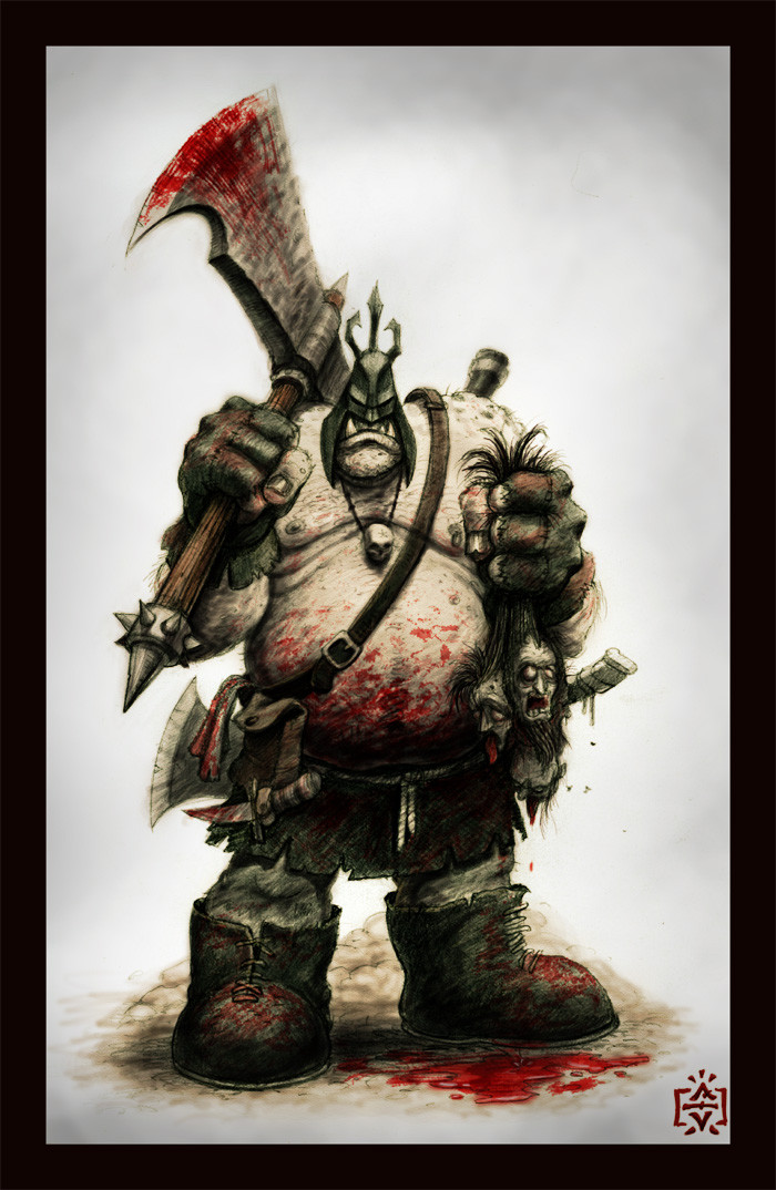
Watercolour, ink, casein on Twinrocker 200 lb. Watercolour paper.Related content


Comments: 122

The depth is AWESOME on this. The two in the front really jump off the page! And it doesn't distract from the guy in the background. I really like this one!
👍: 0 ⏩: 1


I like the expression of the skull thing on his belt. Seems almost alive!
👍: 0 ⏩: 1

Ha ! It could be like a double act.
👍: 0 ⏩: 0


Thanks man, glad you dig it!
👍: 0 ⏩: 0

I expected much from that lineart and you've delivered the goods.
switching between the two, I can see how your colours highlight the details so well. The focus is now on the hammer dude - he seems more animated now. The guys in the foreground look more menacing too, their features are easier to see. And your effort on the brickwork is beautiful.
Great stuff.
👍: 0 ⏩: 1
Thank you!
I put a lot of time into planning this one and I'm glad it paid off!
👍: 0 ⏩: 0

Great work again and I really like the angle in this one.
 (Smile)")
👍: 0 ⏩: 1

Sorry very tired right and cut and pasted to the wqrong place
Please diregard the above
This is great
👍: 0 ⏩: 1

nice, hope I can make sumtin like this
👍: 0 ⏩: 1

I'm gonna have to agree with everyone that this is your best work to date. I mean, just for your technique improvements alone this is cool. Values, texture, lighting and composition have leaped in skill.
👍: 0 ⏩: 1


Sick painting man! Definitely one of my favs from you!

👍: 0 ⏩: 1

Call in the demolition experts!
The underlighting is really well done and adds a great "looking up" effect.
👍: 0 ⏩: 1
Thank you! That's just what I was going for!
👍: 0 ⏩: 1

Is there a light source underneath the guy in the back? It's almost creepy. I love the colors and that watercolor texture!
👍: 0 ⏩: 1
That's sort of what I was going for. Thank you!
👍: 0 ⏩: 0

Great composition and colours. Love the lighting and it's got that beautiful storybook feel you do so well
👍: 0 ⏩: 1
Thanks man! Glad you like it!
👍: 0 ⏩: 0


you're stepping up your game, i'm impressed.
👍: 0 ⏩: 1


Your best piece to date.
Good contrast with the colors, by having more vivid hues in the sky and muted earth tones in the fore you created a strong separation between those two elements whilst framing the brighter central character who's coloring instantly focuses the viewers eyes.
👍: 0 ⏩: 1
Thanks man!
It took me longer than I thought, and quite a bit of planning went into the colours. I'm glad it all paid off.
👍: 0 ⏩: 0

Haha, I missed your stuff. And you've gotten so much better too C:
Really dig that dynamic perspective going onnnnn
👍: 0 ⏩: 1

This is a prime example of hammertime. Good use of contrasts for a dramatic and dynamic effect.
👍: 0 ⏩: 1
Thanks!
I had to resist the urge to write "Hammer Time" in the description!
 (Wink)")
👍: 0 ⏩: 1
Resisting the clichés are a everyday struggle.
👍: 0 ⏩: 0

Hey, this turned out nice! Man, your watercolors are always so smoooooooth
👍: 0 ⏩: 1
Thanks!
It's a lot of edge-softening and blotting.
👍: 0 ⏩: 1
Edge-softening, eh? Like...smoothing plain ol' water into the paper once the paint is already down?
👍: 0 ⏩: 1

| Next =>