HOME | DD
 Jumprabbit — Harmony

Published: 2008-06-20 02:52:21 +0000 UTC; Views: 1047; Favourites: 11; Downloads: 35
Redirect to original
Description
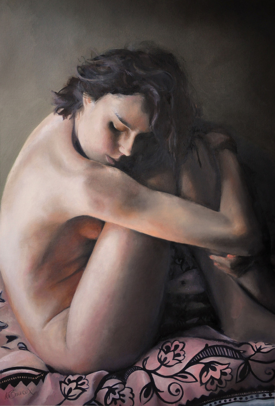
Charcol and Graphite on paper. 70cm X 50cm.OK so I wanted to make something that looks more like a drawing, but still has some elements of my other stuff.
It took me all of 1 day, which for me is nothing at all.
I had lots of funs drawing this, however I did NOT have any fun at all photographing it. Anyone out there have any idea how to get good shots of graphite drawings? tricky little buggers.
Soooooooo...anyways I like it.
However feel free to hurl abuse and point out the latest drawing of that Jolie person is much better.

annnd moved to scraps until I get a good photo, or feel like putting it back
Related content


Comments: 12

Hey mate, take it outside and out it in a slightly shady area with fairly constant light, dont use any flash and presto, half decent graphite photos, personaly I scan them it's definately better.
👍: 0 ⏩: 1

I shall try it, mine are way to be for my scanner I'm afraid
 (Smile)")
👍: 0 ⏩: 0

Graphite is tough to get true shot of digitally. The flash does a number on the material and will totally wash out the shiny build up that can happen when using graphite. So unless an old pro photographer takes the picture of the graphite work the digital image will probably never do the actual work justice.
With that said, you managed to get a great shot of a great piece of work. I'm sure it looks better in person, but it looks pretty damn good here too.
👍: 0 ⏩: 1
Thanks for the feedback, glad its not just me struggling with it.
Glad you likes it, the people I made it for are pleased and paid me, so thats the main thing
")
👍: 0 ⏩: 0

dunno how to get past the poor picture-grabbing of graphite drawings by digital cameras. and scanning seems to take vry dark areas and turn them white, based on shinyness.
been struggling with that myself. if i find any clues, i will forward them on to you. maybe in the tutorials section? dunno - have not looked yet.
i do like your drawing as is ... though the lower left is higher contrast than upper right. that is a bit jarring. perhaps an artefact of the photography? good work, anyway.
RC
👍: 0 ⏩: 0

The contrast between the top right corner and the bottom left corner kind of bugs me...
Other than that, beautiful.
👍: 0 ⏩: 0


That's awesome!
Have you tried scanning rather than photographing? Maybe with a low contrast?
👍: 0 ⏩: 0

hey thanks....sorry for crappy grainy photo
👍: 0 ⏩: 0