HOME | DD
 kefkafloyd — Sweetie Belle Color Guide 2.0 [UPDATED]
Published: 2011-08-01 19:15:55 +0000 UTC; Views: 20074; Favourites: 231; Downloads: 3121
Redirect to original
Description
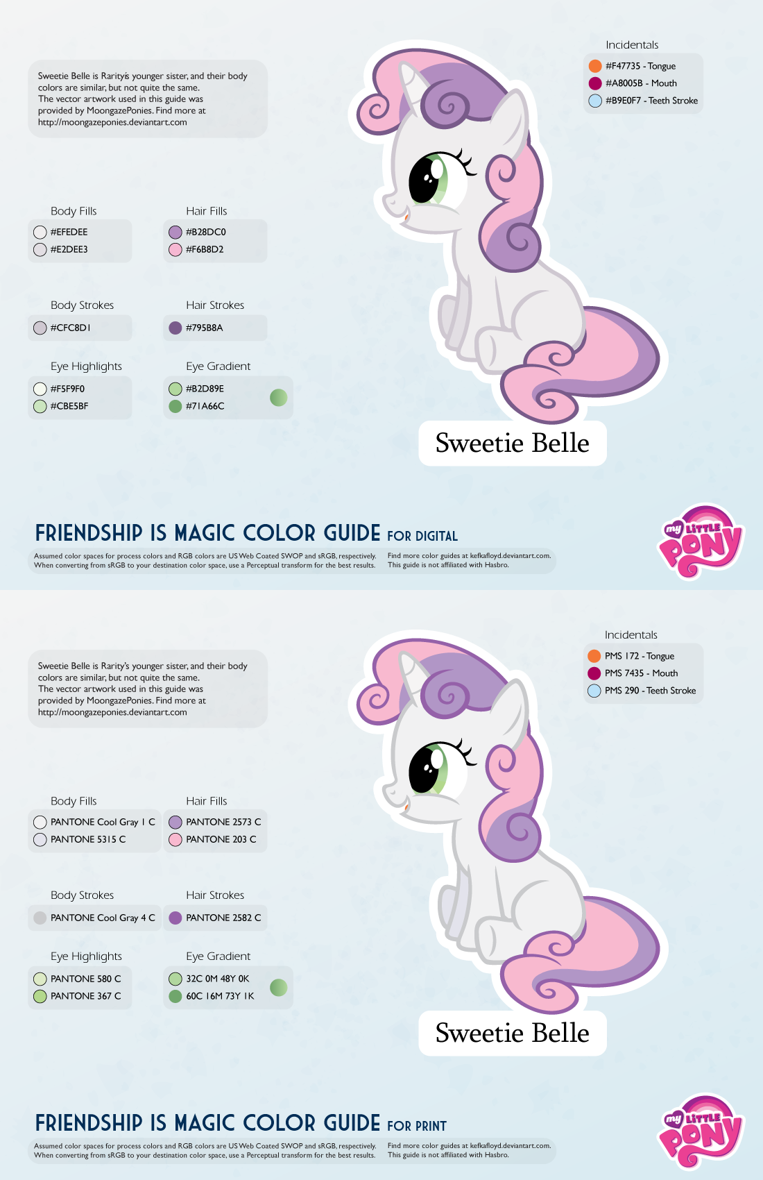
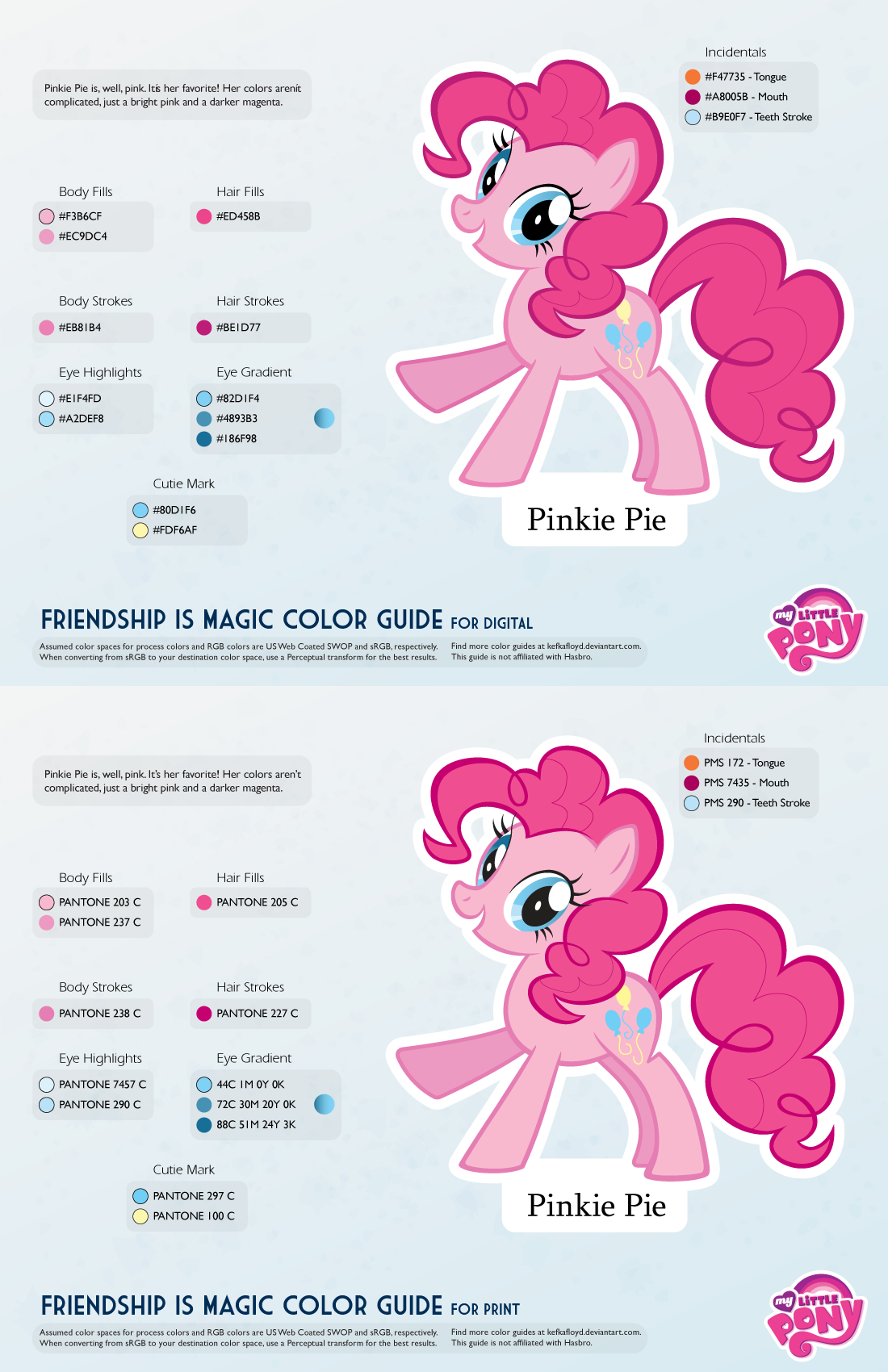
New and improved!All of the color guides are getting a revamp. The guides are all now two pages, one for digital applications (such as vectors, painting in Photoshop, 3D modeling, etc) and the other for print applications (customs, merch, T-shirts, et cetera). The PNG preview for the digital guide should be OK to use as well, so the PDF is optional.
If you use Google Chrome or Safari, they will attempt to open the file in-line with Google Docs PDF viewer. DO NOT EYEDROP THOSE COLORS. SAVE THE PDF FILE. The Google Docs viewer displays in a very low bit depth that results in dithering of the colors. Until Deviantart gives me a way to disable this, you should use the download file link to view the guide!
They are also now more space efficient, and will be able to scale better with ponies that have more colors than normal.
The Digital guides aim to be as close to the show as possible, while the print guides aim to be as close to official merch as possible. When there's no merch of that pony (e.g. background ponies) then the print colors will be based on my conversions which will aim to reproduce the show without looking too weird or have obvious gamut problems.
It is safe to eyedrop the digital colors or use the hex/RGB codes - the swatches should match up just fine. Just make sure you're working in sRGB color mode.
For the merch guides, the spot colors are rendered using CMYK alternate color space. This is based on my own examinations of the merch boxes, where the spot colors are simulated straight to process anyway.
Related content


Comments: 20

Ty but I could barley see it, and once I finally did, the numbers are completely wrong...
👍: 0 ⏩: 0

Ah dunno how many times ah have tuh thank ya for these color guides, they will certainly help with some of those "vehctor" things.
👍: 0 ⏩: 0

 (Smile)")

For some reason, their tongues being orange doesn't bother me until I have to draw them. Then I think, "Wow, that is not a good color for tongues." But it always works out in the end. I wonder who made that artistic decision, because even though I feel like it shouldn't work, it does!
👍: 0 ⏩: 1

Contrast purposes; pink tongues probably blend in too much. But that's just a guess.
👍: 0 ⏩: 0


Nice color guides, man.
By the way, you could update the CMC with their cutie mark colors

👍: 0 ⏩: 0

Hey, I really like your color guides. They helped me a lot so far. But isn't Pantone 427 C too light for her outlines? Using the eyedropper on the PDF got me a color that's more like 428 C.
But maybe I'm just doing it wrong^^
👍: 0 ⏩: 0


And awesome work, though I'm sure you know that already.
👍: 0 ⏩: 0
You wrote down the wrong RGB values for the eye accent; I got 206 R, 229 G, 190 B, while it says 206 R, 165 G, 205 B (a shade of purple not present in the vector).
👍: 0 ⏩: 1
Sounds like I made a typographical error! I'll fix it right away.
👍: 0 ⏩: 0

Thank you so much for this. This will help with my vector work.
👍: 0 ⏩: 0

Awesome! Were you still interested in doing Vinyl Scratch now that there is an official reference of her that doesn't have her in a darkened room? I've got her ready if you ever want it.
👍: 0 ⏩: 1
We can make this happen...
I actually had developed a palette for her based on color correction (the show is remarkably consistent about its amount of hue/saturation/brightness shift they apply to dark scenes, correcting for it is trivial). The trouble with the poster put online is that it has a lot of JPEG compression that negatively affects color purity. Printed versions are halftoned. My kingdom for a high res TIFF version...
👍: 0 ⏩: 1
Okay! I am converting it to shape layers, since I only recently started making things that way (why did I not make this change sooner? ")
👍: 0 ⏩: 0

I was just wondering when you would post the Sweetie Belle one! Thanks a bunch for posting these color guides. They are very helpful.
👍: 0 ⏩: 0