HOME | DD
 MattMoylan — Lil Formers - G1 Nouveau

Published: 2009-11-09 07:26:24 +0000 UTC; Views: 33386; Favourites: 372; Downloads: 418
Redirect to original
Description
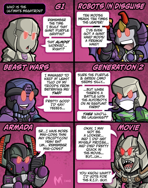
For more Lil Formers head to www.LilFormers.comThis'll get you guys talking!
To see the new look I'm referencing here, check out this preview on Comic Book Resources:
Transformers #1 Preview
Now, I'm not slamming Don Figueroa's art skills, he's still unquestionably the top Transformers penciller now or ever. But I think the choice of these hyper detailed faces is a big blunder. They're ugly, they're emotionless, they look like old men/skeletons. They have no personality... they're no longer characters I can get attached to or care about. Just big scary machines. Sure, perhaps the tradional smooth metal faces with eyes and mouths that some how magically flex might not make sense, but tht didn't matter. You could get expressions out of TF's with those faces, you could see characters with emotion in them.
Anyway, I actually have bigger complaint about this new look... what's up with the colouring!? I may have high standards as I work at a studio known for its high end colouring skills, but this is just god-awful stuff. Either the guy is on his first job, or was ultra-rushed and couldn't finish, or wasn't paid enough to do a decent job, or SOMEthing... but in my opinion as an editor this should never have seen print. Guh.
So anyway, all opinions welcome, what do you guys think of the new TF comic style??
PS: Yes, I am directly contradicting my robot reproduction statement from the Springer strip. But funny trumps consistency.
")
Related content


Comments: 271

I can see them going for the "Movie"-look, to gain some more popularity.
... which is odd, seeing as Bayformers weren't really popular... fandom-paradox?
Bah, I still think they should hire you to do some TF comics, Matt. Heck, they should make a movie about Lillformers!
👍: 0 ⏩: 0

Its like he's trying to copy the movie style as if its the new trend... I grew up watching the show and later the anime versions of it. The designs are just way to busy and distracting too.. I much rather they had lets the designs the way they were instead of trying to make sense out of how their faces and all were build... Your right, this new design is pretty bad.
👍: 0 ⏩: 0

I think I would be shocked to, if I see my dad like this O_o XD
👍: 0 ⏩: 0

And here we go again with the fandom acting like their very lives are being threatened over some change in the franchise that will last what, 6 months?
👍: 0 ⏩: 1

Heh, it's not freaking out dude it's basic people telling them "That's stupid, stop doing that."
You want to try new stuff for the movie or toys whatever, those are for kids. But the comics are exclusively for adults for grew up ont he 80's show/toys.
👍: 0 ⏩: 1
Wasn't really referring to comments here as far as general reaction goes. Seen some seriously retarded crap spewed elsewhere though.
And I don't really subscribe to anything being "exclusive" to anyone either. Don't care for the faces much m'self, but I'm not against the experimentation.
👍: 0 ⏩: 1
Not saying the comics are exclusively for anyone, but the hardcore longterm fans are the only ones that read them. Kids (even if they like TF's) don't read the comics, and in fact don't read American comics in general. Average people who are interested in TF since the movie, pretty much as little chance they will be reading them.
As someone who works in both American and kids comics, this is just the way things are.
👍: 0 ⏩: 0


Oh my god they gave Bumblebee a mustache.
That drawing style is hideous imo, and I could do better colouring than that. T_____T
👍: 0 ⏩: 0


What? Are they trying to combine the G1 designs and the movie designs? I don't necessarily hate it, but I don't necessarily like it either. I mean what's wrong with their previous designs?
👍: 0 ⏩: 0

This is worse than the movie. The look they've gone with doesn't allow the bots to have much expression. Even the movie-style bots had character in their faces.
👍: 0 ⏩: 0

In my opinion, not everything has to look like the movie style..........to me, too much detail like that is over-doing it.
👍: 0 ⏩: 0

With you on that. Besides, most of the early stuff, G1 in particular,made no sense! The faces were the least of it, and yet we love them anyway.
👍: 0 ⏩: 0

Yep, its all because of the movies. I'd prefer a Transformers movie that concentrated on the robots and not the humans, but then again I'm not in charge. About this change though, they do it because the fans already know the characters and expect you to be attached to them, no matter what they look like. While I can applaud them for trying to reinvent the character looks, make them look as though they can actually transform into their alt modes but be real at the same time, I agree with you that these character's faces can show very little in the way of emotion. It will have to depend on coloring/lighting, and dialog. Killing off Ironhide so soon is a huge blow, but I guess it will get people talking as much as when Chewbacca was killed.
👍: 0 ⏩: 0

Actually, I like this style. Would have been nice if the movies looked like that.
Its a nice compromise between the "classic" style and the movie weird esthetic.
👍: 0 ⏩: 0

I completely agree with you, the designs are bad, they're a weird mix of the toyline and the bayformers monsters, what's the deal with that? It's not like bay will allow new designs for the third movie, or is it to promote dvd sales? Whatever it is it ain't pretty, Ironhide looks awful old, like really old men with little to no body fat @_@
👍: 0 ⏩: 0

why would anyone want to copy the bayformer style after all--well, a good majority of--the fans have openly expressed their dislike for his crap?
The faces look like metalic St. Bernards to me.
Even so, at least the bayformers had SOME amount of expression in them, I suppose.
👍: 0 ⏩: 0

I feel they're trying too hard to form their own identity. The North American comic books were too long overlooked because of all the high quality manga flooding the market. Now they have to grab people's attention by going back to basics, to a comic form that was around back in the last 60s and early 70s. The style reminds me of the old Bob Moran series or even a lot of what's been drawn by Dark Horse, gritty, dark. Not something I can get into, but the story is what will mostly carry the comics.
👍: 0 ⏩: 0

My God, the Autobots look like Decepticons! D:
Better yet, their faces look a lot like a certain Transformer race that I can't thing of right now. O.o Possibly the Quintessons? Either them or G1 Cyclonus. Someone help me out here, this is gonna bother me. XD
👍: 0 ⏩: 0

I totally agree with everything you said. The faces are way too segmented. They look like zombie mechs with pieces of metal hanging off. The colouring style seems to change a lot and as you said, some look god-awful. Like Magic Wand and Paint Bucket awful. And the crotches bug me. I don't know why, but they seem to draw attention...or that might just be me.
Anyhoo, your Rodimus rendition is creepy as hell. I'll never get those soulless eyes out of my head now.
👍: 0 ⏩: 0


I didn't noticed about that new style on the comics, but is really ugly, I don't like them like that ¬¬
the crazy or maybe stupid part is that looks like the IDW people want to mix G1 with movie style, and I think that this isn't a great idea.
but well, sure when the comics be out all the fans going to like the new designs as always be in similar situations

👍: 0 ⏩: 0

If he wanted to make them look more alien, well, he's accomplished that.
As far as the coloring... well, at least it's not Nelson Yomtov!
👍: 0 ⏩: 0

i like it. its a nice blend to classic and movie style...now if they can do the same for GIJOE now that'll be awesome
👍: 0 ⏩: 0

")

Agreed, this style of art is weird. I personally prefer Nick Roche's style or the "Animated" intrepretaion 4 that matter.(No offense towards any non-Animated fans what so ever.)
But I'll still give this story a shot, given that it will homage Simon Furman's IDW work and not highly reference the events of AHM, because I hated what McCarthy did to the series.(Again, no offense towards any AHM fans who liked that sereis.)
👍: 0 ⏩: 0

Why do they all have moustaches? I keep thinking I'm at a convention where everyone is cosplaying Alpha Trion.
👍: 0 ⏩: 0

While there is definitely a movie-style asthetic going on, the jury is still out with me. At certain distances it looks good, but that up close of Hot Rod was just BAD. Maybe with some practice it will improve. I can see it working well with the Decepticons though, especially Megatron. My favorite thing about movie Meg's ultra detailed face was the "I EAT BABIES!!!" quality it had.
👍: 0 ⏩: 0

I will probably get a lot of hate for this (especially from the G1ers). If they are going for a movie-verse/ Bayformer look, then they should have changed the body as well.
👍: 0 ⏩: 0

lol about the coloring... I would kill for that gig
👍: 0 ⏩: 0

LMAO!!! I like the new body designs but yeah, the faces need to be toned down a little...
👍: 0 ⏩: 0

Oh, Sweet Jack Kirby, it's a mish mash of G1 designs with movie designs. Though I think it'll be preferable to name it something other than G1. G3/4/5/whatever maybe?
And kill off Ironhide in the first few pages of the series? Savages!!!
👍: 0 ⏩: 0

When it comes to a 'fusion' of styles, Animated (in my personal opinion) made such a fusion work by exaggeration, simplification and ultimately charicaturization, ie Blackout and Strika for the lack of better examples.
Even so, animation and comic form allowed for a range of expressions. The same goes for the original G1 style in terms of expression.
This fusion of G1 and the Live Action films on the other hand is.. bleh...
The bodies? They're fine. The faces? Yeow... I believe what you said earlier about them in your comic and comments sums up what I would have said about it.
I don't know a lot about the professional side of comics, but I feel I know how to make a character (Autobot, Decepticon or what have you) emote properly more so than what is presented in IDW's latest comic outing. But like you I'm certainly not trying to slam Don. I highly respect the guy and his style.
I didn't actually notice anything about the coloring, but then again I'm not much of a colorist.

👍: 0 ⏩: 0

But I think the choice of these hyper detailed faces is a big blunder. They're ugly, they're emotionless, they look like old men/skeletons. They have no personality... they're no longer characters I can get attached to or care about.
I'm guessing it's either the uncanny valley or the fact that the art style is too realistic for a comic based on a TOY!
👍: 0 ⏩: 0

Poor Junior. I don't blame him. It's just creepy! It's scarier than Live Action Megatron!
👍: 0 ⏩: 0

This comment was brought to you by the letter:
"AAAAAAAAAAAAAAAAAAAAAAAAAA
AAAAAAAAAAAAAAAAAAAAAAAAAAA
AAAAAAAAAAAAAAAAAAAAAAAAAAA
AAAAAAH!"
👍: 0 ⏩: 0

Looks awful. 8( Bring back the old Figueroa art! =3=
👍: 0 ⏩: 0

I really don't see whats wrong with this look, the way you depicted Hot Rod is actually rather hilarious, you should see my little brother rolling on the floor right now.
Figueroa is a TF drawing GOD!*please don't kill me for blasphemy* And this new look is amazing, course if I was draawing this I'd probably wind up making them look like a cross between Gundams and the Bandits from Samurai 7(think Cybertron/Galaxy force gone wrong)
👍: 0 ⏩: 0

i agree it completely takes away from them having emotion. and bumblebee just looks like a God-awful scary thing! i never thought id say that about him but holy CRAP!!
What on earth possessed them to design them like this?
👍: 0 ⏩: 0

Now that I think about it, the faces of the new TFs do, in fact, creep me right the heck out. It's just too sinister looking to be relatable.
I don't really get your complaints about the coloring=I like it fine, in particular the backgrounds are really neat-looking. But I can see where there'd be some problems.
Speaking of art, how much are those Mega Man books expected to be in USD?
👍: 0 ⏩: 1
the Mega Man books are $39.99 usd each...and they're printing and on they way from overseas right now!
👍: 0 ⏩: 1
Great to hear. Best of luck with sales!
Y'know, now I want to go and play Mega Man 8 on PlayStation...
👍: 0 ⏩: 0

I'm somewhat surprised you didn't mention the recent films in your comment. I get the impression that the only reason we're getting this redesign is to connect them more to the "new face of Transformers". Just look at Bumblebee and tell me that's not supposed to be like the move version in his new form.
It makes me sad. Transformers 2 really has damaged my fandom of the franchise. I'm just not excited about Transformers anymore...
")
👍: 0 ⏩: 0

Roddy Jr. has been traumatized!
I kinda think that in terms of style and aesthetics, the bayformers look better onscreen than as drawings, and the original G1 style (with magical flexy mouths and all) look better as cartoons and comics. Just my two cents, not that anyone would agree with me on that or not.
👍: 0 ⏩: 0

lol zombie Roddy. G1 + movieverse = fail. :3
👍: 0 ⏩: 0

As much as I dislike the new faces the colouring irks me a lot more. It's a bit flat and dull.
I wish or would've color Don's stuff. They make it even better. They might make the faces not look as bad.
I'm sure Don will take some constructive criticism about the new design and improve them as he goes along.
👍: 0 ⏩: 0

Yeah, what that last poster said: Blame the movies.
The faces made out of double-handfuls of rasping plates sliding all over the place is 100% movie-style.
I don't love it, although I could see it being refined into something likeable.
👍: 0 ⏩: 0


Personally, goddamn but I LOVE those bodies... For some reason, I'm especially attracted to Roddy's feet/pedes. They're sexily done as ever. All hail Don Figueroa!
However... I'm with you on the point of just the faces. Those... really creep me out. >>;
As for colors... I hadn't really paid attention until I read what you put on the subject. From a non-professional's POV, have to say they're fine. They work, at least so that they're "good enough". But when you're actually paying attention to them, and looking at the colors specifically... Yeah, you're right. They're crap. Ew.
👍: 0 ⏩: 0
| Next =>