HOME | DD
 muckSponge — Very SmallFox Concept
Published: 2010-11-01 08:00:35 +0000 UTC; Views: 9159; Favourites: 24; Downloads: 109
Redirect to original
Description
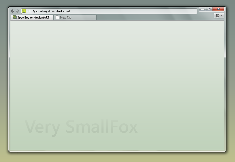
This is a Firefox theme concept for those of us who take pride in the fact that we can't see any of our toolbar buttons, or click them, because they are so small.Related content


Comments: 91

Yeah, I'll probably try that button style for the hover. It is actually exactly the same style as the one used in the Strata40 mockup. I'm just not quite sure whether I'll be able to get the button borders small enough.
👍: 0 ⏩: 0


I think that "Somewhat Smallfox" would be a more fitting title.
")
👍: 0 ⏩: 1
Come on, it's hard to get it any smaller than that without it getting unusable and ugly looking to normal people
")
👍: 0 ⏩: 2

Here's an idea: have all elements ridiculously tiny, like 8x8 pixels, then when you hover over them, they expand to 24x24 pixels. With zoom-y animations and stuff.
That would be cool.
👍: 0 ⏩: 1
It's possible, but it would be a terrible waste of space, seeing as you are putting smaller icons in a space that must accommodate larger icons
👍: 0 ⏩: 0
Lol, then you might not want to make the caption buttons bigger!
👍: 0 ⏩: 2
Wait, that didn't make sense.
👍: 0 ⏩: 1
Oh, wait. Omit the 'not.'
👍: 0 ⏩: 1
Hehe, I meant my reply didn't make sense, but either way. The caption buttons are now bigger

👍: 0 ⏩: 1
I like what you did with the back/forward buttons.
👍: 0 ⏩: 1
Thanks  (Smile)")
👍: 0 ⏩: 0
Because people didn't like them

👍: 0 ⏩: 0

")

Caption-buttons like these (of course on the left side) are modern. Apple uses them for itunes 10, which causes intensiv debates, because now it looks like a real traffic-light  (Wink)")
I like your concept. But now on ff 4.0 the status-bar is hidden in the orange tab-like button on the left upper border of the window-frame. Perhaps you can do a mod with this orange-button (it won't disturb your minimalism.)
👍: 0 ⏩: 1
Ahh yes, the app menu button. I was going to put it in somewhere but then I decided I was too lazy. I'll see about it today when I get back from school. I might end up putting the traffic lights back up the top, so I can squeeze an app menu button up there instead of in the toolbar.
👍: 0 ⏩: 1
Thanks for answering
In my eyes you can delete the 'traffic'-buttons. Your minimal-concept allows to be treated only with keyboard-shortcuts (min, max, close via keyboard without the mouse). That would be really revolutionary
I'm looking forward to see the progress of your great work! Keep it up.
Your stratum is seen as awesome - webwide! Thanks for that.
👍: 0 ⏩: 1
Hmm. I had some ideas for removing the tab bar and only having the urlbar and an app menu (and maybe back / forward buttons) in the theme but I tried removing the tab bar in Firefox 4 and it actually needs it to function correctly. You take it away and you can no longer use keyboard shortcuts to navigate between tabs and such.
I might try removing the borders around the toolbar buttons, redoing the tabs a bit and sticking the normal min / max / close buttons back in. They will only use p a bit of horizontal space and I'm not even sure how to get rid of them in the theme. I tried but I can't seem to get any CSS control over them, even if I do have their IDs.
👍: 0 ⏩: 1
I tried these settings in ff 4b6 to minimize it.
[link] (left side with taskbuttons is yoono)
What do you think?
👍: 0 ⏩: 1
What settings did you use to get the window controls like that?
👍: 0 ⏩: 1
[link]
My language is German. But I think all is in each language on the same place
Besides the 'Options', to be found within the app-menu-button, is an arrow on the very right side, which I used to overlook for long. If you open this you find the options to show or hide all kind of bars including the statusbar.
Greets
👍: 0 ⏩: 0

I wonder if we can do custom caption buttons, haven't tried yet. I don't like the choice of caption button used, other than that it looks pretty good.
👍: 0 ⏩: 3
The caption buttons are listed in the DOM, but they are not editable with CSS straight off the bat. I'm guessing they are somehow attached to the window and beyond Firefox's control. Maybe a separate add-on could fix that.
I made it in about 20 minutes, so it is more of a sketch of what's going on in my mind rather than a decent concept. There are many things I don't like about it.
👍: 0 ⏩: 0

Hide caption bar plus does it.
👍: 0 ⏩: 0

there is a addon that put's the captions at the toolbar and so make the captions skinable and even like a traffic light
so yes it can but it is some work and there are cons like it doesn't use the captions of the OS(or visualstyle of windows.)
")
👍: 0 ⏩: 0
It's just a concept made in Photoshop. The actual theme probably wouldn't be too hard to make, but its a matter of what people want me to work on (whether it be this, Strata40 or one of my other concepts).
👍: 0 ⏩: 1

Yeah but it looks great, love the minimalistic look!
This one is meant to be for firefox 4 right?
👍: 0 ⏩: 1
Yep
👍: 0 ⏩: 1
Awesome! looking forward to it
👍: 0 ⏩: 0

Are you going to ever release somthing? All you do is just relesing screenshots! :/
👍: 0 ⏩: 1
If you've read any of my journal entries you will notice that I can't release any of this stuff or indeed finish it until Firefox 4 is RC.
👍: 0 ⏩: 1
I don't think I have the time right now to get into that. I've got exams coming up, so I don't want to get too heavily caught up in skinning. Making concepts is light and easy and can be accomplished quickly. It's more how I sketch ideas than anything else. Theming Firefox is time consuming but nowhere near as time consuming as making Windows styles. There are far less images to process.
👍: 0 ⏩: 1


👍: 0 ⏩: 1
That was a very informative comment, thank you
👍: 0 ⏩: 1

<= Prev |