HOME | DD
 spiceofdesign — Ubuntu Concept
Published: 2012-03-10 23:06:16 +0000 UTC; Views: 10567; Favourites: 58; Downloads: 103
Redirect to original
Description
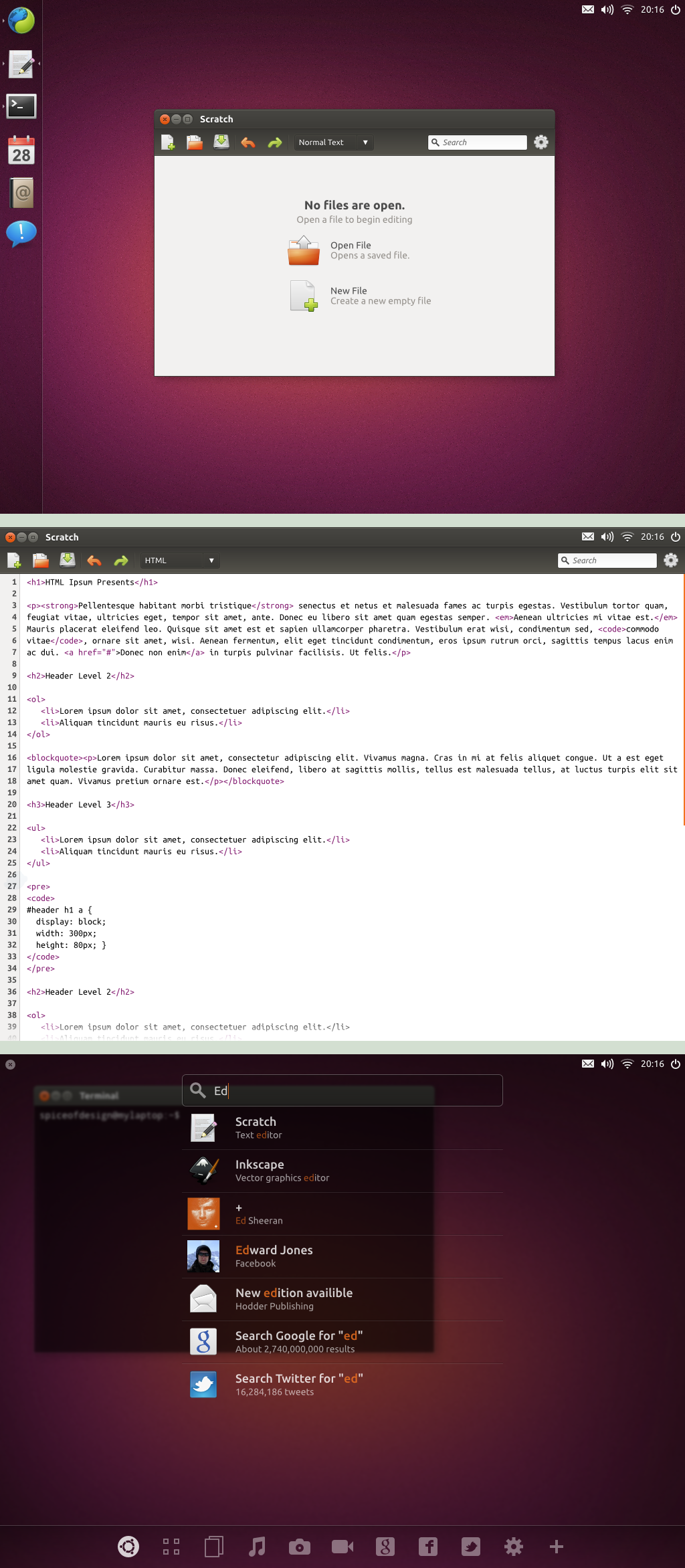
This is a concept user interface for Ubuntu.The first screen just shows a basic view with the dock on the left, showing open and pinned apps (in the order open pinned apps, open non-pinned apps, non-open pinned apps) This auto hides when apps are fullscreen but is accessible through the left hand edge. In the top right there is a classic wing-panel-esque applet area, which floats above windows.
The second screen shows a full screened app, with the applet area still showing over the top over the application title bar, allowing the user constant access to the information and settings it provides.
The third screen show the dash search, accessible by pressing the super key. Lenses are at the bottom (the selected one being a complete search, using all of the currently installed lenses). There is space at the side for any filters lenses allow.
Made in Inkscape 0.48 (with a little bit of GIMP)
Related content


Comments: 47


 (Wink)")

It's pretty... but look at your designs from the eyes of a user who isn't that clued-up when it comes to computers.
Would I be able to discover how to open apps that aren't on the launcher quickly? There is nothing on the screen to indicate that I need to press a button to do so.
Can I still put icons on the desktop? And why is the clock in my way when I make Firefox go full screen? I think I deleted something how do I find it again? etc.
Those would be some of the comments from user testing on this..
The thing about the big ol' BFB on the current launcher is that it does something when clicked, and users like to click. Keyboard shortcuts (i.e. like pressing the superkey) are used more by the computer literate, and those who are. They point and poke their way around an interface (there are videos of someones grandad using Unity and Windows 8 on YouTube. See how he navigates)
I do like your tweaks to Ambiance though. Not so sold on the use of elementary icons or the elementary cog.
(Also, this is all meant in a constructive way - it's awesome to see someone playing around with Unity elements)
👍: 0 ⏩: 1

That is a rather broad and sweeping opening statement. Given that this was made with a computer you cannot say that this is entirely true.
This is more of a design of how I would have it customised. If you look at the second Ubuntu concept I have the BFB included as an option for dock items, for people who want the button. I personally think the way that the Dash is currently activated and used is bad, since you move you mouse to click the button (which is a long way on a big screen), then have to type to search forcing you to switch from a mouse to a keyboard. They you would click on an app to launch it. Instead I am suggesting type super to open the Dash, then type your search, navigate through the few results to launch using enter or preview using space, for example.
I was mainly using Elementary due to the gaps in Ubuntu's icon set (last time I checked there were no symbolic icons).
👍: 0 ⏩: 0

I wonder how the Launcher would look over a maximised window. But good proposal indeed!
👍: 0 ⏩: 1

This looks great! However, I see that the design doesn't mention where the window menus would go... is this design going with the elementary method of using app menu buttons instead?
👍: 0 ⏩: 1
Probably with a combination of HUD
👍: 0 ⏩: 0

This one must be implemented. You should contact with someone in ubuntu to ge this job integrated by default. It is just perfect
")
👍: 0 ⏩: 2
I wish this were what Ubuntu looked like, but I think they are heading in the wrong direction at the moment. Theoretically it shouldn't be that hard to replicate, other than the theming of the dash (all you have to do is remove gnome-panel, remove the icon boxes and change the dock background, and add a [classic] wingpanel type program and it should look pretty decent)
👍: 0 ⏩: 0
I respond myself after look at other comments. So i will try to do some noise sharing in facebook,, g+ etc maybe in that way will be a start.
👍: 0 ⏩: 0


amazing work man! I really really wish ubuntu could look like this.. guys and gals would go gaga
")
👍: 0 ⏩: 0


This is AMAZING. Much better than the current one. But I would have replaced the icons for those of elementaryOS.
👍: 0 ⏩: 0


You find them using the dash, or pinning them to the dock.
👍: 0 ⏩: 0

Elegant, but the Dash will become too long when dealing with a number of items. It will also be harder to use with the mouse, and doesn't really use the available space well.
👍: 0 ⏩: 1
You could allow scrolling. Also this is on a 1024 x 768 screen, whereas most users would have a much larger screen, therefore needing less scrolling.
👍: 0 ⏩: 0

Super sexy!
Love the integration of the applet area into the window borders on fullscreen  (Smile)")
👍: 0 ⏩: 0

Is there any chance of you showing this to Ubuntu developers (at least the ambiance modifications)? It's beautiful, really.
👍: 0 ⏩: 1
I have absolutely no idea how to contact them. the information on Ubuntu's website seems to make it very difficult to actually contact someone, but if you want to send a like to them then go ahead!
👍: 0 ⏩: 1

How 'bout in the ayatana IRC channel? #ayatana on irc.FreeNode.net
👍: 0 ⏩: 1

Dear mother of god this looks this is beautiful.
👍: 0 ⏩: 1
I'm not even sure how to reply to that so I'm going with thanks!
👍: 0 ⏩: 0

Simple, Usable, Elegant
It has everything one could want
👍: 0 ⏩: 1

Beautiful work!
ps. someone send this to Canonical.. now!
👍: 0 ⏩: 1
I would send it myself, but it seems impossible to contact them.
👍: 0 ⏩: 0
1. I must say, this thing is beautiful.
2. But I wonder how it would work if the top right part of the background isn't dark? Would it automatically detect if it's light or dark and change the color? What if the background there is detailed, or I have a non focused, non maximized window there?
3. Although the dash in this fake, low resolution looks nice, I wonder if it would look good on high res? Especially if you have to put the mouse on the lower left corner and then focus on the top for typing in the search query.
4. And I find your lack of a workspace switcher and a trash applet disturbing. :3
👍: 0 ⏩: 1
1. Thank you very much!
2. I believe gnome 3 symbolic icons an adopt their colour (matching font colour I believe), but I don't really know the limitations of them since they were kind of just dreamt up recently. I can see the problem with having a light background but a dark theme, to which the only solutions are add a background to the panel, or use black icons with a white stroke or vice versa.
3. I'm not really sure what you mean, although I have changed dash activation to pressing the super key only, which would mean users would already be at the keyboard before searching, so the search field could already be focused.
4. Trash I don't think you really need, but workspace applet could be easily remedied, (I was just being lazy since I don't use workspaces myself).
👍: 0 ⏩: 0

I just need to say this one more time: It's awesome!
👍: 0 ⏩: 0

This looks so much better than regular ubuntu.
I would maybe even move the unity dock to the bottom, kinda matches the filter when using HUD.
Love it o/
👍: 0 ⏩: 0
Wow! I can't find the words to express how much I like this! It has solved all problems I see with the current implementation, like how the top bar steals so much screen space when it holds no more information than just the indicators. With it gone it feels so much more spacious and lighter. I've never thought of just having the indicators floating above the desktop before but I now see that it's perfect since the desktop won't be used for icons anyway.
The only problem I see is that by only having a hot corner for the dash it would be very hard for new users to find this functionality and for touch devices to activate the dash.
You have to send this to the canonical design team and get their input on this!
👍: 0 ⏩: 1
Changed it so that it is just by pressing super, which is the same as it is now. Most touch devices have some sort of home button which could be used for this, although I already have the Ubuntu tablet concept for them.
👍: 0 ⏩: 0

