HOME | DD
 zeruch — wages of spin v3
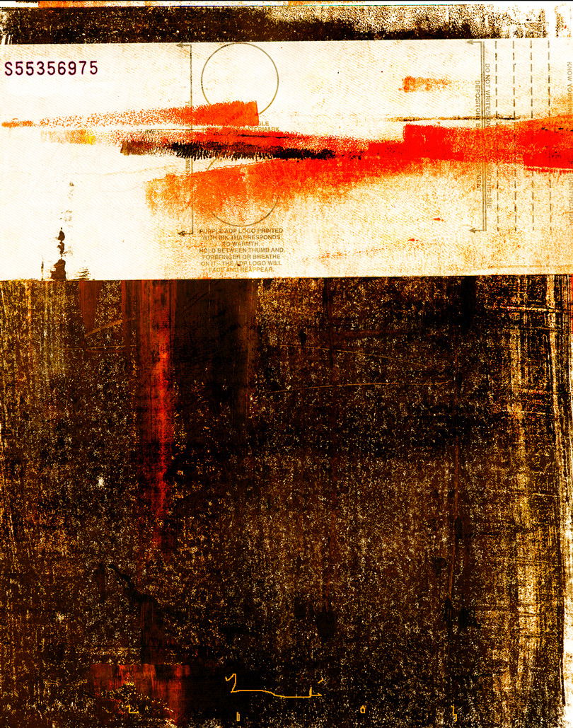
Published: 2003-06-08 09:25:42 +0000 UTC; Views: 1980; Favourites: 21; Downloads: 196
Redirect to original
Description
this is actually a fairly personal statement done in a fairly vague manner. I will neither explain it nor confirm any guesses.acrylic paint, found object, screenprinting ink + digital
Related content


Comments: 14

reminds me a bit of the album art for "The Fragile" by NIN
👍: 0 ⏩: 1

I'll take that as complimentary, seeing as I am a fan of Russell Mills (both his design and his music).
👍: 0 ⏩: 0

That is simply amazing. I have no guesses as to what it may mean, but I still think it looks awesome. The colors and style are great. I'd like to see something like this on an album cover.
👍: 0 ⏩: 1
find me a band and Ill make one for them
 (Wink)")
👍: 0 ⏩: 0


very nice work here. im curious to know what parts are digital and what ones arent. that red on that letter just screams, man. just sitting up there screaming.
👍: 0 ⏩: 0

i find your art scary. i could see a face on the lower portion of your art. and i could see blood from the head. it's nice though
👍: 0 ⏩: 0

there's something i just love about this but for once i'm not sure what it is...
and if there's personal meaning behind it that just makes it better, i really need to learn to express myself in a more vague manner too, some of my pieces are way too much to the point..
👍: 0 ⏩: 0


I like it for the title alone - the rest is just icing for me!
👍: 0 ⏩: 0

Absolutley delicious. This has you written all over it.
👍: 0 ⏩: 0

I really like the stuff in the white up top; that is some well done digital tweaking.
👍: 0 ⏩: 0

I like the abstract nature of this, and the layout is really cool, not much activity in it, but that is one of the things I like about it.
👍: 0 ⏩: 0