HOME | DD
 CGCookie —
Gold Step by Step tutorial
CGCookie —
Gold Step by Step tutorial

#goldtutorial #cgcookie
Published: 2012-09-14 20:50:48 +0000 UTC; Views: 851959; Favourites: 14926; Downloads: 9976
Redirect to original
Description
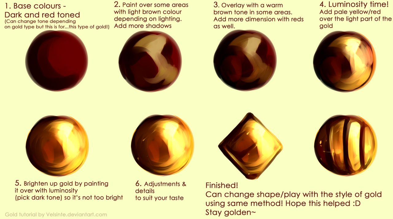
Check out the Golden Exercise and Download the Practice Sheet HEREEXERCISE: Challenging your knowledge and application of gold.
You can use gold on many different materials and surfaces from a golden helm to the stitching of a golden fleece. The trick is knowing how to accurately create the appearance of gold. Gold itself is a metal material. A metal surface will most often reflect light rather than absorbing it. We created a reference last year that give you a quick look at one way of creating the “golden” look.
Related content


Comments: 207


too bad I don't have any software that have these brushes...
👍: 0 ⏩: 0

 (Smile)")

Ooo pretty layering! Looks just like my jar of gold paint sitting on my desk
👍: 0 ⏩: 0


Spam?? Where??? I dont see it
👍: 0 ⏩: 0


Lol when I saw the gold Hamilton was the first thing I thought of xD
👍: 0 ⏩: 1

woah so......that....gold brown turns into.....something shiny!?
👍: 0 ⏩: 0


FR E SH A VACA DO
👍: 0 ⏩: 0


very interesting...
get inspired by abstract...
www.youtube.com/watch?v=MYfeVR…
👍: 0 ⏩: 0

")


I didnt understand can u explain what did u do?
Ur tutorail is awesome
👍: 0 ⏩: 1

Block out the colour, texture in the light (if the gold is scratched or not completely smooth), splatter on lighter and lighter dots/splatters~
👍: 0 ⏩: 0


this is fantastic, I nearly bypassed this but chose to have a look. Your tutorial may just save me days of work. <3 Thank you so much!
👍: 0 ⏩: 0

P.S.: Made this using your tutorial and brushes:
Thank you very much again! 
👍: 0 ⏩: 0
Hello, CGCookie! First of all, I have to thank you for such a useful tutorial, colours and brushes!
That's what I really need for one of my ideas I'm working at.
The second. I have some questions.
1. I've made 7 layers, each for one colour. I've played a little with them... made a little scheme: So, what's your layer settings?
2. I didn't know how to make more "glow", like in your sample. But then figured out and used smart sharpen filter after merging layers.
And how did you make yours "glow"?
3. What's your brush settings? I mean opacity/flow?
👍: 0 ⏩: 1

i believe the layer mode was either screen, overlay, or add. with the opacity down.
👍: 0 ⏩: 0

Wow, awesome example of how to achieve nice realistic effect. It could also help to draw other metals, less shiny = bronze, color changed to reddish = copper, color changed to silver = iron, more shiny = silver/steel (am I getting it right?). Definitely going to use this knowledge in my future works!
👍: 0 ⏩: 0

Thank you for this, though mine didn't really turn out....
Is there any way you could add a short written portion saying how you recommend using it? Or if not, could you maybe critique my gold making skills using your resources?
My painting is here:
👍: 0 ⏩: 2

When working with any kinds of metal (including gold) definitely play up the contrasts and work on creating the illusion of reflection. For this gold trophy, it reads a bit flat but you can keep adding to the foundation that's already in place here. Round out the values and add some "cast shadows" where the light wouldn't be able to reach.
👍: 0 ⏩: 1
Thank you! I appreciate your help.
👍: 0 ⏩: 0

i'm not an expert but I think you need a more vivid source of light, with higher contrast on the reflects to make it look more metal-like, like maybe a white line on the side and upper corner....do you know what I mean?
👍: 0 ⏩: 1
I do, thank you! Ya, I'm usually pretty timid (I don't know if that's the right word...) when it comes to lighting and shadows. I agree, looking back at it now, I think it would look better with higher contrast on the reflections. I was afraid I was using too much at the time I was coloring it, but I didn't actually step back to look at the whole picture. Thank you for the advice!
👍: 0 ⏩: 1
you're welcome! I completely get your feeling about shading, I'm always afraid to do too much. Which is why it's good to take a step back or ask someone else for advice  (Wink)")
👍: 0 ⏩: 0


link in the description
👍: 0 ⏩: 1

Pixel-Spark [2015-08-25 20:38:36 +0000 UTC]
I found this tutorial on your site, and it is amazing! ^^
👍: 0 ⏩: 0
| Next =>