HOME | DD
 GH-MoNGo — Tidebringer - WIP 2
Published: 2010-02-15 05:43:05 +0000 UTC; Views: 614; Favourites: 16; Downloads: 0
Redirect to original
Description
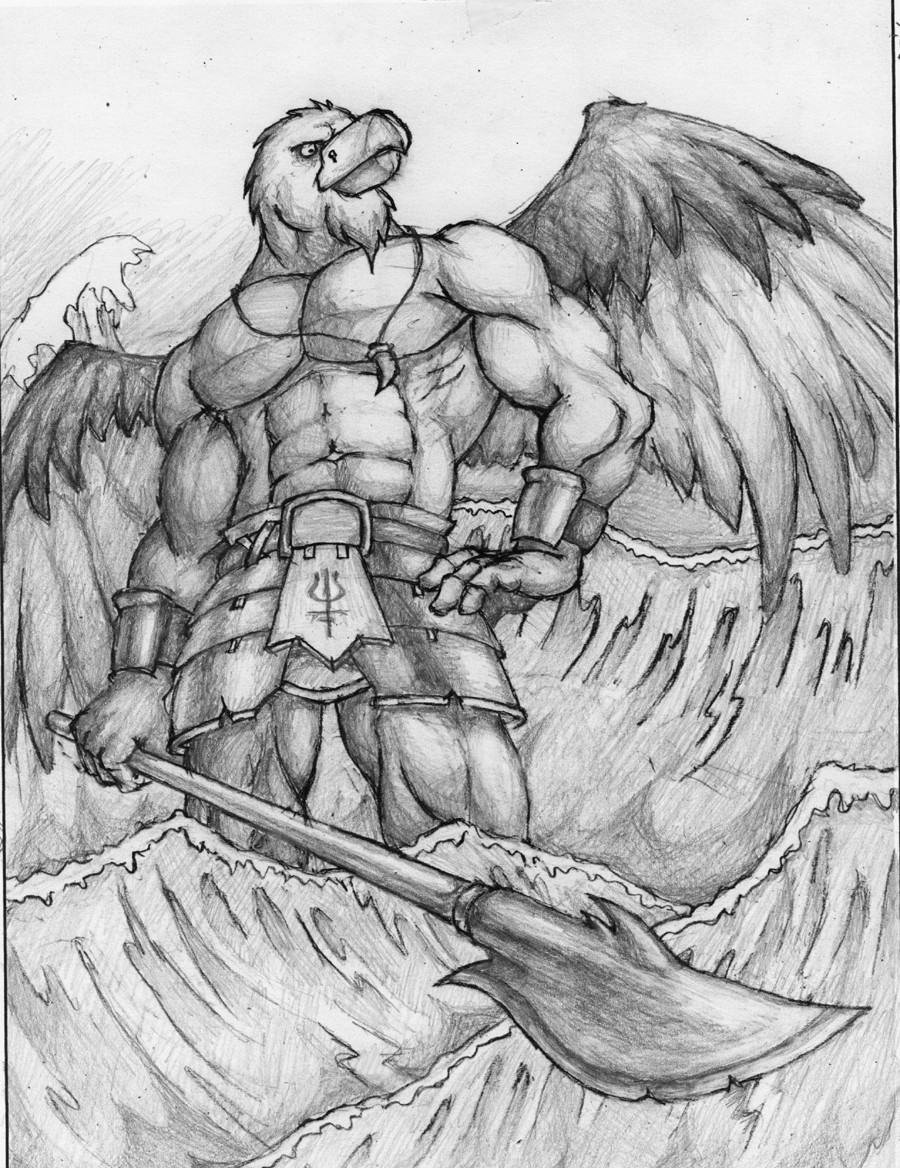
Value study in graphite.It's been a loooooooong time since I submitted pieces in stages like this.
Related content


Comments: 31


lookin' good. One thing you're missing here are some sharp shadows from objects like the necklace, his beard and left hand, and the "skirt" he is wearing. I also noticed you forgot to draw the back side of the skirt between his legs. I don't know if you were planning some kind of reflection or shadow on the water, might look nice or maybe it would completely fuck everything up..
👍: 0 ⏩: 1

I'll look into it. Thanks for the suggestion!
👍: 0 ⏩: 0

I like the pose and the concept, it is awesome  - =D")
👍: 0 ⏩: 1
No doubt. Get a towel or something!
👍: 0 ⏩: 0

Oh wow, that's nice! Love the perspective on the spear and everything.
👍: 0 ⏩: 1
 (Smile) - :)")


Just awesome, the water needs some work, he looks casual, as if "I can't help BUT make tidal waves" kind of thing. Rad. The subtle twist in his waist is perfect.
Rock on.
👍: 0 ⏩: 1
What would you suggest for the waves?
👍: 0 ⏩: 2
Hard to describe so I'll do my best, some more foam surf on top to bring out the shape more, especially with some spray to really make the waves look like they're going to crash down hard. Waves often also cast shadows on themselves, but also let light through the middle of the forward wall. You may or may not find using a few more parallel lines on the waves works with your style. But overall, the only thing I think I can describe accurately would be to do a little structuring sketch when drawing waves, they're a real challenge but have such interesting shapes. Swelling waves are smooth, moving waves are folding over themselves and crashing waves spray alot more than moving waves.
Also, I'm sure they'd look much better with colour, but that's not the point.
Basically, more foam, structure, shade and colour it as if it's misshapen glass.
I mean it with all respect, they aren't that bad as is, but I think you want to do better than that. Am I right?
👍: 0 ⏩: 1
I see what you mean about that. To be fair, I was planning to add some white on top of some of them. The waves really aren't that big and they work more as a compositional device than a physical representation of waves.
👍: 0 ⏩: 1
Excellent, so you already had that idea. I know what you mean, the waves behind him describe power, the waves scurrying from his feet makes me imagine his influence over the elements, and the cresting water over his shoulder adds both a design element, a curving line that follows his shoulder and arm, and makes him seem backed, a legit authority. But it's the idea, the symbol of the wave that does most of this, how it's rendered on paper is up to your ability to learn no matter what and do it your way.
👍: 0 ⏩: 0

Interesting, the waves look almost like the Japanese painting of "The Great Wave" - [link]
👍: 0 ⏩: 1

👍: 0 ⏩: 0

Very cool, I understand it's a WIP but it looks awesome. I like the sketchy shading. The anatomy is spot on and the pose is good. I'd have trouble with drawing the left hand.
Good job man

👍: 0 ⏩: 1
No problems brothah
👍: 0 ⏩: 0


Very nice, In Philippine folklore we called it 'Mulawin', a myth creature with a half human body and half eagle/falcon.
👍: 0 ⏩: 1

Glad you like my interpretation bout your works
👍: 0 ⏩: 0