HOME | DD
 h2g2guy — 'The' bridge
Published: 2013-08-08 02:09:21 +0000 UTC; Views: 180; Favourites: 3; Downloads: 2
Redirect to original
Description
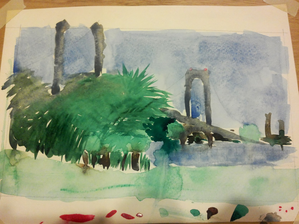
Whenever we're going over 'the' bridge, this is it.My first en plein air watercolor painting, surprisingly NOT of ponies (don't worry; they'll be back soon!). I'll get this out of the way first: Done on 140 lb Strathmore cold press, with a limited palette of burnt sienna, pthalocyanine green and cerulean blue (with just two tiny dots of quinacridone red on the top of the bridge; all colors from M. Graham). Brushes were 1/2" and 1-1/2" flats and a #8 round.
This was a challenge, but a bit of fun, as well. I picked up a copy of "Drawing on the Right Side of the Brain" by Betty Edwards yesterday, which I highly recommend if you don't think you can draw. The main thing the book tells you to do is to deactivate the logical, symbol-oriented left side of the brain by viewing and drawing things in ways it can't easily process. One good example is by drawing the negative space around and inside the object, which your left brain can't name and symbolize, instead of drawing the object itself. By drawing those boundaries, you end up drawing the whole object.
So that's exactly with my underdrawing here, and I think it worked rather well. This is perhaps the most realistic thing I've ever drawn.
Then came the painting bit. I went at this with a sort of 'excited apathy'; I didn't know how well this would turn out, and I didn't care, but I tried to gear myself up for it and work with determined and confident brush strokes. Despite some mixing issues early on (and the difficulties of working with a limited supply of water!), I managed to start to get my bearings. You can tell that the sky is sort of streaky, indicating overworking of the paint, while the distant, darker bushes have confident swooshes and squiggling in their forms.
If I could redo a few bits here, I'd take a bit more time with the trees to make them a bit clearer, along with the grass. It was beginning to drizzle, so I rushed the grass terribly and ended up with a washed out, uneven, backwashing space. I'm rather proud of the two buildings in the distance for a strange reason: they're indicative of me overcoming my perfectionism. I was able to recognize that they're in the distance and don't need detail, so I very intentionally omitted detail. (Now I just need the patience to wait for the paint to dry to be able to ADD detail to the nearer objects!) The other detail I omitted were the suspension cables on the bridge, as I felt the composition didn't really need them, and they are provided in the visible undersketch for closer observations.
Let me know what you think!
(One last thing: I finished this up rather late, and I don't have a natural-light lamp, so this is a quick snapshot lit under yellow indoor lighting. I'll see what I can do to get a more faithful photo of this painting tomorrow afternoon.)
Related content


Comments: 2

Ooo! Nice! I still can't critique watercolors, so lets just say this is something I would hang on my wall. I really like how you did the trees, and I agree with what you said about the buildings. They fit in perfectly with the overall style, and I agree that you really don't need much detail on those.
👍: 0 ⏩: 1

Heh, thanks! Honestly, there are a lot of things in the foreground that I wish I had done better and with more detail, looking at it a day later, but hey, it's a learning experience!
👍: 0 ⏩: 0