HOME | DD
 jocarra — Jen's Fur Tutorial 2
Published: 2006-03-02 06:00:44 +0000 UTC; Views: 85387; Favourites: 2093; Downloads: 14429
Redirect to original
Description
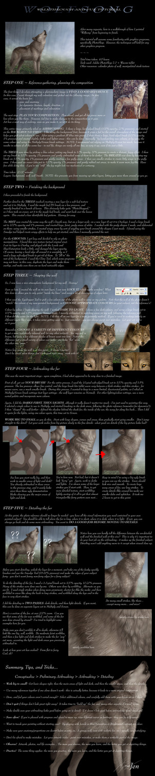
A walkthrough of Wolfsong, describing my new fur technique. If you have any additional questions, feel free to ask (Smile)")
Original image: [link]
Other wolf images: [link]
Related content


Comments: 690


Thank you for the reply and the time you put into it, I am going to grab my previous lineart and try all those things you suggested. Thanks again.
(and yes I did mean the second red arrow, after looking through your comments a lot of people seem to get stuck there).
👍: 0 ⏩: 1

I should probably redo that part, but... so lazy D:
👍: 0 ⏩: 0
I think this is probably the easiest tutorial I have seen so far but I am still having the problems that I had with the others (this is the 15th fur tutorial I have looked at).
1.How would you do it on an Arctic Wolf? (as there isn't such thing as several shades of white, I have tried using pale browns and greys but that doesn't seem to work).
2.How do you know where to put the light and dark areas on the 2nd picture of stage 4? (Reference pictures don't really show where to put them clearly.)
3. How do you get from the 2nd to 3rd picture of stage 4? I have tried several things such as using 100% flow and smudging/ blurring and have also tried using a 15% flow brush for the light and dark areas which just makes a trail of circles.
Sorry to bother you with all these questions but its been about 5 months since I started looking at these tutorials and I really want to get somewhere further than just lineart (because it is slightly boring with no colours).
👍: 0 ⏩: 1
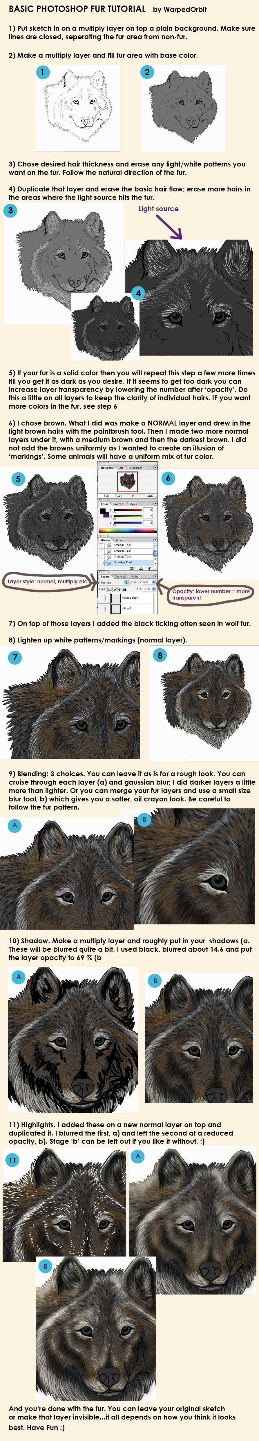
While you're looking at a barrage of tutorials... [link] goes over all the fur tutorials I have, from easiest to hardest.
1) Black and white are the hardest colours to render. [link] to do so WELL you need to carefully balance a variety of colours. Using complementary colours is probably best - here, she used blue and orange (brown). The way complementary colours work is that when you blend them, they create a grey colour. So when you view them in very close proximity, or say, if you blurred them (try squinting at the picture from far away), it overall looks like shades of white or grey.
However, it's much easier for a beginner to just stick to fewer colours right now. [link] I used just light blue and a dark grey to shade with. Same thing with [link] - just grey with a little blue.
2) That's hard to say. If your reference doesn't show lighting well, try to imagine your reference as a semi-shiny 3D sculpture. Now imagine the 3D sculpture under the same lighting as you want in your picture. If it helps, you can always go out and buy one of those cheap little plastic toys and try sticking it in different light to see where it falls. But it's basically just "knowing" what parts of the body stick out more than the others, which requires an understanding of anatomy. All I can do is just try to refer you to more photos. I often use several references - for example, maybe one or two for the pose, one for the head, one for the fur colours, and one for the lighting.
3) This part is generally confusing, such that I should probably rewrite it given how many people have asked me about it. Firstly, do you mean how do you do the part with the second red arrow?
Anyway, let me just say that your image shouldn't look like the first two big pictures at any point. When you do it (100% opacity, 1-5% pressure/flow, soft-edged brush), it should come out smooth looking like the first two small pictures. What the big pictures are showing is WHERE to airbrush. If you airbrush where the big hard blocks are, it should come out looking like the small pictures.
You should not NEED to smudge/blur. It's airbrushing, so it should be very smooth and very "pre-blended" when you do it.
👍: 0 ⏩: 0

It may sound stupid, but, I have a problem. When I do all the small strokes after doing the big ones, I don't know how to make it look all furry like you did. I've tried the smudge tool, and the blur... but I don't know how to make it like that! Can you please help?

👍: 0 ⏩: 1
Hm, it depends on the exact technique you're using for the small fur. Both should be used with a very small brush. 1-3 pixels.
For "scribbled" fur, you'll probably need to use the smudge tool a little to clean it up a little better. See my first fur tutorial for that. Here's a list of all my fur tutorials: [link]
For hair-by-hair fur, well, it just takes some getting used to. It can't be too thick and blurry, or too thin and sharp, otherwise it doesn't look quite right. It also can't be too uniform, or else it looks fake, and too messy and it might not work. Try looking at Moment Walkthrough or third fur tutorial for more direction.
👍: 0 ⏩: 1
Thank you for the help, I appreciate it.
👍: 0 ⏩: 1

thank you very much for this!
...especially with the locking layer thing, i just used select with the wand, but that always leaves pixel-y edges...i honestly never really looked around photoshop to see the stuff it had

👍: 0 ⏩: 1
*nods* I do that sometimes - you can fix it by feathering the edges. At the top it should say Feather: and then a blank space. You put in a number to represent the number of pixels to "smudge/blur" so it's not hard and pixelly at the edges of a selection.
Or, if you're doing lineart and you end up with pixelly edges just inside the lineart and not fully filled in at the edges, you can use Refine Edge to make the selection a little bigger to make up for the lineart, so it fills the colour in more completely at the edges.
👍: 0 ⏩: 1

Did you use the smudge tool in order to get to the smoother looking fur? If not how did you do it...thanks!
👍: 0 ⏩: 1
No, I didn't use the smudge tool.
I did it by using my brush set to 100% opacity and 1-5% pressure (see step 4). The colour comes out slowly enough that it "auto smooths" as you paint.
The hard-edged, non-blended, step-by-step images are supposed to show you not how it actually looks, but WHERE I used the airbrush. Because it comes out smoothly, it automatically makes it look like the smaller images rather than the big rough images.
👍: 0 ⏩: 2

Oh, that's something I've been wondering about for a long time! Thank you!
👍: 0 ⏩: 1
By the way - another question; do you use the screen/multiply brush though the whole fur process, or do you only use them in the start to get the brightest and darkest colors you want to use?
The reason for why I ask is that your wolf looks soft and not too contrasty~
👍: 0 ⏩: 1
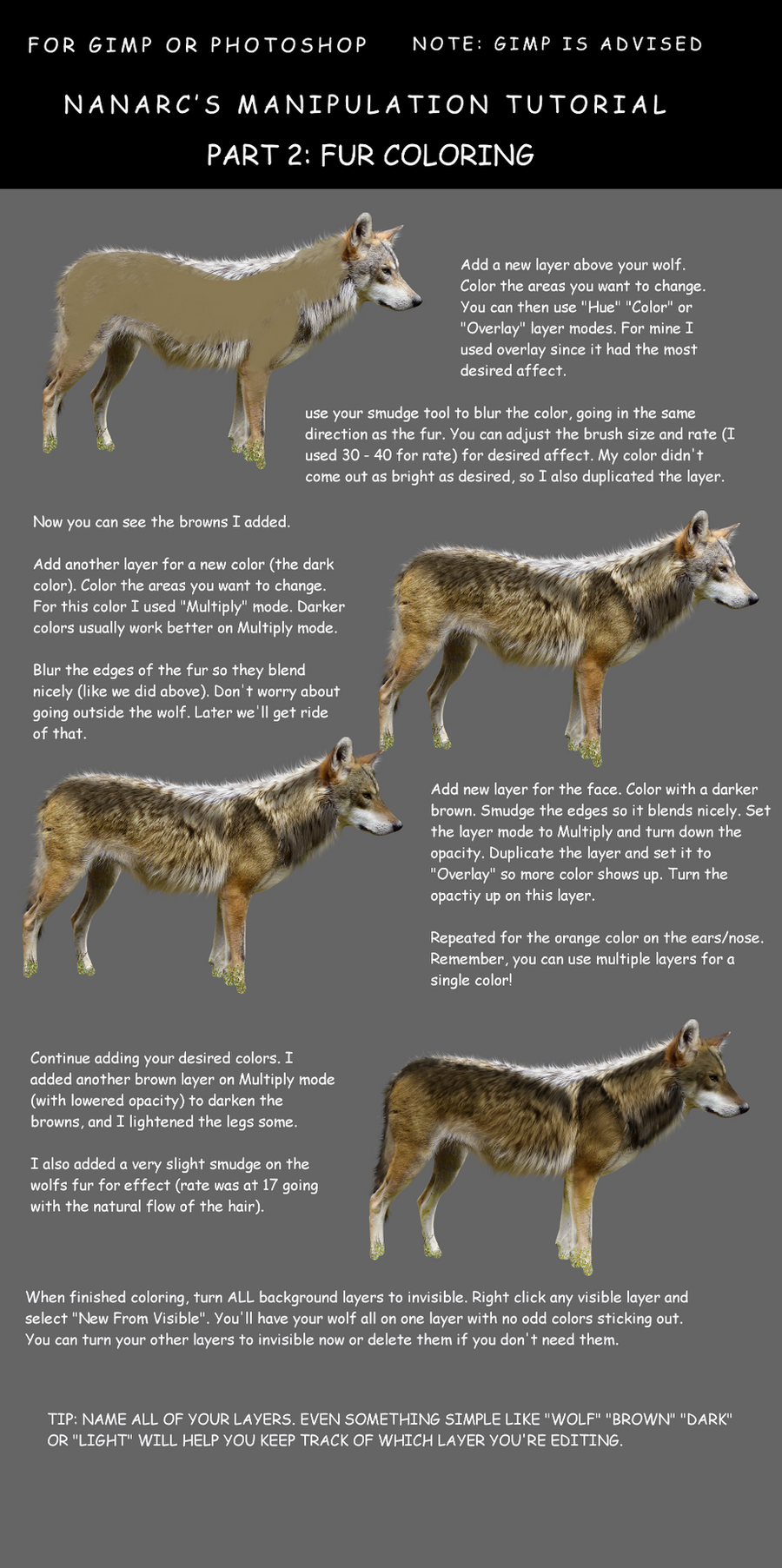
I use a mixture of screening and multiplying as well as a (less varied than I'd like) selection of different colours.
I usually try to use at least 2-4 different colours for a single-colour subject (like a plain brown wolf) in combination with screen and multiply.
Like...
Brown 1 + (normal)
Brown 1 + multiply
Brown 1 + screen
Brown 2 + (normal)
Brown 2 + multiply
Brown 2 + screen
This yields 6 slightly different products/effects, and helps it look more realistic. I personally need to work on using more colours.
👍: 0 ⏩: 1
ooooh, thanks soooo much. And thanks a lot for responding quickly!
👍: 0 ⏩: 0

awesome!!! I tried some of the teqhniques and it works charms!
One question though:
I have gimp. So its a little different. When you say 'lock' and then it 'colours inside the lines', how does that work? Are you locking the transparency? I couldnt figure it out. Maybe a hint? because, yeah... I dont have the same program. So... ")
Also, what type of tablet do you recommend getting, because all I have at my disposal is a bluetooth mouse and a crappy mousepad, and I was thinking about buying a tablet.
👍: 0 ⏩: 2
Yeah, you're basically locking the transparency, so you can't lay down any more colour, you can only colour over what's already there, thus preserving what transparency on the layer there is.
I definitely recommend getting a Wacom tablet. [link] I use an Intuos, which is the higher end of the simpler tablets, if that makes any sense.
👍: 0 ⏩: 1
thanks! 
👍: 0 ⏩: 1
You dont have to answer the first question!
I still would like to know your opinion of tablets i might want to look at. For example, what kind do you have?
👍: 0 ⏩: 0

I will try to use this...but it might get kind of cunfusing.
👍: 0 ⏩: 1
Feel free to ask any questions if you find it confusing.
👍: 0 ⏩: 1


Lets see, I really wanna use this, but do I need to wait and get my tablet first?
👍: 0 ⏩: 1
A tablet helps A LOT, but is not absolutley necessary.
👍: 0 ⏩: 1
Hmm, okay thank you so much!

👍: 0 ⏩: 0

Can you do the same thing with GIMP?
👍: 0 ⏩: 1
I have absolutely no idea. If GIMP has pressure sensitivity and lets you control how fast the colour comes out, then yes. You don't need special brushes or filters or layer effects.
👍: 0 ⏩: 1

This will very helpful. Thank you!
👍: 0 ⏩: 1

This is easily one of the best fur tutorials I've come across...thanks so much for putting this together
👍: 0 ⏩: 1


one question.. did you actually draw the wolf or did you like... cut out the outline and then do the details? lol. Just wondering
👍: 0 ⏩: 1
Yeah, I actually painted the wolf. I don't do overpaints, although sometimes it looks like I do.
👍: 0 ⏩: 0

")
👍: 0 ⏩: 1

I like this one! especially when you showed the transitions in part 4... and how it took u 2 hours to get to there. That shows that it cant be done in just a few minutes and turn out good.
and thats what I lack... time ^_^' ill have to try this one later
👍: 0 ⏩: 1

Such an awesome fur tutorial!
👍: 0 ⏩: 1
<= Prev | | Next =>