HOME | DD
 maXVolnutt — Book Cover 3- Dune

Published: 2010-10-25 01:26:36 +0000 UTC; Views: 2738; Favourites: 2; Downloads: 24
Redirect to original
Description
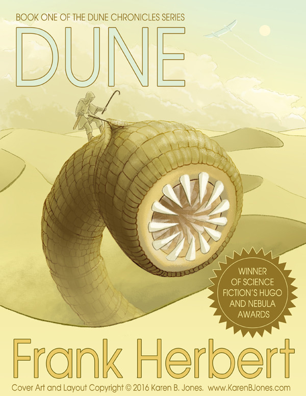
One of numerous book cover ideas for a design project, this one for Dune, more or less a redesign of this one [link] I wanted to redo this cover using more of my own personal design tastes rather than the original, which was more or less based on the works of Milton Glaser. There is another version of this which uses a white theme rather than black, but I actually... lost it on my computer. ^_^;; I hate to say it... but I think this is superior to the crummy cover they have on the book now. A classic should have a cover that pertains more to the story itself, don't you think? Done in Photoshop, Illustrator and InDesign.Dune is not my property, nor do I take credit for it.
Related content


Comments: 8

That is a pretty excellent cover.
What's the crummy cover you're thinking of? The one on my copy is pretty good, in my opinion. It's... actually not entirely dissimilar to yours. Except less of a landscape and more of a narrow rectangle with some sand.
Or is that the same one you were referring to?
👍: 0 ⏩: 1

[link] This one. It's just... real generic to me.
👍: 0 ⏩: 1
Ahhh... it is the same one.
Personally, I like that cover. It's not generic, it's stark and minimalistic!
It also helps if you look real close and see that there are some people on the sand. So there's a little more detail than immediately meets the eye.
But I think pretty much everything I like about it is present in yours, too. Including the tiny-person-on-sand bit. Except yours has got an actual landscape instead of a narrow sliver. Also, a sand worm.
So I guess I agree that yours is superior, but not that the other one is crummy.
👍: 0 ⏩: 0

I really like that this is panoramic. I've never actually read dune, or seen the movie (I think I heard a comedian joke about the movie, which is why I assume there is one), but I can gather quite a few things from this cover alone, and some of it comes from the simple fact that it's one whole picture for the whole cover.
I also really like the way you shaded it.
👍: 0 ⏩: 1
There's actually two movies. The Sci-Fi Miniseries movie and a fucked up David Lynch movie. Both are... kinda good, kinda crappy in their own was. And I really wanted to do something that brought the whole cover together, and a big, desolate desert seemed like a good way to capture just how sandy that book is. Would you believe I actually had to extend the original illustration to do that? It was actually pretty hard.
👍: 0 ⏩: 1
Seems accurate enough, dunno if I'd ever be convinced to watch it though. Unless I was high, and didn't have Tron*.
I would believe that you had to extend the original illustration. It seems like a clever thing to do for something like this.
[That was the right joke, right? From NDK? I fail at this D:]
👍: 0 ⏩: 1
I dunno. It's hard to remember. I was too smoked up. Maybe I'd remember if we got smoked up and watched Tron.
👍: 0 ⏩: 1
That would solve all of our problems.
👍: 0 ⏩: 0