HOME | DD
 NotMatthias — Dallas Stars Concept

Published: 2011-08-26 20:55:12 +0000 UTC; Views: 2428; Favourites: 8; Downloads: 0
Redirect to original
Description
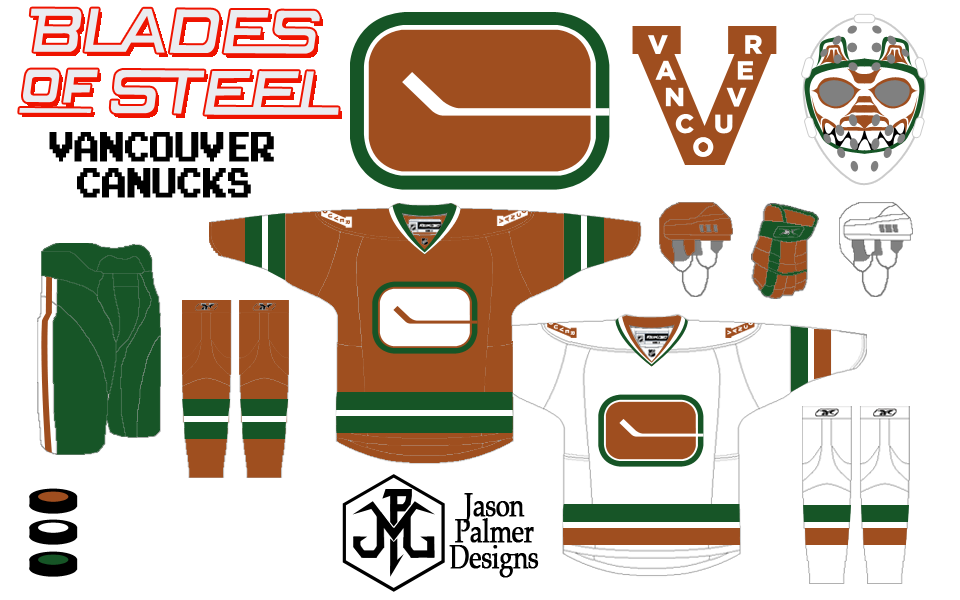
So, the NHL Project continues with the Stars! Let's get into the description, shall we?WARNING: THE FOLLOWING CONTAINS ADVANCED DESIGN THEORY AND GEOMETRIC CONCEPTS. READ AT YOUR OWN RISK.
My original plan was to go back to the classic star-sweater. But a while back, I found a concept similar to this one, which made a very good point: the skewed star of the main logo, when placed above the central point of the jersey star, creates a ton of tension. As such, the college-style Dallas text actually has a ton of potential when used with the star-sweater design– by nature, it is perfectly balanced, just like the jersey star, and as such keeps things nice and even. And still pretty awesome.
I stuck a modified version of their alternate logo on the shoulders– more on that later– and as a tribute to the North Stars, I put three stars down the side of the pants. (I also made this separate star an alternate logo in its own right.)
Now, you may be thinking, "Wait, the primary logo doesn't appear anywhere on the home and away sets! And the one on the alternate is heavily modified! What is this?" And, in all honesty... I wanted to put it on, but I just went with the flow and, well, when it was over, I couldn't find anyplace to put it. I actually considered making the text-less star the primary logo instead, but in the end just decided to leave it off of the jerseys. (The Rangers do it...)
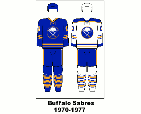
Now, on to the fauxback. Obviously, the Stars never wore this set– it's a North Stars jersey. But as we've seen before, when teams throw back to previous franchises, they've changed the logos and colors. (Looking at you, Calgary. You too, Buffalo. And, in a few months, Philly.) Since the Stars and North Stars share similar colors– it's really just the shades– I simply North-Star-ized the Stars logo and... Ta-da!
(Interestingly, the pants on the home and away were a tribute to the pants worn with the jersey being used for the fauxback, but I made the pants and fauxback decisions separately.)
As for the logos, I closed up the gap on the star... I think we all know that "ST∆RS" is "Stars," and the gap is unnecessary. (I also considered ditching the Dallas.) The only other change was on the alternate: it used to have the star centered on Texas with a "D" over Dallas. The D just looked bad, so I put the star over Dallas instead. Simple change, big improvement.
Oh, and the ST∆RS logo doubles as the wordmark, so I threw together a secondary wordmark in the style of the jersey text for the corner.
On a final note, I did modify the colors somewhat– the gold is a lot paler, kind of a silver-gold, and the green is, well... I'm not sure how it compares to the real colors (it went through many shade changes), but I know it's different.
Anyway, so I know this isn't my most outlandish concept (Phoenix), or the one with the biggest changes (Anaheim), but I think this one definitely has a lot of things worth commenting on... hint hint.
")
Related content


Comments: 4


Why the Stars discontinued their starry night jerseys, I'll never understand. And the pants. Besides the word "DALLAS" running down them, those were some damn awesome pants.
Love the fauxback also. I'm a big fan of those past-meets-present sweaters.
👍: 0 ⏩: 1

Reebok claimed the star wouldn't fit the Edge template. (Same problem occurred in Colorado.) However, this claim has since been proved to be total bull, so corporate pressure's the only thing keeping the Stars from bringing them back.
👍: 0 ⏩: 0

this looks like it actually might work ")
👍: 0 ⏩: 0