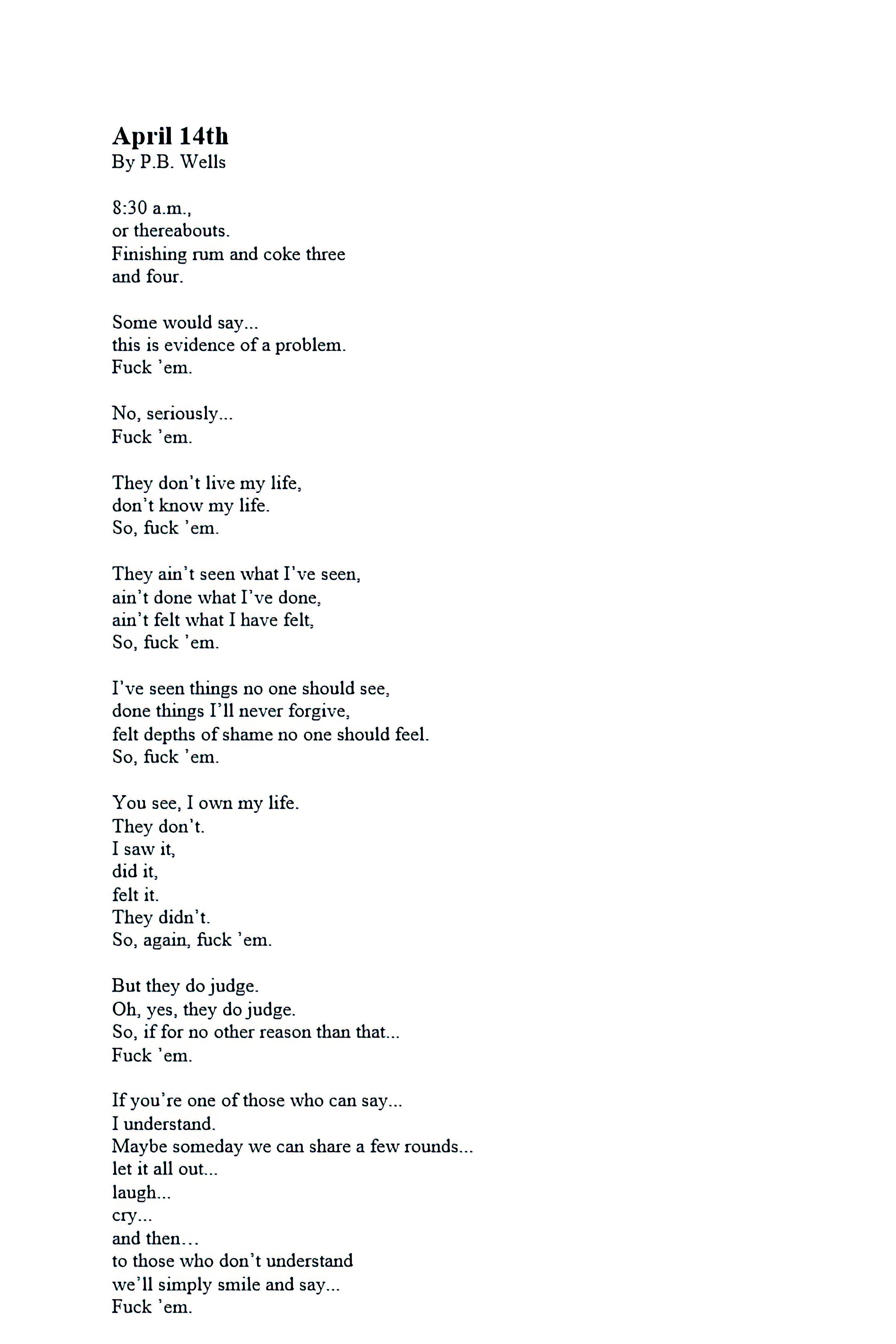
HOME | DD
 SiathLinux — Blender 254 Tutorial 2a
by-nc-nd
SiathLinux — Blender 254 Tutorial 2a
by-nc-nd

Published: 2010-10-20 20:29:55 +0000 UTC; Views: 1340; Favourites: 17; Downloads: 59
Redirect to original
Description
Blender 2.54 Tutorial Part 2a (there are 3 files for this tutorial)Thanks for looking.
Link to some Blender Materials = [link]
Look for the b and c of part 2 shortly.
Randy
Related content


Comments: 9

dear pal,
this set of blender tutorials are simply awesome
for someone like me who had lost touch with blender, this is the ideal 'restart' help
 (Smile)")
👍: 0 ⏩: 1

Thanks, once I get a computer again (I only have a Asus Transformer TF101 {a tablet} right now so no Blender)... I'll do a fresh set of tutorials based on the newest version of Blender with it's new bells and whistles and changes to it's layout.
👍: 0 ⏩: 0

Besides the dark colors, how about changing the typeface of the text. Looks like the credit-roll
on a cable/satellite Who cares about the
SFX Supervisor's name, anyway?
Best static tutorial I've seen in a while!
👍: 0 ⏩: 1
You double posted - I choose that font for it's easiness to read.
👍: 0 ⏩: 0
Besides the dark colors, how about changing the typeface of the text. Looks like the credit-roll
on a cable/satellite Who cares about the
SFX Supervisor's name, anyway?
Best static tutorial I've seen in a while!
👍: 0 ⏩: 0

You should change your text color. It is painful to read. Good tutorial though
👍: 0 ⏩: 1
I was told that... the Next set are already 'easier' to read.
👍: 0 ⏩: 1
hehe, text color reminds me of the Undertaker!
")
👍: 0 ⏩: 1
I haven't been on here much (no computer to make art with, and the tablet doesn't do well on dA due to the high graphics nature of the site...
Hadn't thought about the Undertaker in relation to the text style, but now that you point it out... yeah... it really does...
👍: 0 ⏩: 0