HOME | DD
 Sprybug — Tooth and Claw - Iss 1 - Pg 10

Published: 2011-08-16 10:55:44 +0000 UTC; Views: 652; Favourites: 16; Downloads: 6
Redirect to original
Description
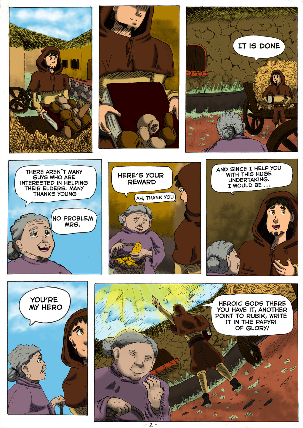
Tooth and ClawIssue 1
Page 10
"To Higher Ground"
Sorry for the slight delay on this release. I was visiting family all weekend, which took a big chunk of time I usually devote to T&C. As you can see this is a pretty big detour from what I did in the animated version. I'm having fun with this reboot and doing things that if I had animated it, would have taken a lot longer to do!
Related content


Comments: 17


Oh its turning out quite a bit more intense and longer than the animated version. Very nice! (does the mink get killed in this version?)
👍: 0 ⏩: 1

I suppose you'll have to find out, wontchya?
 (Wink)")
👍: 0 ⏩: 1
gah now that is just taunting
")
👍: 0 ⏩: 1
Hehe. Actually you know about as much as I do. I've debated doing that. I didn't rewrite the script for this, although I probably should have. But the basics are all plotted out for the first issue.
👍: 0 ⏩: 1
well... I think you should go all the way! no turning back! mwahahahahahah! ahem... I mean... characters are people too so you should be nice X3
👍: 0 ⏩: 0


Is Milo shorter because he's still a kid or are minks that much bigger than muskrats?
👍: 0 ⏩: 1
I was waiting for someone to say something about that. Yeah, minks are pretty large in comparison. Almost twice the size. I played around with that at first but it looked weird to me, so I just made them just a little bit bigger.
👍: 0 ⏩: 0

I do have one tip to provide in a comment that's not silly and random this time. :3
One tip I picked up from a user is that it would be recommendable to break the words into separate chunks, as opposed to centering them or trying to get them all in one little space. I'm doing it all for Issue 3 now of Keeping Up with Thursday and it's been a great help.
You could try something, perhaps, for the fourth panel in secton two--
"Father, I'm not
going anywhere,
without..."
Break them apart like that and line them accordingly, almost like you were centering, but not quite. If you know what I mean. :3 I just noticed that on that one panel, it looks a little off.
Other than that, everything looks good, and strangely enough, the Princess Mononoke theme started playing as soon as I clicked this. xD
👍: 0 ⏩: 1
Funny that you mention it, because I was going to try something new in the next page with the bubbles, because I never really liked how there was all this space around the text and it was hard to use it all. I'm thinking of changing the bubble shapes to be a little more of a rounded square. Should I justify left or center?
👍: 0 ⏩: 1
I would go for center, but like I said, break the words individually. You're using Flash for this right?  (Smile)")
I usually like to do the scene first, apply all the colors and shading design, then sticker attach the speech in next.
👍: 0 ⏩: 1
Yeah, I looked at it again and for some reason I did that bubble left justified which made it different from all the others, cause I always center. Maybe it was cuz I was just in a hurry to get this one out. Once I do my text in flash, I always break it down into a shape and then group them, so that if I go onto another machine with Flash, I don't have to worry about not having the font on it, plus it gives me freedom to resize and transform the shape at will since it's a shape, which I've done multiple times to fit certain text in a certain space without it looking like I did too much to it. Sometimes I will break up words individually to make it all fit okay in the bubble. I did that with the first panel. I think I see what you're saying, and in the next page I'm going to play around more with the bubbles and experiment. The speech bubbles is usually one of the last things I add too. I can usually rearrange the panel easily if I have to, to make it fit because I have things in symbols, groups, and layers. Thanks for the feedback.
👍: 0 ⏩: 1
Anytime, friend.
👍: 0 ⏩: 0

Looks like a pretty tough battle there... d'ya think he can make it, or should somebody intervene now...?
")
👍: 0 ⏩: 1
It does get pretty scrappy as you'll see by page 12 or 13.
👍: 0 ⏩: 1