HOME | DD
 torstan — How to draw grasslands
Published: 2012-04-06 17:35:29 +0000 UTC; Views: 29550; Favourites: 416; Downloads: 512
Redirect to original
Description
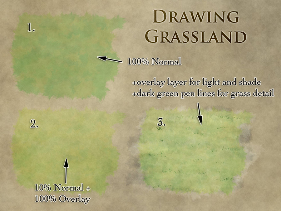
How to draw grasslandGrasslands are tricky to map. They're large empty open expanses. But if you just flood fill an area with light green it'll stand out like a sore thumb against your beautifully rendered mountains and lovingly painted rivers and forests. The colour is tough too - you want it to be a light green without being fluorescent.
I've found that the following works well for grasslands:
1. Lay in the base colour
• Take two shades of mid-green and turn on colour jitter with Foreground/Background jitter set to 100% - this'll give you a nice varying green, which helps to break up the monotonous uniformity of a green expanse.
• Use a large grungy brush (such as this case: [link] ) and set it to low opacity (20-30%?) and block in your grassland. This should give you something that looks a little like 1 in the attached image. This is a little dark, and a little solid green for my liking - I like to let the background texture bleed through.
2. Play with some blend modes
• Duplicate the layer
• Set the bottom layer to 10% with Normal blend mode
• Set the top layer to 100% Overlay.
(if that makes no sense, see yesterday's post on Blend Modes: [link]
- that should give you a nice mid green colour with some good colour variation, that should look something like 2 above. Honestly, you can leave it at that, and it'll look fine. But if you want to switch it up a bit more:
3. Add some detail
• Create a new layer over the top and set the blend mode to Overlay. First block in a dark blue with roughly 10-20% opacity. Use horizontal strokes - this will help to reinforce the isometric perspective of your map.
• Now go over the same layer with a very light yellow (almost white) also with horizontal strokes, and again at low opacity
- this should give you some nice light/dark variation in your grassland without breaking anything.
• Finally finish it off with a few dark green grass tufts scattered around using a thin brush (2-3 pixels, or 5 px if you're using a pressure sensitive stylus).
If you'd like to check out the psd file for this, you can get it here: [link]
Feel free to share this around to anyone who might find it useful. As always, you can check out previous tutorials over on the Tutorials page of my site: [link]
Related content


Comments: 8

I think the realization that much of the colorization I see on so many awesome maps is based on a suitable background layer (in your case the dark parchment) plus using several blended layers on top of one another rather than just one that you fiddle with over and over again has helped me a great deal. Thanks, Torstan.
By the way, this piece still links to your blog rather than your new site. For those who get the error message: simply delete the "wordpress" part in the address.
👍: 0 ⏩: 0


Thanks - I'm glad it's useful!
👍: 0 ⏩: 0

Simple and effective. Great little tutorial here.
👍: 0 ⏩: 1
Thanks - I hope it comes in handy.
👍: 0 ⏩: 0

Thanks for the tutorial. I am just recently discovering how wonderful the brush options can be when you set them just right.
👍: 0 ⏩: 1
They're incredibly powerful. I'm still finding fun new tricks to use them for.
👍: 0 ⏩: 0